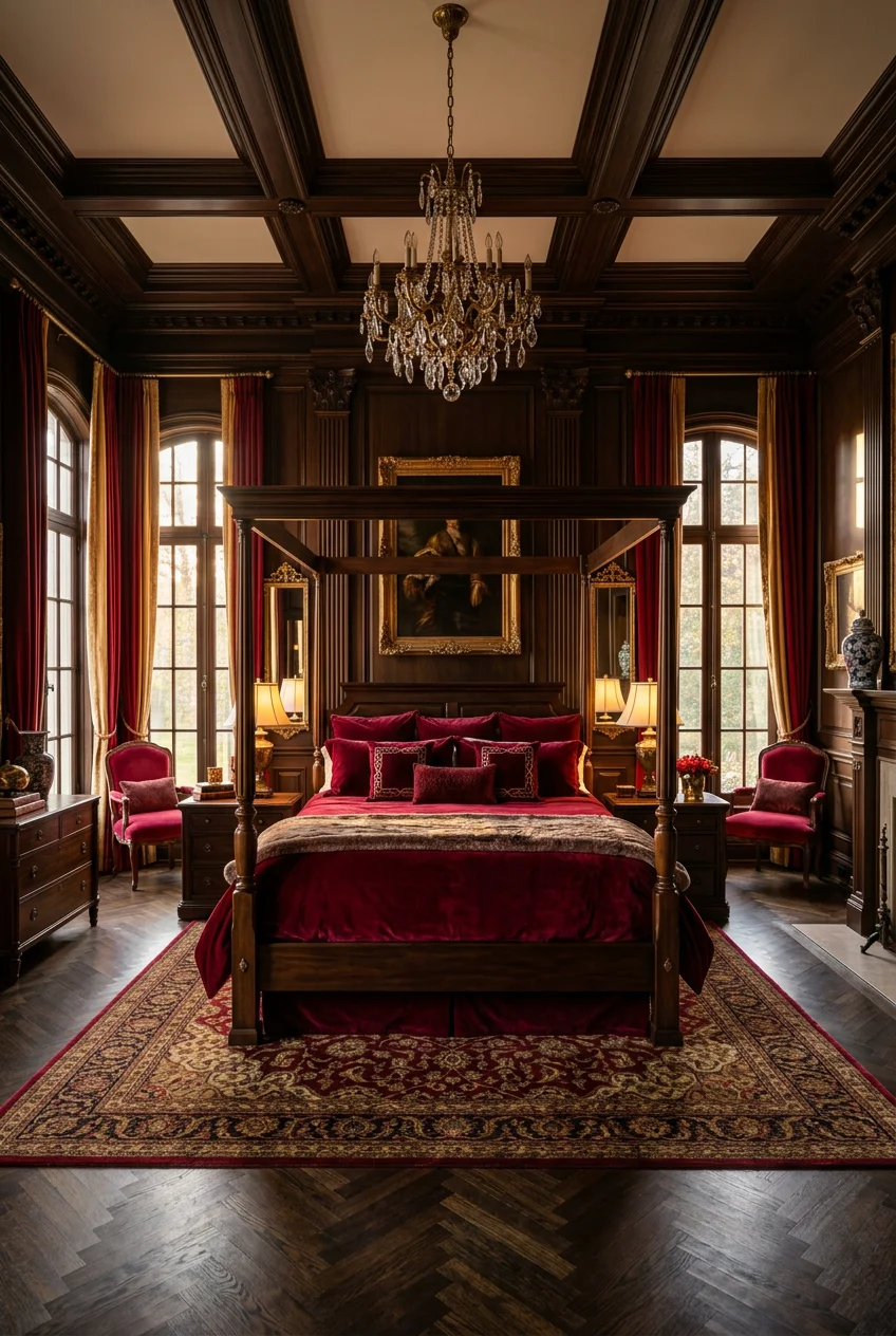
What’s Inside
- Build a Red Bedroom Aesthetic with Muted, Earthy Tones
- Implement the 60-30-10 Rule for Balanced Color
- Choose a Red Accent Wall for Impact in Small Rooms
- Layer Textures with Plush Red Fabrics
- Opt for Strategic Lighting to Enhance Mood
- Incorporate Red-Toned Textiles Against Neutral Walls
- Select Luxury Red Bedding for a Cohesive Look
- Pair Red with Complementary Colors
- Avoid Overly Saturated Reds on All Walls
- Consider Red Wallpaper for Texture and Depth
- Use the Unexpected Red Theory for a Modern Twist
- Integrate Red Furniture Thoughtfully
- Don’t Underestimate the Power of Red Accents
- Embrace Deep Wine-Red Ceilings
- Avoid Monochromatic Red Overload
- Anchor Your Red Bedroom Aesthetic with Dark Hardware
Three years back, I painted my 12×12 guest room a blinding cherry red because I thought it’d be romantic. It looked like a fast-food lobby. Getting a red bedroom right is tough. Pick the wrong shade, and you’re sleeping in a giant stop sign. After spending thousands fixing my own paint disasters and styling client rooms, I’ve learned how to make red work. You can’t just slap crimson on four walls. It takes balance, texture, and restraint. I’ll walk you through how to build a space that feels warm and grounded instead of chaotic. Let’s look at the colors, products, and layouts that actually work.
1. Build a Red Bedroom Aesthetic with Muted, Earthy Tones

Ditch the bright, stimulating reds. You need earthy tones like terracotta, burgundy, or whisper red. These shades create an intimate vibe that’ll actually let you sleep. Designers agree that low-brightness reds are the top picks for bedrooms in 2026. They add warmth without the visual noise. I learned this the hard way after using primary red in a downtown loft; it felt aggressive. Now, I stick to colors like Glidden’s Warm Mahogany. It’s a grounded red-brown that looks sophisticated. A gallon of their premium interior paint is about $45 at Home Depot. Farrow & Ball’s Rectory Red is another great choice for a dusty finish, though it’s around $130 per gallon. The flat finish absorbs light, making walls look like soft velvet. Skip high-gloss finishes. They’re too reflective and make red look cheap.
2. Implement the 60-30-10 Rule for Balanced Color

To keep red from overwhelming the room, follow the 60-30-10 rule. It’s a classic design formula for keeping high-energy colors in check. You allocate 60 percent of the room to a neutral, 30 percent to a secondary tone, and 10 percent to your bold red. For example, walls and ceilings take up the 60 percent. I usually use a warm cream. The 30 percent comes from wood floors, a black metal bed frame, or a charcoal rug. The 10 percent is your red. This keeps the red as a focal point, not a flood. I bought white Threshold percale sheets from Target last Tuesday for $45 for my 60 percent base. The bright white makes a single red velvet lumbar pillow pop. Push red past 10 percent in a small room, and it feels like a cave. Trust me.
3. Choose a Red Accent Wall for Impact in Small Rooms

In smaller bedrooms, paint only the headboard wall. It creates drama without losing the room’s sense of space. Keep the other three walls a warm cream or soft white. This keeps things airy. I once painted a 10×10 room entirely red and it felt like a closet. By sticking to one wall, you trick the eye into thinking the room is deeper. When painting that wall, use quality tape. I only use green FrogTape, which is $8.99 a roll at Walmart. Cheap tape lets the dark pigment bleed onto your white walls, and touching that up is a nightmare. It always leaves a smudge. The headboard wall is best because you aren’t staring at it while trying to drift off.

50×70 Inch Rust Throw Blanket – Soft & Fluffy Fleece
Honestly, 50×70 Inch Rust Throw Blanket – Soft & Fluffy Fleece surprised me — sturdier than it looks in the photos, and over 11 buyers gave it 4.5 stars.
4. Layer Textures with Plush Red Fabrics

Use plush, tactile fabrics to add luxury. It softens the intensity of the color. Flat cotton looks harsh, but red velvet or satin catches the light and creates shadows. A deep red velvet headboard is a stunning focal point. I bought a queen-size Kelly Clarkson Home velvet headboard from Wayfair for $289.99 last month. The fabric is thick and catches the afternoon sun, shifting from ruby to dark maroon. You can also bring in texture with heavy velvet blackout curtains. I found a pair at Costco for $49.99 that block streetlights completely. The heavy draping dampens sound, making the room feel isolated. Avoid cheap polyester satins. They snag and look plastic under artificial light, which ruins the mood.
5. Opt for Strategic Lighting to Enhance Mood

Red absorbs light, so you need warm lighting to keep the room from feeling heavy. A single overhead fan light won’t cut it. You need a mix of lamps and ambient lighting. I install LED strips behind the headboard in almost every red room I design. It makes the wall glow. I use Govee 16.4-foot LED strips from Amazon for $22.99. The adhesive sticks to the headboard, and you control the warmth from your phone. Use bulbs with a 2700K temperature. Anything cooler than 3000K casts a blue hue that turns beautiful red paint into muddy purple. I made this mistake and spent a week wondering why my burgundy paint looked like dried mud before I realized the bulbs were the issue.
6. Incorporate Red-Toned Textiles Against Neutral Walls

If full walls feel like too much, use textiles against neutral backdrops. It’s a huge trend for 2026. A burgundy or terracotta-patterned rug gives you warmth without the permanence of paint. I recently bought the Kamran Burgundy 8×10 rug from Ruggable for $359. The low-pile texture is soft, and the vintage pattern breaks up solid blocks of color. It’s machine washable, which is good since I spill my coffee. Throw pillows are another low-risk move. I grab 20×20 inch down-filled inserts and use rust-red linen covers. The linen provides a matte, organic texture that contrasts nicely with smooth sheets. If you get tired of it in six months, just swap the covers. It’s easier than priming over dark paint. You might also like: 15 Lovely Cool Bedroom Ideas Worth Trying This Year

Wood Phone Docking Station for Men
Wood Phone Docking Station for Men – 360° Rotating Nightstand Organize punches above its price — 29 buyers rated it 4.5 stars. I would buy it again.
7. Select Luxury Red Bedding for a Cohesive Look

Invest in good bedding to make the look intentional. Cheap red dyes bleed in the wash and fade to dull pink. Brands like Anne de Solene offer organic cotton sets that hold color well. A queen duvet cover is about $350, but the crisp cotton is worth it. It breathes well, so you don’t overheat. If that’s too much, Macy’s Hotel Collection has heavy-weight red bedding that often goes on sale for $150. I bought a crimson duvet from Macy’s three years ago, and the color is still saturated. When using a big block of red on the bed, keep the furniture simple. A massive red bed with busy wallpaper is visual chaos. Let the bedding be the star. You might also like: 15 Cozy Small Bedroom Decor That Make a Real Difference
8. Pair Red with Complementary Colors

Balance red by pairing it with the right colors. White, cream, gold, charcoal, navy, and olive green all work well with deep reds. A red frame with white bedding feels tailored. I like pairing burgundy with olive green. The earthy tones ground each other. Last Saturday, I picked up an olive green ceramic lamp at Target for $35 and put it on a mahogany nightstand next to a red wall. The green cuts through the red’s warmth perfectly. Avoid pairing red with bright yellows or lime greens unless you want a theme park vibe. I tried mustard curtains in a terracotta room once, and it ruined the calming energy. Stick to moody secondary colors or clean neutrals. You might also like: 20 Creative Cozy Small Bedroom for Any Style
9. Avoid Overly Saturated Reds on All Walls

Designers advise against using bright, saturated reds on every wall. High-energy colors raise your heart rate and cause agitation, which makes sleeping impossible. You don’t want your brain on high alert at 11 PM. I painted a client’s room fire-engine red once; she called two weeks later to have it repainted because she couldn’t sleep. The room vibrated. Opt for muted shades or use vibrant reds as tiny accents. If you want saturated red, put it on something small. A picture frame or a wooden chair. Leave the large surfaces for colors with brown or gray undertones. This knocks down the brightness and turns a stressful color into a soothing backdrop.

Yieach Bedside Shelf for Dorm Bed,Rv
If you want something that just works, Yieach Bedside Shelf for Dorm Bed is a safe bet (94 reviews, 4.5 stars).
10. Consider Red Wallpaper for Texture and Depth

Explore red wallpaper for depth. Flat paint can feel one-dimensional in dark colors. Trending in 2026 are wallpapers with layered textures and organic, nature-inspired patterns. Rebel Walls has a great range. Their paste-the-wall murals are about $85 per square meter. I installed their Misty Forest mural in dark burgundy last month. The trees break up the heavy color and add visual interest. Use heavy-duty paste. I tried a cheap generic paste once, and the paper peeled at the seams within a week. Wallpaper is tedious, but the payoff is a custom look. It also hides drywall imperfections that flat dark paint usually highlights.
11. Use the Unexpected Red Theory for a Modern Twist

Add a surprising pop of red somewhere unexpected. It adds energy to a minimalist room. The Unexpected Red Theory is a massive trend because it works. You place a single red item in a room that otherwise has no red. The surprise draws the eye and makes the space feel styled. I bought a glossy red 8-inch glass vase from a local boutique for $24 and put it on an oak dresser. It changed the whole dynamic. Try a red binding on a stack of books or a small alarm clock. I found a retro red metal alarm clock at Walmart for $12.99 that looks great on a white nightstand. It gives you the punchy aesthetic without a gallon of paint.
12. Integrate Red Furniture Thoughtfully

Red furniture makes a statement but needs soft elements for balance. A red dresser or nightstands add a custom touch. I recently refurbished a pine dresser by sanding it and using two coats of Rust-Oleum Chalked Paint in Farmhouse Red. A 30-ounce can is $19.98 at Home Depot. The matte finish keeps the red from looking like plastic. If you use a large piece, pair it with light curtains or pastel art to keep the space comfortable. I put that red dresser against a white wall with a muted landscape canvas above it. If you surround red furniture with dark walls and rugs, the room turns into an oppressive box. Give the furniture room to breathe.

Leeleberd Led Lights for Bedroom 100 ft (2 Rolls of 50ft)
If you want something that just works, Leeleberd Led Lights for Bedroom 100 ft (2 Rolls of 50ft) Music Sync C is a safe bet (199 reviews, 4.5 stars).
13. Don’t Underestimate the Power of Red Accents

Tiny touches of red make an impact. You don’t need a huge budget. Red throw blankets, pillows, or crimson flowers make a room feel alive. I keep a 50×60 inch red sweater-knit throw from Macy’s at the end of my guest bed. I got it on clearance for $49.99. The chunky knit adds texture, and the deep red anchors the bed. Another easy fix is flowers. I buy a $9.99 bundle of dark red alstroemeria from Trader Joe’s and keep them in a jar on the nightstand. They last two weeks and bring organic color into the room. These small accents are the best way to test the color before you paint walls or buy expensive rugs.
14. Embrace Deep Wine-Red Ceilings

For a luxury effect, paint your ceiling deep wine red. It’s a technique from high-end restaurant design that creates drama in bedrooms. When you pair a dark red ceiling with lighter walls, it draws the eye up and makes the room feel cozy. I used Benjamin Moore’s Black Cherry in a flat finish on my own ceiling. A gallon is about $65. The dark color makes the ceiling recede, which can actually make the room feel taller at night. Use a dead-flat finish. If you use eggshell on a dark ceiling, every roller mark will reflect your bedside lamps. I made that mistake and spent a Saturday sanding and repainting because the glare was distracting. A flat finish creates a velvety canopy.
15. Avoid Monochromatic Red Overload

A common mistake is using only one shade of red. It becomes overstimulating and looks like a matching furniture catalog from 2005. Use a variety of shades, from soft to flamboyant, to give the room depth. This layering makes for a more sophisticated design. If your accent wall is dark burgundy, choose a throw pillow in faded terracotta and a rug with hints of bright cherry red. I have a maroon velvet chair paired with a rust-red linen curtain. The variation in undertones keeps the eye moving. When everything matches perfectly, the room feels flat. Mixing shades proves you collected pieces over time rather than buying everything in one trip. It feels organic and lived-in.

upsimples Floating Shelves for Wall
If you want something that just works, upsimples Floating Shelves for Wall is a safe bet (4 reviews, 4.5 stars).
16. Anchor Your Red Bedroom Aesthetic with Dark Hardware

Finish off the look by replacing standard silver or nickel hardware with matte black or dark bronze. Red is a heavy color, and bright silver often looks flimsy against it. Dark hardware grounds the space and adds an industrial edge. I swapped the plastic knobs on my closet doors for solid matte black iron pulls. I bought a 10-pack from Costco for $29.99. The black pops against the white doors and ties in with the red accent wall. I also replaced my plastic light switch covers with dark bronze plates from Lowe’s for $6.98 each. It’s a tiny detail, but it makes the room feel expensive. Don’t leave builder-grade fixtures in a room where you’re trying to pull off a bold, moody palette.
Building a red bedroom doesn’t mean creating a chaotic space. When you stick to muted tones, balance the color with neutrals, and layer in textures like velvet and linen, red becomes soothing. I’ve changed my mind about red bedrooms after learning to control the shade and lighting. Try starting with a vintage rug or a few burgundy pillows before you buy a gallon of paint. Pin this guide so you have the names and links ready when you start your makeover.
Frequently Asked Questions
What is the best red paint color for a bedroom?
Muted, earthy reds like terracotta, burgundy, or red-browns are best for bedrooms. Shades like Glidden’s Warm Mahogany or Farrow & Ball’s Rectory Red create a warm, calming environment, whereas bright primary reds cause visual agitation.
How do I decorate a red bedroom without making it look dark?
Balance the red using the 60-30-10 rule. Keep 60% of the room a light neutral like warm cream or crisp white, ensure you have multiple warm light sources like LED strips and lamps, and use red only as an accent.
What colors pair well with a red bedroom aesthetic?
Olive green, navy blue, charcoal gray, warm cream, and gold perfectly complement a red bedroom aesthetic. These desaturated, earthy tones ground the intensity of the red and keep the space looking sophisticated and intentional.
Should I paint all my bedroom walls red?
Interior designers highly recommend against painting all four bedroom walls a highly saturated red, as it can increase heart rate and disrupt sleep. Instead, paint a single accent wall behind the headboard or use a muted, dark burgundy.
