I painted my college bedroom a blinding shade of fuchsia back in 2014. It looked like a bottle of stomach medicine exploded on my walls, and honestly, it gave me a migraine every morning. I couldn’t sleep in there. If you’re looking for bedroom ideas that look grown-up and sophisticated, you’re in the right place. I’ve spent six years as a bedroom stylist fixing tragic pink rooms just like my old one. It’s easy to get this color wrong. But when you get it right, it feels like a warm, luxurious hug. Skip the cheap, overly sweet bubblegum paints. They look terrible. Let’s walk through the exact products, paint shades, and styling tricks I use to make pink bedrooms look expensive and relaxing.
1. Choose A Sophisticated Paint Shade

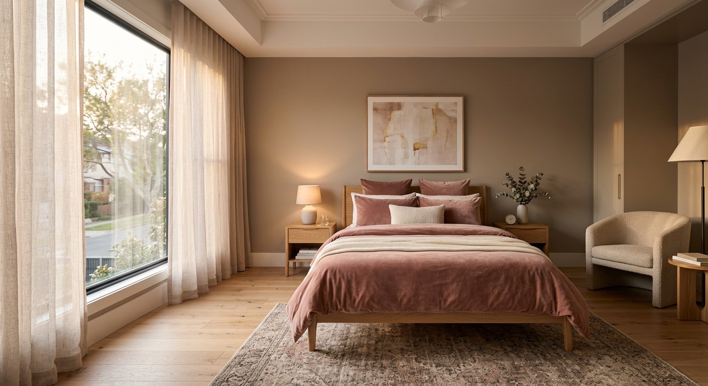
Skip the bright bubblegum stuff. It looks like a cheap toy store. I’m obsessed with muted, dusty tones that act as a refined backdrop for your furniture. Last Tuesday at Whole Foods, I saw a bouquet of pale blush roses that perfectly matched Benjamin Moore First Light (2102-70). It costs about $64.99 a gallon. It has a Light Reflectance Value of 75.86, meaning it bounces warm light everywhere and brightens up dark corners. Another favorite is Farrow & Ball Pink Ground (No. 202) for roughly $130 a gallon. It has this sneaky yellow pigment that makes it feel warm instead of sugary sweet. I tried a cheap, bright pink from a discount hardware store once and it made my skin look green in the mirror. Don’t do that. You won’t regret sticking to these dusty, high-quality shades. They make the room feel expensive.
2. Layer Textures So Your Space Isn’t Flat

A flat pink room is boring. I learned this the hard way when I bought matching pink cotton sheets, curtains, and a rug for a client. It was a disaster. You need tactile richness to break up the space. I’m currently styling a client’s space with the West Elm Washed Soft Cotton Luster Velvet Duvet Cover in Blush Pink. It costs $210 for a queen size and feels like a cloud. Throw a chunky knit blanket over the foot of the bed to add contrast. I found a heavy, 50-inch by 60-inch cream knit throw at Target for $35 last month. The contrast between the shiny velvet and the rough, heavy knit breaks up the color beautifully. It’s the only way to make a monochromatic room work.
3. Mix In Heavy Brass And Gold Hardware

Silver hardware in a pink room makes it look icy and cheap. I won’t sugarcoat it. If you want a luxurious 2026 vibe, you need warm metals. I’m swapping out standard silver drawer pulls for knurled brass knobs from Rejuvenation that cost $18 each. It shifts the room to regal heights. Even a cheap Target Project 62 brass bedside lamp for $40 makes a huge difference on a nightstand. The gold tones pull out the warmth in blush pinks. I made the mistake of leaving my apartment’s standard brushed nickel doorknobs in my pink guest room for months before figuring it out. The room felt cold. Once I swapped them for antique brass, the whole space finally made sense.

COOVA Faux Fur Throw Blanket for Couch
Honestly, COOVA Faux Fur Throw Blanket for Couch surprised me — sturdier than it looks in the photos, and over 12 buyers gave it 4.5 stars.
4. Anchor The Space With Crisp Neutrals

There is a real danger of using way too much color. I’ve walked into client homes where the room feels like a cupcake exploded. It’s suffocating. You have to balance it out. If you’re doing pink walls, you need crisp white or light gray to give your eyes a break. I swear by the Walmart Mainstays 400-thread-count white sheet set for $15.98. Yes, Walmart. They are soft and provide that stark, clean contrast you need against a blush duvet. A light gray upholstered headboard also works wonders to break up the wall color. Just don’t buy beige sheets. Pink and beige together often look muddy and unwashed. Stick to crisp, clean whites to keep the room feeling fresh.
5. Ground The Room With Natural Rattan

Pink can get too sweet too fast. To bring out a masculine-neutral balance, you need natural textures. I’m talking woven baskets, washed wood, or rattan. I snagged the IKEA DELAKTIG rattan headboard for $150 and it grounded my overly sweet blush walls. Last weekend, I was grabbing groceries at Sprouts and found these gorgeous, rough woven water hyacinth baskets for $14.99 each. I bought three for my bedroom closet storage. The rough, brown texture against a soft pink wall stops the room from looking like a nursery. Wood tones are your best friend here. Skip the glossy white painted furniture. It just makes the pink look plasticky and cheap. Natural wood brings out the sophisticated side of pink.
6. Fix Your Tragic Lighting Situation

Poor lighting will sabotage your pink color scheme. I’m dead serious. Cool LED lighting turns a beautiful blush into a harsh, sterile morgue color. I tried this wrong for months before figuring it out in my own apartment. You need warm or neutral bulbs. I buy the GE Reveal warm white bulbs in a 4-pack for $12.49 at Target. They emit a soft, 2700K color temperature that makes pink walls glow. Layer your lighting, too. Relying strictly on a ceiling fixture casts terrible shadows across your bed. You need a bedside lamp, maybe a floor lamp, and diffused overheads. It makes the space feel cozy at night instead of feeling like a doctor’s waiting room. You might also like: 20 Cozy Cozy Minimalist Bedroom for Every Budget

AMADA HOMEFURNISHING Floating Shelves
Honestly, AMADA HOMEFURNISHING Floating Shelves surprised me — sturdier than it looks in the photos, and over 114 buyers gave it 4.5 stars.
7. Pick Your Pink Bedding Carefully

Going full pink on your bed is a rookie mistake. A solid pink bed looks like a giant piece of bubblegum sitting on your floor. If you want a significant pink presence, buy the West Elm Silky TENCEL Plush Comforter and Shams. The price ranges from $31.20 for shams to $279 for a king comforter. But here is the trick. Break it up. Fold a heavy white quilt at the foot of the bed. Use crisp white sleeping pillows. I once bought a 7-piece pink-on-pink bedding set from a discount store and it was visually exhausting. Now, I always mix a patterned white and pink sheet set with a solid duvet. It’s much easier on the eyes. You might also like: 20 Simple Bedroom Wall Design Ideas That Actually Work
8. Invest In One Statement Velvet Chair

You don’t need to paint the walls to get a pink bedroom. Sometimes, a single piece of furniture is enough. I’m obsessed with the Anthropologie Thora Velvet Lounge Chair in pink. It’s an investment at $998, but the exact measurements (28.75 inches high, 39.25 inches wide, 35 inches deep) make it the perfect oversized corner chair for reading. The velvet texture catches the light beautifully. If that’s too big, their Velvet Elowen Chair (34.25 inches high, 24 inches wide, 24.25 inches deep) is slightly smaller and just as stunning. I used to buy cheap, stiff accent chairs that nobody actually sat in. Total waste of money. Buy one comfortable, luxurious pink chair and let it be the star. You might also like: 20 Creative Cozy Small Bedroom for Any Style
9. Stop Over-Accessorizing With Tiny Pink Junk

I have a strict rule about accessories. If you have pink walls or pink bedding, don’t fill your nightstand with pink vases, picture frames, and candles. I did this in my early twenties and it felt cluttered and overwhelming. It’s too much. I was at HomeGoods recently and saw a gorgeous $14.99 pink glass vase, but I forced myself to put it back. When everything is pink, nothing stands out. Choose one or two impactful pieces instead. A single, large piece of art or one beautiful throw blanket is enough. Let your neutral accessories, like a heavy black metal clock or a clear glass lamp, do the heavy lifting to balance the room.

KSIPZE 100ft Led Strip Lights RGB Music Sync Color Changing
KSIPZE 100ft Led Strip Lights RGB Music Sync Color Changing Led Lights punches above its price — 376 buyers rated it 4.5 stars. I would buy it again.
10. Play With Subtle Geometric Patterns
Solid pink everywhere is boring. You need patterns to add visual interest without drowning the room in color. I’m a fan of muted blush geometric wallpaper on a single accent wall behind the bed. Spoonflower makes an amazing peel-and-stick wallpaper for $34 a roll (2 feet by 12 feet). I applied it myself last year and it took three hours. The subtle white lines running through the blush background break up the monotony perfectly. You can also do this with striped cushions or a patterned rug. Just make sure the pattern has a lot of white or cream in it so it doesn’t fight with the rest of the room. It keeps the eye moving.
11. Treat Pink As Your New Neutral Background
In 2026, pink isn’t just an accent color. It’s acting like beige or gray. Light, rosy hues layer beautifully with dark wood tones, heavy metals, and rough textiles. It adds warmth without being overtly feminine. I love Sherwin-Williams Romance (SW 6323). It costs about $65 a gallon and has these incredible mauve and beige undertones. When I painted my guest room this color, people thought it was a warm cream until the afternoon sun hit it. It’s the perfect relaxing atmosphere. Stop treating pink like a novelty color and start using it as a versatile base for your entire house. You’ll be shocked at how well it pairs with olive greens and navy blues.
12. Bring In Heavy Greenery And Plants
Pink and green are complementary colors, which means they make each other pop. Plants provide a fresh, organic contrast to a pink room. I was grocery shopping at Sprouts last week and impulse-bought an Anthurium Laceleaf for $12.99 because it had these weird, waxy pink flowers. It looks incredible sitting on my oak dresser against a blush wall. If you kill every plant you touch, just fake it. I bought a 4-foot artificial olive tree from Costco for $49.99 and shoved it in a woven basket. The dark green leaves cut through the sweetness of the pink room instantly. You need greenery to make the space feel alive and grounded. Don’t skip the plants.

Tenmiro Led Lights for Bedroom 100ft (2 Rolls of 50ft)
A dependable everyday pick — Tenmiro Led Lights for Bedroom 100ft (2 Rolls of 50ft) Music Sync Colo pulls in 35 ratings at 4.5 stars. Not flashy, just solid.
13. Test Your Paint Undertones First
Interior designer Lisa Bradburn always stresses this, and I’ve learned it the hard way. Pinks have peach, grey, or lavender undertones. If you paint a north-facing room with a cool-toned pink, it will look purple. I ruined a client’s room this way in 2018. We had to repaint the entire thing the next day. Now, I always use Samplize peel-and-stick paint samples. They cost $5.95 each and you can move them around the room to see how the lighting hits them at 8 AM versus 8 PM. Never buy a gallon of pink paint without testing a large swatch on your actual wall first. It’s the biggest mistake you can make with this color.
14. Add Wavy Furniture For A Modern Vibe
Straight lines are out right now. A trend for 2026 is wavy or scalloped furniture. It adds this playful, dynamic movement to a room. I just bought a scalloped wood side table from Urban Outfitters for $129 and it changed the energy next to my bed. It breaks up the rigid, boxy feel of standard bedroom furniture. You can also look for scalloped headboards or wavy mirrors. Just don’t overdo it. One wavy piece is chic. Five wavy pieces make your room look like a funhouse mirror maze. Pair a scalloped pink nightstand with a traditional, straight-lined bed frame for the perfect balance. It keeps the room looking curated and fresh.
15. Start Small With Budget-Friendly Accents
You don’t need a massive budget to get this look. Start small. I love dipping my toe into a trend before committing. I grabbed the IKEA FLODSVALA Lantern in pale pink for $9.99. I put a battery-operated tea light in it and it casts the softest, warmest glow on my nightstand. IKEA has a range of pink decor under $50, from velvet cushion covers to cardboard storage boxes. I bought three of their $4.99 pink DRÖNA boxes for my closet shelves. It’s a zero-risk way to see if you like living with the color before you drop hundreds of dollars on a custom headboard. Test the waters with cheap accessories first.

HOMIDEC Closet Organizers and Storage
HOMIDEC Closet Organizers and Storage punches above its price — 8 buyers rated it 4.5 stars. I would buy it again.
16. Frame Your Windows With Heavy Velvet
Cheap, sheer pink curtains look like a teenager’s bedroom. I won’t apologize for saying it. If you’re going to do pink curtains, they need to be heavy and luxurious. I’m obsessed with the Target Threshold velvet curtains. They run about $35 per 84-inch panel. The heavy velvet material blocks out the light and adds a dose of texture to the walls. I hung a pair of dusty rose velvet panels in my bedroom, making sure to mount the rod six inches above the window frame to make the ceilings look taller. The weight of the fabric makes the pink look intentional and expensive, rather than flimsy and cheap. Don’t skimp on your window treatments.
17. Anchor The Floor With A Muted Rug
A massive expanse of empty floor makes a room feel cold. I always anchor a bed with a large area rug. The Ruggable Kamran Rose Quartz rug is my current obsession. A 5×7 foot size costs $219, and the best part is you can shove it in your washing machine. I spilled an entire mug of black coffee on mine last month and it washed out perfectly. The distressed, vintage pattern mixes soft pinks with deep reds and creams. It hides dirt well and brings a sophisticated, antique vibe to a modern pink bedroom. Make sure the rug extends at least two feet on either side of your bed so your feet hit it first thing.
18. Curate Your Pink Wall Art Carefully
Don’t buy generic pink canvas art from a big box store. It looks mass-produced and cheap. I prefer finding unique, downloadable prints on Etsy for around $6.50 each. I’ll buy a digital file of a vintage pink botanical sketch or an abstract watercolor. Then, I take the file to Costco and have it printed on high-quality matte photo paper for $1.99. I pop it into a thin gold frame from Walmart. It looks like custom, expensive art for under $20. I made the mistake of hanging a massive, bright pink abstract canvas above my bed once, and it overpowered the room. Keep your art subtle and let the walls shine on their own.
19. Buy Fresh Pink Florals Weekly

Nothing beats the smell and look of fresh flowers. It’s the ultimate luxury for a bedroom. I make it a habit to swing by Trader Joe’s every Sunday morning. They almost always have bunches of pink peonies or ranunculus for $9.99. I trim the stems short and stuff them into a heavy glass water pitcher on my dresser. The organic, natural pink of a real flower is impossible to replicate with paint or fabric. It brings a different energy to the room. Plus, they smell amazing. I used to buy fake flowers, but they just collect dust and look sad after a few months. Spend the ten bucks on fresh ones. You won’t regret it.
20. Layer Different Shades Of Pink Pillows

Matching your throw pillows exactly to your duvet is a design mistake. It looks like a cheap bed-in-a-bag set. You need contrast to make the bed look inviting. If your duvet is a pale blush, throw a deep magenta or dusty rose pillow in front. I was wandering through the home section at Kroger last week and found a stunning, deep mauve pink velvet lumbar pillow for $14.99. I tossed it onto my pale pink West Elm bedding and the contrast was exactly what the bed needed. Mix a 20×20 inch square pillow with a smaller lumbar pillow in a slightly darker or lighter shade of pink. It makes the bed look professionally styled and cozy.
I hope these tips help you build the pink sanctuary of your dreams. I’ve spent years figuring out what works and what doesn’t, so you don’t have to make the same expensive mistakes I did. If you’re ready to start decorating, I’d recommend starting with a fresh coat of Benjamin Moore First Light. It’s the easiest way to see immediate results. Don’t forget to pin this article to your favorite home decor Pinterest board so you can reference these brand names and paint colors later. Happy decorating!