Last November, I stared at a blank, cold white wall in my master bedroom and felt like crying. My previous attempt at a bedroom wall design was a total disaster. I’d just spent $45.00 on three tiny, pathetic canvas prints from Target that looked like postage stamps floating in a sea of drywall. It was embarrassing. I’m a stylist, and my own sleep space looked like a cheap motel room. I realized I needed a massive overhaul. You don’t have to live with boring drywall or weirdly spaced art. I’ve spent the last six months testing paints, panels, and lighting to figure out what works and what looks terrible. I’m sharing the exact formulas, measurements, and products you need to fix your space. Let’s fix those walls.
1. Paint Your Bedroom Wall Design With Sherwin-Williams Universal Khaki

If you’re tired of stark white walls, you need to look at earthy neutrals. I’m obsessed with Sherwin-Williams’ 2026 Color of the Year, Universal Khaki (SW 6150). It costs about $72.49 a gallon, and it’s worth every penny. This is a warm, mid-tone tan that changes the feeling of a room. I’ve bought cheap paint before and regretted it immediately because the coverage is always terrible. Last Tuesday, I picked up a heavy-duty canvas drop cloth at Walmart for $14.88 and spent the afternoon rolling this color onto my walls. The caramel-butter smell of fresh paint always makes me feel productive. The creamy texture of this specific paint goes on smooth. Universal Khaki pairs beautifully with natural materials like raw wood and stone. It creates an inviting, grounding foundation that won’t clash with your existing furniture.
2. Create Drama With Benjamin Moore’s Silhouette

If you prefer a deeper, more refined neutral, you have to try Benjamin Moore’s 2026 Color of the Year, Silhouette AF-655. It runs about $68.99 a gallon. This color is an elegant burnt umber with delicate charcoal undertones. Last year, I made a huge mistake. I tried painting my tiny guest room a stark, flat black. I thought it’d look moody and chic. Instead, it looked like a literal cave. I hated it. Silhouette is different. It’s rich and commanding, but it still feels like a warm hug. I used a Purdy 2.5-inch angled brush ($12.50) to carefully cut in the edges around the trim. You can use it for a massive focal wall behind your bed, or even paint your trim and millwork with it to create a stunning contrast against lighter walls. It’s sophisticated.
3. Try Color Drenching For A Moody Retreat

Color drenching is a trend right now, and I’m totally here for it. This means you paint your walls, your baseboards, your window trim, and your ceiling the exact same rich hue. I highly recommend Benjamin Moore’s Narragansett Green HC-157 ($68.99 a gallon) for a dramatic, blackened teal effect. I bought a 3-pack of green FrogTape at Costco for $12.99 to protect my hardwood floors before starting. Skip the cheap masking tape. It bleeds every single time, and scraping dried paint off baseboards is miserable. I learned that the hard way. I have a strong opinion about this trend: don’t skip the ceiling. I know painting a ceiling is a pain in the neck, but if you leave it white, the room looks disjointed. Wrapping the entire room in one deep blue-gray or smoky olive green creates a cohesive, atmospheric retreat.

Qukaka Floating Shelves for Wall Decor
A dependable everyday pick — Qukaka Floating Shelves for Wall Decor pulls in 169 ratings at 4.5 stars. Not flashy, just solid.
4. Install Acoustic Wood Slat Paneling

If you want a hotel-like accent wall, acoustic wood slat paneling is the way to go. I personally swear by the panels from Naturewall, which run about $149.99 per 94-inch panel. I live in an older building, and I can hear my neighbors watching TV at night. It’s annoying. These panels aren’t just pretty; they have a thick, dense felt backing that actually absorbs sound. The real wood veneer feels rough and natural under your fingers, adding amazing texture to the room. Installation is easy if you have a level and some construction adhesive. I glued three panels directly behind my bed, and it softened the acoustics in my bedroom. The room feels quieter, cozier, and significantly more expensive. It’s a brilliant way to add architectural interest without doing major construction.
5. Master The Proportions Of Your Gallery Wall

Most people get gallery walls wrong. I used to eyeball my frame placement, and I always ended up with a crooked, weirdly spaced mess that drove me crazy. There is an exact mathematical formula for this. When creating a gallery wall above your bed, it needs to span exactly two-thirds to three-quarters the width of the furniture below it. For instance, if you have an 84-inch wide king bed, aim for a gallery width of 56 to 63 inches. Hang the bottom edge of your lowest frames exactly 6 to 10 inches above the headboard. Maintain a strict 2 to 3 inches of space between every single frame. I bought six simple black wooden frames from Target for $15.00 each to create mine. Use a measuring tape and cut out kraft paper templates first. It saves you from putting twenty unnecessary holes in your drywall. You might also like: 20 Clever Bedroom Ideas for Men That Make a Real Difference
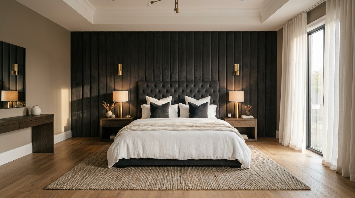
6. Anchor The Room With An Oversized Upholstered Headboard

Tall, enveloping upholstered headboards are crucial for creating a cocoon bedroom feel. They add visual interest and help with sound-dampening. You don’t have to spend a fortune here. I’ve seen bespoke custom headboards go for over $3,000, but I’m not spending that. I found a gorgeous, budget-friendly JONPONY velvet headboard on Walmart for just $65.99. The velvet material is soft to the touch. I do have one honest negative to share about cheap upholstered furniture, though. It often has a weird, chemical factory smell right out of the box. I had to leave my bedroom windows wide open for 48 hours to let the fabric air out. Once the smell faded, it changed the room. A massive padded headboard makes a large, blank wall feel styled. You might also like: 15 Lovely Cool Bedroom Ideas Worth Trying This Year

AMADA HOMEFURNISHING Floating Shelves
AMADA HOMEFURNISHING Floating Shelves punches above its price — 114 buyers rated it 4.5 stars. I would buy it again.
7. Layer Smart Wall Sconces For Reading

You need to get your bedside lamps off your nightstands and onto the walls. I’m clumsy. Last month, I knocked a full glass of ice water off my crowded nightstand at 3 AM. It ruined a stack of expensive hardcover books and soaked my rug. I switched to the Philips Hue Ascend wall sconces ($99.99 each), and it solved the problem. These smart lights feature an adjustable neck and a frosted glass shade that focuses the light perfectly for reading. Swing-arm wall lamps are practical because they free up your table space for your phone, water, and current book. Plus, with the Philips Hue app, I can dim the lights to a warm, amber glow without getting out of bed. It adds a beautiful layer of ambient lighting to the wall design. You might also like: 15 Brilliant Small Bedroom Inspiration That Changed Everything
8. Warm Up The Space With Wide Tongue and Groove Paneling

Skinny vertical shiplap is overdone. If you want to add texture to your walls, you need to opt for wide tongue and groove paneling. It’s a rising trend that offers a modern take on classic design. Wide panels add depth and make a space feel established and lived-in. I picked up an easy-to-install kit of Panels by Sofia at B&Q (you can find similar 5-inch wide pine kits at Home Depot for about $34.50 a bundle). I glued mine up horizontally using heavy-duty Liquid Nails ($4.98 a tube). The smell of cut pine boards filled my bedroom for days, and it smelled amazing. The wider planks look much more high-end than the thin, farmhouse-style strips. Paint them a moody color, and you’ve got a stunning, textured focal wall.
9. Prop An Oversized Mirror On A Console

Here’s a trick to make a small bedroom feel larger and brighter: prop an oversized mirror against the wall instead of hanging it. I bought a gorgeous 36-inch wide brass Threshold mirror from Target for $70.00. I rested it on a low-profile console table across from my window. It reflects natural light back into the room and adds visual depth. I have a strong opinion about hanging heavy mirrors. Don’t use cheap plastic drywall anchors. I did that once in my old apartment. The mirror crashed down at 2 AM, shattered everywhere, and took a chunk of drywall with it. It was terrifying. Propping a large mirror is safer, requires zero tools, and is a top compact design trend for making tight spaces feel expansive.

Amaoot Floating Shelves Set of 3, Home Wood Wall Shelf
A dependable everyday pick — Amaoot Floating Shelves Set of 3 pulls in 893 ratings at 4.5 stars. Not flashy, just solid.
10. Avoid The Too Small Art Mistake
This is the most common bedroom wall design mistake I see. People choose artwork that is way too small for the wall, and it looks lost. I used to buy tiny 8×10 prints and stick them right in the middle of a massive blank wall. It looked ridiculous, like a tiny postage stamp on a giant billboard. Your art needs to occupy about two-thirds of the available wall space to look aesthetically pleasing. If you have a large empty wall, you need a large piece of art. I recently found a massive 40×60 inch canvas at HomeGoods for $129.99. The thick, textured oil paint on the canvas draws the eye immediately. It fills the space perfectly without overwhelming the room. Stop buying tiny art for big walls. It won’t work.
11. Wrap The Room In Fabric Wall Treatments
Beyond upholstered headboards, you can actually wrap entire expanses of your walls in fabric. This is an old-school luxury trick that’s coming back. You can use silk, mohair, or washed linen to create soft, padded surfaces from floor to ceiling. I bought 5 yards of heavy, dusty rose washed linen at JoAnn Fabrics for $14.99 a yard. I used a heavy-duty staple gun to attach quilt batting to the wall first, then stretched the linen tightly over it. Running your hands over a soft, padded wall is a wild sensory experience. It adds tactility to the room. More importantly, it significantly softens the acoustics. It absorbs echoes and makes the bedroom feel like a dead-quiet, intimate sanctuary. It takes some patience to install, but the payoff is huge.
12. Add A Halo Effect With Hidden LED Strips
If you want to add architectural interest without spending a lot of money, install LED strip lighting behind your headboard or wall panels. I bought a roll of Govee LED strip lights for $19.99 on Amazon (they also sell them at Walmart). They have a sticky adhesive backing. You just peel it off and press the strip along the back edge of your furniture. It creates a mesmerizing halo effect, giving the illusion that your bed is hovering off the floor. I have a strict rule about LED lights, though. Don’t use the harsh blue, bright red, or neon green color settings. It makes your bedroom look like a cheap nightclub. Stick exclusively to the warm white 2700K setting. It provides a soft, indirect glow that is perfect for winding down at night.

upsimples Floating Shelves for Wall
upsimples Floating Shelves for Wall has been one of the most consistently praised picks in this category. 4 reviewers averaged 4.5/5.
13. Introduce 3D Wall Sculptures For Texture
Flat artwork can get boring if that’s all you have in a room. For a unique approach, you need to introduce three-dimensional wall sculptures. I found an incredible, abstract metal floral sculpture at West Elm for $149.00. Pieces made of metal, papier-mâché, or blown glass add a layer of texture that flat canvas simply can’t provide. Because the sculpture physically protrudes from the wall, it catches the light differently throughout the day. I love sitting in my bedroom at 4 PM and watching the long, stretched-out shadows the metal petals cast against the painted drywall. It serves as a focal point without being visually distracting. If you’re struggling to make a modern bedroom feel cozy, a textured 3D piece is exactly what you need.
14. Hang A Vintage Area Rug As Art
If you want serious warmth and texture, you should hang an area rug on your wall. It’s a modern twist on traditional wall hangings. I found a gorgeous 4×6 printed rug at Kroger, of all places, in their home goods aisle for $49.99. It features deep rust and navy tones that match my bedding. Hanging a rug isn’t as simple as tapping a nail into the wall, though. Rugs are heavy. I bought a wooden carpet tack strip for $3.50 at the hardware store, screwed the strip into the wall studs, and pressed the top edge of the rug onto the tacks. The thick pile of the rug adds warmth to the cold drywall. It’s a striking focal point, especially when hung directly behind a low-profile bed frame.
15. Stick To Matte Or Eggshell Paint Finishes

The finish of your paint matters just as much as the color. Expert opinion suggests using only matte or eggshell finishes for bedroom walls. I always use Behr Premium Plus eggshell enamel, which costs about $34.98 a gallon. I made a huge mistake a few years ago in my old house. I painted my bedroom walls with a semi-gloss finish because the guy at the hardware store said it’d be easier to clean. It was a disaster. The glossy finish reflected every single bump, dent, and bad tape job on the drywall. It looked like the walls were wrapped in a shiny plastic bag. Hideous. Eggshell and matte finishes absorb the light beautifully. They hide drywall imperfections and create a soft, relaxing look that is ideal for a tranquil sleeping environment.

QEEIG Floating Shelves for Wall Bathroom Shelf Bedroom
QEEIG Floating Shelves for Wall Bathroom Shelf Bedroom Kitchen Living punches above its price — 45 buyers rated it 4.5 stars. I would buy it again.
16. Install Floating Shelves With Trailing Plants

If your walls still feel a little lifeless, you need to bring nature indoors. I installed two 24-inch wooden floating shelves from Target ($25.00 each) in the empty corner of my room. To style them, I bought a lush, green Pothos plant from Sprouts for $9.99. The green leaves trailing down the wall break up the hard, straight lines of the furniture and frames. I give the plant exactly 1/2 cup of water every Sunday morning, and it thrives. Next to the plant, I keep a lavender soy candle I picked up at Whole Foods for $14.99. Lighting the candle and watching the plant leaves drape down the wall adds so much life to the space. It’s a cheap, easy way to fill an awkward gap in your bedroom wall design.
Honestly, fixing your walls changes the entire energy of your room. You don’t have to tackle all 16 of these ideas at once. Pick one weekend project, grab some paint or a new headboard, and start there. I recommend pinning this list so you can reference the exact measurements and paint colors when you’re standing in the hardware store aisle trying to remember what to buy.