Three years ago, I stared at a sad, tiny 8×10 inch picture I bought for $9.99. I hung it dead center over my king-sized bed, and it looked like a literal postage stamp. Getting bedroom wall art right is hard if you don’t know the rules. I messed this up for months. My walls looked either bare or cluttered like a dorm room. Forget the generic advice online. You need actual measurements and specific rules to make your space look good. I’ll walk you through how I fix these mistakes in my own house and for clients. Let’s look at the math and products that work.
1. The Two-Thirds Rule for Bedroom Wall Art

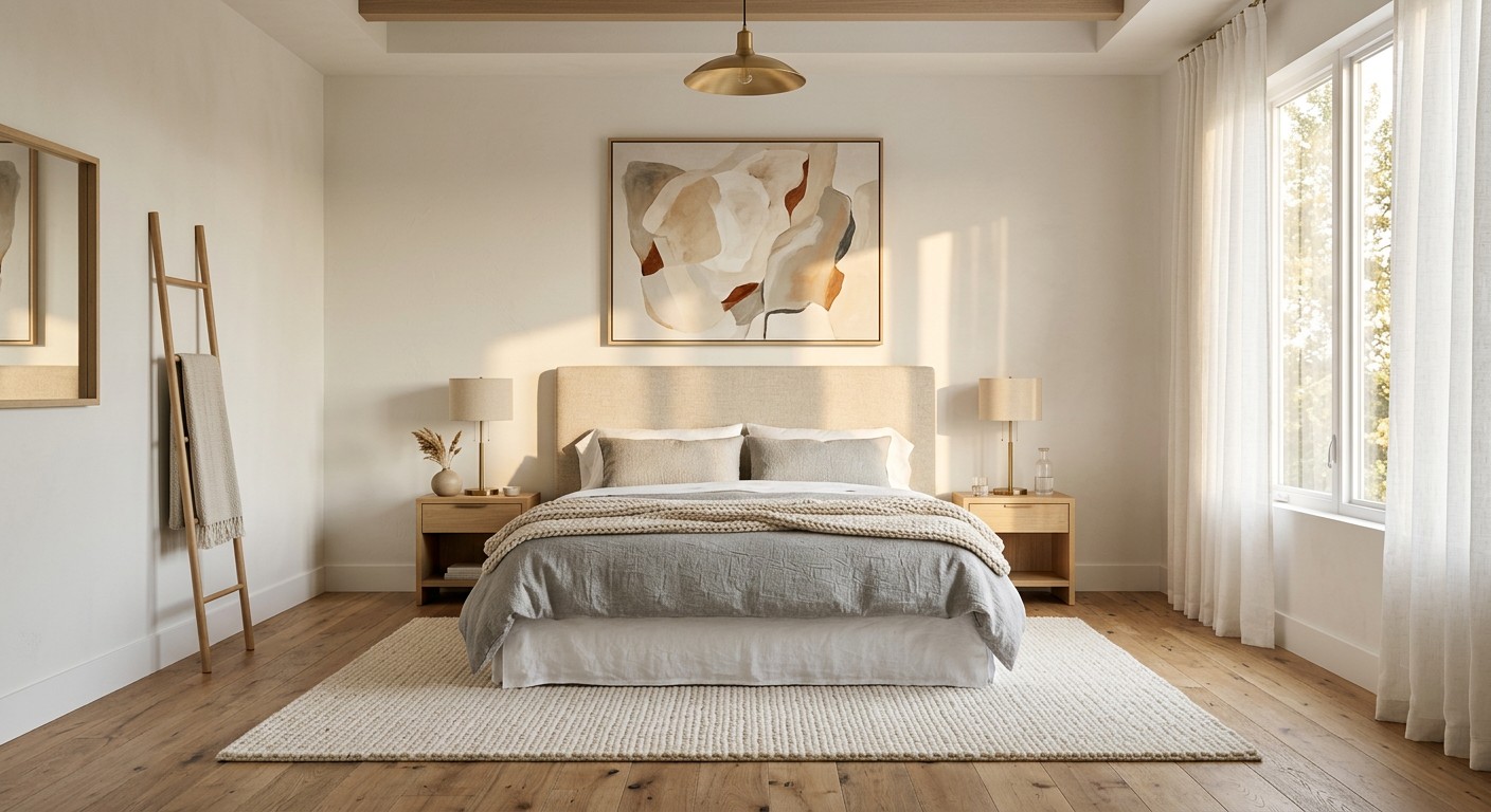
Hanging a tiny picture over a big bed is a common mistake. For that tricky space above your headboard, follow the two-thirds rule. Your art should be 60 to 75 percent of the bed’s width. If you have a 60-inch wide queen bed, your art needs to span 36 to 45 inches. I swear by this. Last Tuesday at Target, I saw someone buying a tiny 11×14 inch frame for a master bedroom. I almost stopped her. It’ll just look lost. Buy a large canvas or group three 16×20 inch frames together. I use the Project 62 black gallery frames from Target. They’re $15.00 each and look expensive when lined up. It anchors the space.
2. Hang at Eye Level (The 57-60 Inch Guideline)

Most people hang art too high. It makes the room feel disconnected. The center of your artwork should sit 57 to 60 inches from the floor. That’s average eye level. I used to eyeball this and failed. My husband would ask why the art was touching the ceiling. Now, I grab my $3.98 Mainstays tape measure from Walmart and mark 58 inches on the wall. That mark is where the center of your art goes. If you’re hanging a gallery wall, the center of the grouping should hit that mark. It makes viewing comfortable. No neck strain.
3. Mind the Gap: 6-10 Inches Above Furniture

When placing art above a dresser or headboard, you need a specific gap. Leave 6 to 10 inches between the furniture and the frame. Too much space and it floats away. Too close and it feels cramped. I learned this with a heavy oak dresser. I hung a $45.00 West Elm floating frame 15 inches above it. It looked disjointed. I lowered it to an 8-inch gap, and the dresser and frame looked like one unit. Designers use this trick constantly. It connects the art to the furniture.

Qukaka Floating Shelves for Wall Decor
If you want something that just works, Qukaka Floating Shelves for Wall Decor is a safe bet (169 reviews, 4.5 stars).
4. Embrace Oversized Statement Pieces

Tiny art is out. Oversized pieces are a huge trend for 2026. A big piece creates a focal point without adding clutter. I’m obsessed. A few weeks ago, I ordered a 40×60 inch canvas from BIG Wall Décor. Their canvases start around $32.99 to $44.00, which is cheap for the size. The fabric print stretched over the frame took up the entire wall opposite my bed. It changed the room’s vibe. You don’t need a dozen small frames. One giant piece makes a bold statement. Just measure your wall first. A piece this big needs breathing room.
5. Cultivate Calm with Warm Neutrals

Your bedroom should be for sleeping, not a neon nightclub. 2026 trends favor warm neutral palettes. Think beige, taupe, soft greys, and muted greens. I pair these with abstract nature prints. Greens, blues, and yellows calm the brain. I bought three abstract botanical prints from Minted for $48.00 each. They feature soft sage green and warm terracotta. I hung them above my reading chair. The colors make my shoulders drop. Skip the stark black and white photography. It’s too harsh. Stick to muddy, muted tones that feel like a hug.
6. Incorporate Tactile Woven Art for Depth

Flat posters get boring. Add physical texture. I love woven wall hangings, thick macrame, or raised plaster. These add warmth that glass frames can’t provide. I found a chunky cream macrame hanging from Mkono on Amazon for $18.99. I hung it near my closet, and the thick cotton ropes add cozy depth. You can also find woven pieces from brands like Tapestry Girls. Their woven fabric art ranges from $20.00 to $100.00. Adding something you can touch makes the room feel layered. I’d never go back to flat paper. You might also like: 20 Clever Bedroom Ideas for Men That Make a Real Difference

AMADA HOMEFURNISHING Floating Shelves
Honestly, AMADA HOMEFURNISHING Floating Shelves surprised me — sturdier than it looks in the photos, and over 114 buyers gave it 4.5 stars.
7. Master Gallery Wall Intentional Spacing

A gallery wall can look like a nightmare without the right spacing. Keep a consistent 2 to 3 inches between every frame. This gives each piece room to breathe. It changed how I hang art. I used to hammer nails randomly. It was a disaster. Now, I lay everything out on the floor first. Then I buy a 3-pack of Scotch Blue Painter’s Tape at Costco for $12.49. I use the tape to map out the sizes on my wall. I measure the 2-inch gaps before touching a hammer. It takes twenty minutes, but your wall won’t look chaotic. You might also like: 20 Creative Bedroom Wall Design You’ll Want to Bookmark
8. Integrate Hidden Acoustic Sound Panels

This is my secret for a peaceful bedroom. If you live on a busy street, you need acoustic art panels. They look like regular canvas but absorb sound. They reduce echo. Companies like GIK Acoustics and Acoustimac sell custom-printed panels with a high Noise Reduction Coefficient rating of 1.0. You can upload your own photos. Prices start at $39.99 and go up to $224.99. I installed two 24×48 inch panels from GIK Acoustics on my apartment wall. The street noise dropped. It’s functional decor. You get art and better sleep. You might also like: 20 Fresh Bedroom Ideas to Transform Your Space
9. Stop Matching Your Colors Perfectly

I see this mistake constantly. People buy a navy blue comforter and try to find art with the exact same shade of navy. It’s called matchy-matchy syndrome, and it looks cheap. You want cohesion, not duplication. Your art should introduce contrast. If you have a blue bed, bring in art with mustard yellows or burnt orange. Last month, I bought a reusable canvas tote at Whole Foods for $2.99. It had an abstract print in peach and olive green. I cut the bag apart and framed it. The colors clashed slightly with my grey sheets, but in an intentional way. Your art should reflect your personality.

Fixwal Black Floating Shelves for Wall
Fixwal Black Floating Shelves for Wall punches above its price — 42 buyers rated it 4.5 stars. I would buy it again.
10. Sticky Frames for Commitment Phobes
If you rent or hate holes in the drywall, this is for you. Use adhesive, repositionable frames. Brands like Mixtiles are brilliant. They cost $15.00 each and have a sticky strip on the back. Press them into the wall. If you mess up, you just pull them off and stick them somewhere else. They don’t leave residue or rip the paint. I used these in my guest room because I change my mind about decor every three months. It makes planning a gallery wall stress-free. You won’t lose your security deposit.
11. Soft Modern Cozy Minimalism
Minimalism used to mean stark white walls and one black line drawing. That look is dead. The 2026 trend is soft modern, or cozy minimalism. Keep it simple, but use warmer layers. Look for abstract prints with organic shapes and textures. I bought a terracotta clay wall disc from Crate & Barrel for $29.95. It has raw, unglazed texture that looks ancient. I hung it alone on a bare wall. The earthy tone makes the room feel inviting without clutter. Skip the harsh geometric black frames. Soften your space with curves and muted tones.
12. Secure Hanging Hardware is Non-Negotiable
Please stop hanging heavy glass frames on a flimsy thumbtack. I did this once with a vintage mirror. I woke up at 3 AM to the sound of it crashing onto my nightstand. It missed my head by inches. Secure hanging is crucial. Use appropriate mounting hardware. If you have drywall, use anchors. I buy OOK picture hanging kits from Home Depot for $4.98. They come with heavy-duty hooks. Always use more than one hook for large items. Two hooks keep the art from swinging every time you close the door. Don’t risk a concussion.

WOPITUES Wood Floating Shelves Set of 6
WOPITUES Wood Floating Shelves Set of 6 has been one of the most consistently praised picks in this category. 66 reviewers averaged 4.5/5.
13. Personalize with Custom Photo Galleries
Stock art of Paris or generic quotes are out. Personalized galleries are a trend for 2026. People want walls that tell a story. Display custom canvas prints of your memories. Don’t print blurry iPhone selfies. Mix your high-resolution travel photos with curated art prints. I use Society6. I buy their art prints for $35.00 each and mix them with my own black and white photos from CVS. It creates a unique narrative. It looks curated, not like you bought a set from a big box store.
14. The Headboard Horizon Rule for Bedroom Wall Art
There is an imaginary line above your bed called the headboard horizon. Designers use this constantly. Art hung above your bed should stay within this zone. It’s a band from the top of your headboard up to 12 inches above it. If you hang art higher, it creates visual tension. It makes the ceiling feel lower and disrupts the comfort of the room. I tested this with a heavy wood frame from Pottery Barn that cost $59.00. I hung it 18 inches above the headboard. It looked awful. I lowered it to an 8-inch gap. The room instantly felt grounded.
15. Floating Shelves as Bedroom Wall Art Displays
If you’re tired of traditional frames, try a floating shelf as a display ledge. It gives you flexibility. You can lean art, stack books, and add plants without a hammer. I bought the white Lack floating shelf from Ikea for $24.99. I mounted it securely using anchors. Now I just lean frames against the wall. I swap them out every season. Right now, I have a charcoal sketch next to a trailing pothos plant. It adds a 3D element. Just make sure the shelf isn’t right above your pillows.

Amaoot Floating Shelves Set of 3, Home Wood Wall Shelf
If you want something that just works, Amaoot Floating Shelves Set of 3 is a safe bet (893 reviews, 4.5 stars).
16. Vintage Mirrors to Bounce Morning Light
Mirrors count as wall art, especially in a dark bedroom. A framed mirror acts like a window, bouncing light around. I found an ornate brass mirror at a thrift store for $45.00. I hung it opposite my window. To make it feel less like a bathroom mirror, I draped dried eucalyptus over the corner. I buy bunches from Trader Joe’s for $3.99. The smell is amazing, and it adds a pop of muted green. It makes the mirror look like a deliberate piece of art instead of just a functional object.
17. Woven Baskets for Organic Bedroom Wall Art
You don’t have to stick to framed canvases. Woven shallow baskets make incredible art. They are lightweight, cheap, and bring texture into the room. I went to World Market and bought three shallow seagrass baskets for $12.99 each. They have beautiful black and natural patterns. I hung them in a cluster above my nightstand using tiny finishing nails. Because they are weightless, you don’t need heavy anchors. They add a relaxed, bohemian vibe. Skip the glossy posters and try hanging something with physical texture. It warms up bare drywall.
18. Pressed Botanicals in Floating Glass
I’m obsessed with bringing nature indoors, but fake plants collect dust. Instead, I make pressed botanical art. It’s easy and looks high-end. I buy clear floating glass frames from Target for $14.00. Then, I buy dried lavender from Sprouts for $4.99. I arrange the lavender inside the frame and seal it. You can see the wall color through the glass. It feels light, airy, and delicate. I hang three in a row. It’s a cheap DIY that looks like you spent hundreds of dollars at a boutique. Plus, it smells like lavender.
19. Digital Art on Frame TVs

If you refuse to give up your bedroom television, disguise it. A giant black rectangle ruins a serene aesthetic. I caved and bought a 43-inch Samsung Frame TV for $999.00. It mounts flush to the wall and looks like art when off. I refuse to pay for their art subscription. Instead, I buy digital downloads on Etsy for $3.50. Load the file onto a USB drive and plug it into the TV. Right now, my TV displays a vintage oil painting of a cloudy sky. You can’t tell it’s a television until I turn on Netflix.
20. Layering Small Art Over Mirrors

This is a stylist trick that makes a room look customized. If you have a large floor mirror, don’t leave it bare. Layer a small piece of art over the glass. I use a leaning mirror from Target. I bought a 5×7 inch vintage portrait from a flea market. I attached a small clear Command Hook from Kroger ($3.49 for a pack) onto the top center of the glass. I hung the portrait on the hook. It breaks up the reflection and adds an unexpected detail. It’s a tiny touch, but it makes the room feel professionally styled.
Figuring out your bedroom wall art doesn’t have to be a guessing game. Once you know the measurements and rules, it’s basically simple math. I’ve ruined enough drywall so you don’t have to. Stick to the two-thirds rule, hang things at eye level, and don’t be afraid of oversized pieces. I promise your bedroom will finally feel like that cozy sanctuary you want. If you’re planning a room refresh this weekend, save this guide. Pin your favorite tips to your Pinterest boards so you have the measurements handy when you’re standing in the aisle holding a tape measure!