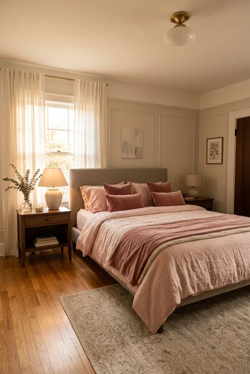
What’s Inside
- Select a Sophisticated Muted Pink for Walls
- Ground the Pink Bedroom Decor with Charcoal Accents
- Incorporate Natural Linen Textures
- Install Matte Brass Hardware for Contrast
- Layer Chunky Knit Throws at the Bed’s Foot
- Add Architectural Interest with Fluted Wood Panels
- Choose Modern Abstract Art Over Florals
- Introduce Terracotta Ceramics for Warmth
- Scale Down with Low-Profile Upholstered Bed Frames
- Soften Hard Edges with Bouclé Accent Chairs
- Swap Standard Bulbs for Warm 2700K Lighting
- Ground the Space with Oversized Jute Rugs
- Mix Velvet Pillows into Your Pink Bedroom Decor
- Hang Floor-to-Ceiling Blackout Curtains
- Finish with Asymmetrical Nightstand Styling
Back in 2019, I painted my primary bedroom a blinding shade of magenta. I thought bold pink decor would fix my bland walls and make the space feel intentional. Instead, it looked like a bottle of stomach medicine exploded on the drywall. The glare gave me a headache every morning. I spent $120 on heavy-duty primer just to undo the damage. Let’s be clear: pink is notoriously hard to get right in a bedroom. Skew too bright and it looks juvenile; go too pastel and it feels like a nursery. The trick is treating pink as a neutral foundation rather than a novelty. I’ve spent four years testing paint swatches, returning cheap throw pillows, and watching how natural light shifts those tones. It takes precise planning to make this color look sophisticated. You need the right undertones, contrasting textures, and proper lighting. Here’s how to execute pink bedroom decor without turning your room into a plastic dollhouse.
1. Select a Sophisticated Muted Pink for Walls

Your foundation dictates everything. Skip the bubblegum paint. You need a refined, muted pink that acts as a neutral backdrop. I use Benjamin Moore First Light 2102-70. It costs about $64.99 per gallon. This shade is a pale blush with cool gray undertones. That gray is vital. It keeps the walls from looking overly saturated when the afternoon sun hits. I tested five different pinks last October before settling on this one. The others reflected too much red, making my wooden furniture look orange. First Light stays balanced. Buy two gallons for a standard 12×12 foot room. Use a matte finish. Eggshell or satin reflects light and makes pink walls look shiny and cheap. A matte finish absorbs light, giving the color a soft, chalky depth. Apply two coats over a stark white primer. If you paint over beige or gray without primer, the underlying color will shift the pink into a muddy peach. Do the prep work.
2. Ground the Pink Bedroom Decor with Charcoal Accents

Pink needs a heavy anchor. Without a dark contrast, a pink room floats away into a pastel blur. Charcoal gray provides that necessary weight. I learned this the hard way after trying to pair pale pink walls with white furniture. The room felt washed out and lacked definition. I bought the West Elm European Flax Linen Duvet Cover in Slate. It retails for $230 for a queen size. That moody charcoal immediately grounded the room. The contrast between soft blush walls and heavy gray bedding creates a structured, adult aesthetic. You don’t need to paint your trim black. Just add substantial charcoal elements through your textiles. A 20×20 inch charcoal throw pillow or a dark gray bench at the foot of the bed works perfectly. Dark tones absorb the excess sweetness of the pink. It’s basic color theory. Cool, dark shades push back against warm, light ones to prevent visual fatigue.
3. Incorporate Natural Linen Textures

Texture matters as much as color. When you have pink walls, smooth or shiny fabrics make the room look like a budget hotel. You need natural, matte textures to break up the space. I bought a set of slippery microfiber sheets from Amazon for $25 a few years ago. They trapped heat, pilled quickly, and looked terrible. I tossed them. Now, I strictly use linen. I use the Target Casaluna Heavyweight Linen Blend Sheets. A queen set costs $139. Linen has a natural crumple. That wrinkling adds organic texture that softens the rigid lines of a bed frame. The fabric is breathable and heavy. I prefer the natural oatmeal color. The slightly warm, beige undertone of unbleached linen complements a cool pink wall perfectly. Buy two sets and rotate them weekly. Linen gets softer with every wash, but wash it on cold. Hot water breaks down the flax fibers and causes the fitted sheet to tear at the corners.

Mkono Macrame Hanging Shelves Boho Wall Decor Set of 2
Mkono Macrame Hanging Shelves Boho Wall Decor Set of 2 Rustic Wood Flo has been one of the most consistently praised picks in this category. 2 reviewers averaged 4.5/5.
4. Install Matte Brass Hardware for Contrast

Replacing builder-grade hardware is mandatory. Standard brushed nickel pulls look cold and sterile against blush paint. You need matte brass for warmth. I bought cheap gold-painted knobs from a generic seller last year. The paint chipped in a month, and the screws stripped my dresser drawers. Now, I use the CB2 Hex Brushed Brass Knobs. They cost $8.95 each. They are solid cast brass and weigh half a pound apiece. The matte finish doesn’t show fingerprints, which matters when you’re fumbling for a drawer in the dark. The warm, yellow undertones of the brass cut through the cool gray of the pink walls. It creates a sharp, intentional contrast. I installed six of these on my IKEA Malm dresser. You need a standard Phillips head screwdriver and twenty minutes. Measure your drawer front thickness before buying. The included screws are 1.25 inches long. If your drawer face is thicker than an inch, grab longer screws at the hardware store.
5. Layer Chunky Knit Throws at the Bed’s Foot

A flat bed looks unfinished. You need dimensional layers to make the space inviting. A chunky knit throw serves two purposes. It adds physical warmth and introduces a heavy, three-dimensional texture that contrasts with smooth sheets. I use the Pottery Barn Colossal Handknit Throw. It measures 50×60 inches and costs $149. The yarn is thick and tightly woven. I tried a cheaper, loosely knit version once. My cat snagged it on day one, and it unraveled into a mess. The Pottery Barn version holds its shape. I fold it lengthwise and drape it across the bottom third of the mattress. Choose an ivory or soft cream. The cream bridges the gap between your dark charcoal duvet and the light pink walls. It softens the transition. Don’t buy a pink throw for a pink room. Monochromatic styling requires a professional eye to avoid looking flat. Stick to neutral creams and let the walls carry the color.
6. Add Architectural Interest with Fluted Wood Panels

Blank pink walls can feel empty, especially behind a bed without a headboard. Adding physical texture to the wall itself solves this. Fluted wood panels bring natural warmth and architectural detail. I installed the Wood Slat Wall Panels from Home Depot. They cost $119 for a pack of four. Each panel is 94 inches tall and 4.7 inches wide. I mounted them directly behind my bed to create a floor-to-ceiling focal point. The natural oak finish breaks up the continuous pink paint. The vertical lines draw the eye upward, making my 8-foot ceilings look taller. Installation requires a brad nailer and a level. I tried construction adhesive first, but it damaged the drywall when I made a mistake and had to pull a panel off. Stick to finishing nails. They hold the panels securely and leave tiny holes that are easy to patch. The wood tones ground the pink and introduce a mid-century element.

Leeleberd Led Lights for Bedroom 100 ft (2 Rolls of 50ft)
Leeleberd Led Lights for Bedroom 100 ft (2 Rolls of 50ft) Music Sync C punches above its price — 199 buyers rated it 4.5 stars. I would buy it again.
7. Choose Modern Abstract Art Over Florals

Art selection dictates the maturity of the room. Floral prints against pink walls instantly push the aesthetic into teenager territory. Avoid botanical clichés. I rely on modern, geometric abstract art. I bought an oversized framed canvas from Minted called ‘Neutral Geometry’. It measures 30×40 inches and costs $298. The piece features sharp angles in charcoal, mustard yellow, and cream. The strict geometric lines provide a necessary contrast to the soft, feminine energy of the pink walls. Hang the art 6 to 8 inches above your headboard. Most people hang art too high, leaving an awkward gap that disconnects the frame from the furniture. I made this mistake in my guest room and stared at the floating frame for six months before fixing it. Use a wire hanging kit and two hooks spaced 10 inches apart. This distributes the weight and keeps the frame level when doors slam. The abstract shapes force the room to read as a curated, adult space. You might also like: 15 Lovely Cool Bedroom Ideas Worth Trying This Year
8. Introduce Terracotta Ceramics for Warmth

Pink and terracotta belong to the same warm family, but they serve different purposes. Terracotta introduces earthy, baked warmth that prevents pale pink from feeling icy. I use the Artisan Terracotta Vase from Crate & Barrel. It costs $49.95 and stands 12 inches tall. I place it on my wooden dresser. The raw, unglazed finish of the clay absorbs light. I used to display clear glass vases, but they looked too delicate against the light walls. The heavy, opaque nature of terracotta commands attention. Fill the vase with dried eucalyptus or tall pampas grass. The muted green of the eucalyptus provides a subtle complementary contrast to the pink. Don’t use fake plastic flowers. They collect dust and cheapen the aesthetic. If you can’t keep real plants alive, stick to dried stems. The terracotta grounds the arrangement and adds a rugged, handmade element to an otherwise soft room. You might also like: 18 DIY Bedroom Decor Worth Trying
9. Scale Down with Low-Profile Upholstered Bed Frames

Tall, ornate bed frames overpower a colored wall. A low-profile platform bed keeps the sightlines clean and allows the pink walls to breathe. I use the Article Sven Bed in Birch Ivory. It costs $1,299 for a queen size. The headboard sits relatively low. This leaves plenty of negative space on the wall above, which is crucial when working with a painted backdrop. A massive, tufted headboard would suffocate the room. The Sven bed features a tailored, mid-century silhouette with tapered wooden legs. The ivory upholstery provides a soft, neutral break between the charcoal bedding and the pink walls. I originally bought a cheap metal frame. It squeaked constantly, and the sharp corners bruised my shins. The upholstered frame absorbs sound and softens the physical edges of the room. A low profile forces you to be intentional about your nightstand height. Keep your nightstands under 24 inches tall to match the scale. You might also like: 20 Creative Cozy Small Bedroom for Any Style

Govee RGBIC LED Strip Lights, Smart LED Lights for Bedroom
Govee RGBIC LED Strip Lights has been one of the most consistently praised picks in this category. 243 reviewers averaged 4.5/5.
10. Soften Hard Edges with Bouclé Accent Chairs

Every bedroom needs a secondary seating area, even if it’s just a place to toss clothes. A harsh wooden chair looks out of place in a soft pink room. You need textured upholstery. I bought the Project 62 Bouclé Barrel Chair from Target. It costs $250. Bouclé fabric features looped yarn that creates a nubby texture. It looks like sheep’s wool. The heavy texture contrasts brilliantly with smooth painted walls. I tucked this chair into the corner near the window. It creates a reading nook that softens the square geometry of the room. I previously tried a sleek leather chair there. The leather felt too cold and corporate against the blush walls. Bouclé adds necessary coziness. The barrel shape hugs the body and eliminates sharp corners. Use a small lumbar pillow in a dark charcoal or olive green to tie the chair back to the rest of the palette. Vacuum the fabric weekly with a brush attachment to keep dust out of the loops.
11. Swap Standard Bulbs for Warm 2700K Lighting

Lighting completely alters how paint colors read. If you use the wrong bulbs, your sophisticated pink room will look like a hospital corridor. I made this error last winter. I installed 4000K daylight bulbs. The cool, blue light washed out the pink paint and made the gray undertones look dirty. It was miserable. I immediately switched to Philips Hue White Ambiance Smart Bulbs. A two-pack costs $44.99. I lock the color temperature at 2700K. This is a warm, soft white that mimics traditional incandescent bulbs. The warm light enhances the blush tones and makes the room feel intimate. Put every light on a dimmer. You need to lower the light output in the evening. Bright overhead lighting creates harsh shadows that ruin the softness of the pink decor. Rely on table lamps and wall sconces rather than the main ceiling light. Layered, warm lighting is the only way to make pink walls look expensive after sunset.
12. Ground the Space with Oversized Jute Rugs

A bare floor makes a bedroom feel cold and unfinished. A rug is mandatory, but material matters. A plush, synthetic rug in a pink room often looks cheap. You need natural fibers to add grit. I use the Chunky Jute Tasseled Rug from Rugs USA. An 8×10 foot size costs $185. Jute is a rough, durable plant fiber. The golden-tan color warms up the cool pink walls. The rough texture provides a counterpoint to the soft linens. I tried a fluffy white shag rug first. It matted down within a month and looked gray in traffic areas. Jute hides dirt and holds its shape. Place the 8×10 rug perpendicular to the bed. The front legs of your nightstands should just barely touch the back edge of the rug. This leaves about three feet of rug exposed on the sides and foot of the bed. It gives you a warm, textured surface to step on when you wake up.

50×70 Inch Rust Throw Blanket – Soft & Fluffy Fleece
Honestly, 50×70 Inch Rust Throw Blanket – Soft & Fluffy Fleece surprised me — sturdier than it looks in the photos, and over 11 buyers gave it 4.5 stars.
13. Mix Velvet Pillows into Your Pink Bedroom Decor

Throw pillows are the easiest way to introduce secondary colors, but you must choose the right fabric. Cotton canvas looks too casual. You need velvet. I use the IKEA SANELA Velvet Cushion Covers. They cost $9.99 for a 20×20 inch square. I buy the dark olive green and the dark gray versions. The cotton velvet has a matte finish. Don’t buy crushed or shiny polyester velvet. I made that mistake once, and the shiny pillows looked like cheap prom dresses on my bed. Matte velvet absorbs light and looks incredibly rich. The heavy fabric adds luxury to the entire room. I use down-alternative inserts that are two inches larger than the covers. A 22×22 inch insert inside a 20×20 inch cover creates a firm, plump pillow that doesn’t slouch. The dark olive green velvet against the pale pink walls creates a sophisticated, moody contrast. It proves that pink doesn’t have to mean pastel and delicate.
14. Hang Floor-to-Ceiling Blackout Curtains

Window treatments dictate the perceived height of your room. Flimsy, sheer curtains make a space look unfinished. You need heavy drapes to frame the windows and add vertical lines. I use the Signature Velvet Blackout Curtains from Half Price Drapes. They cost $79 per 96-inch panel. I chose the ‘Alabaster’ color, a warm, creamy off-white. The heavy velvet blocks out streetlights completely, which is great for sleep. The fabric hangs in thick, uniform folds. I hang the curtain rod exactly two inches below the ceiling line, not just above the window frame. This draws the eye up and makes the walls look taller. I used to hang curtains right on the window trim, and it made my bedroom feel like a cramped box. Buy panels wide enough to cover the window with plenty of fabric left over. When closed, they should look full, not stretched tight. The heavy drapes add acoustic dampening, making the room quieter and more insulated.
15. Finish with Asymmetrical Nightstand Styling

Perfect symmetry looks staged and rigid. A bedroom should feel lived-in and collected. Stop trying to match everything perfectly. I use an asymmetrical styling approach for my nightstands. On the left nightstand, I lean the Anthropologie Gleaming Primrose Mirror in the small size against the wall. It costs $118. The ornate brass frame catches the morning light. On the right nightstand, I place a tall, matte black table lamp with a linen shade. The differing heights create interest. I used to have matching lamps and frames on both sides. It looked like a furniture catalog, lacking personality. Asymmetry forces the eye to move around the room. Keep the functional items consistent. You still need a place to charge your phone and set a glass of water. Use a small brass tray on one side and a stack of three hardback books on the other. This curated, slightly unbalanced approach makes the pink bedroom decor feel mature, relaxed, and highly intentional.
I hope these specific details help you avoid the expensive mistakes I made. Getting the right undertones and textures is the only way to make pink work in an adult space. Save this guide or pin it for later when you’re standing in the paint aisle trying to decide between fifty shades of blush.

QEEIG Floating Shelves for Wall Bathroom Shelf Bedroom
If you want something that just works, QEEIG Floating Shelves for Wall Bathroom Shelf Bedroom Kitchen Living is a safe bet (45 reviews, 4.5 stars).
Frequently Asked Questions
What is the best pink paint for a bedroom?
Benjamin Moore First Light 2102-70 is highly recommended. It is a muted blush with cool gray undertones that prevents the walls from looking overly saturated or juvenile when natural light hits them.
How do you make a pink bedroom look mature?
Ground the room with dark contrasting colors like charcoal gray. Incorporate natural textures like heavy linen, matte brass hardware, and abstract geometric art instead of cliché floral prints.
What colors go well with pink bedroom decor?
Charcoal gray, natural oatmeal linen, olive green, and terracotta all pair beautifully with pink. These colors add earthy warmth and visual weight that balance the lightness of the pink walls.
What lighting works best with pink walls?
Use 2700K warm white bulbs. Cool daylight bulbs (4000K) will wash out the pink and make the gray undertones look dirty and sterile. Warm lighting enhances the blush tones perfectly.
