What’s Inside
- Follow the Two-Thirds Rule for Bedroom Portraits Wall Art
- Nail the 57-Inch Eye-Level Standard
- Invest in Oversized Statement Pieces
- Lean Into Warm Minimalism and Neutral Palettes
- Prioritize Meaningful, Story-Driven Selection
- Choose Canvas Prints for a Softer, Safer Finish
- Avoid the Furniture Overhang Mistake
- Create a Looser, Asymmetrical Gallery Wall
- Utilize Floating Shelves for Flexible Displays
- Incorporate Textured and Layered Designs
- Plan Your Layout with the Painter’s Tape Method
- Don’t Over-Decorate Every Single Wall
- Prop Large Art for a Contemporary Vibe
- Match the Mood of the Art to the Room’s Function
- Explore Custom Portrait Services for Unique Pieces
- Mix Vintage and Modern Frames for Contrast
- Unify Mismatched Photos with Black and White Filters
- Frame Your Art with Wall Sconces
- Use Grid Layouts for Maximum Uniformity
- Source Bedroom Portraits Wall Art from Independent Artists
Most people hang their bedroom portraits way too high. They leave a weird floating gap above the headboard that kills the room’s proportions. You walk in, and instead of feeling grounded, your eyes shoot straight to the ceiling. It’s a common mistake that makes a space feel disjointed. Finding the right piece isn’t about perfectly matching your duvet cover. It’s about scale, mood, and anchoring the wall with intention. If you only try one idea from this list, make it #3. Here’s why: an oversized statement piece solves the scale problem instantly. It requires exactly one nail. That saves you the headache of aligning a complex gallery wall. Trust me on this.
Skip this if you’re renting an older apartment with crumbling plaster or strict lease rules against drilling heavy anchors. Large framed portraits require serious hardware. Standard adhesive strips won’t safely hold a heavy glass frame over your head while you sleep. I’ve learned that the hard way. Stick to lightweight unframed canvas or fabric pieces instead.
1. Follow the Two-Thirds Rule for Bedroom Portraits Wall Art

When hanging art above your bed, the math matters more than the motif. A frequent error is hanging a tiny 8×10 frame over a massive king bed. It looks like a postage stamp. To fix this, make sure the total width of the artwork is roughly two-thirds to three-quarters the width of your headboard. For a standard queen bed sitting at about 60 inches wide, aim for art spanning 40 to 45 inches across. If you’re working with a king bed closer to 80 inches wide, your art needs to hit that 54 to 60-inch sweet spot. This prevents the piece from looking small. You can find oversized frames at Target in the budget to mid-range tier. The catch: adhering strictly to this rule limits your options if you fall for a vintage piece that’s slightly too small.
2. Nail the 57-Inch Eye-Level Standard

Galleries hang art so the center sits exactly 57 to 60 inches from the floor. Your bedroom shouldn’t be any different. Most people eyeball it. That results in art that creeps way too close to the ceiling. However, when placing art directly over a headboard, the rules shift slightly. You need to position the bottom edge of the frame exactly 6 to 12 inches above the top of the headboard. This maintains a visual connection between the furniture and the art. If the gap is larger than 12 inches, the art floats away and the look falls apart. Use a tape measure and mark the spot lightly. It’s tedious but necessary. The catch: this measurement gets tricky if your bed frame is high or if you’re dealing with slanted attic ceilings.
3. Invest in Oversized Statement Pieces

Best for: large empty walls.
Large-scale art continues to dominate interior styling for 2026. It creates a focal point that simplifies the rest of your decor. Instead of fussing with multiple small pieces, consider one massive canvas. A 30×40 inch or 36×48 inch piece works beautifully over a queen bed. A 40×60 inch canvas commands a king-sized setup. It’s a bold visual impact that requires zero layout planning. Brands like CanvasChamp offer these massive sizes, typically ranging from $50 to $150 depending on the dimensions. It fills the visual void instantly and gives the room a polished look. The catch: shipping oversized art is expensive, and maneuvering a 60-inch framed canvas up a narrow flight of apartment stairs is a logistical nightmare.

QEEIG Floating Shelves for Wall Bathroom Shelf Bedroom
A dependable everyday pick — QEEIG Floating Shelves for Wall Bathroom Shelf Bedroom Kitchen Living pulls in 46 ratings at 4.5 stars. Not flashy, just solid.
4. Lean Into Warm Minimalism and Neutral Palettes

The current aesthetic favors soft modern minimalism. We’re talking soothing neutrals like warm beige, soft grays, muted dill, and olive greens. Choosing portrait art in these calming tones turns the room into a sanctuary. You want colors that lower your heart rate. Look for pieces with subtle shading rather than high-contrast, aggressive pop art. You can find excellent neutral prints at West Elm, usually sitting in the mid-range price bracket. They curate pieces that fit this exact soft, muted profile. The catch: if your walls are already painted a stark, cool builder-grade white, these warm beige and olive tones can look dingy or washed out by comparison, requiring a fresh coat of warmer paint.
5. Prioritize Meaningful, Story-Driven Selection

Wall art is shifting away from generic, mass-produced hotel art toward pieces that tell a specific story. Select portraits that evoke positive emotions, spark distinct memories, or hold sentimental value. It’s much better to frame a slightly blurry candid photo from a trip to the coast than a crisp stock photo you bought just to fill a blank spot. People notice the difference when they walk into the room. The art should mean something to you personally, anchoring the space with real memories. The catch: curating a collection of highly personal photos that look cohesive, properly lit, and aesthetically pleasing together is incredibly difficult and often takes months of hunting through old hard drives.
6. Choose Canvas Prints for a Softer, Safer Finish

Best for: homes with kids or pets.
Hanging heavy glass directly over where you sleep is a safety hazard. This is especially true if you live in an earthquake zone or have large dogs that jump on the bed. Canvas prints are significantly lighter than traditional framed art with glass fronts. They’re the smarter, safer choice for above-bed placement. Brands like Canvaspop offer custom canvas prints starting around $40 for smaller sizes, with massive 40×32 inch pieces typically landing under $150. The matte finish of canvas also eliminates the annoying glare you get from glass when your bedside reading lamps are turned on. The catch: raw canvas lacks the polish of a properly matted and glass-framed photograph, and it’s much harder to dust without scratching the ink. You might also like: 20 Farmhouse Bedroom Decor You Need to See

AMADA HOMEFURNISHING Floating Shelves
A dependable everyday pick — AMADA HOMEFURNISHING Floating Shelves pulls in 116 ratings at 4.5 stars. Not flashy, just solid.
7. Avoid the Furniture Overhang Mistake

A mistake people make is selecting art that extends beyond the width of the furniture sitting directly below it. If you hang a 70-inch wide canvas over a 60-inch wide dresser or bed, it creates a top-heavy, unbalanced look. It makes the room feel like it’s tipping over. Always ensure your art adheres to that two-thirds to three-quarters width rule relative to the furniture anchoring it. It’s a hard visual boundary you shouldn’t cross if you want the room to feel stable. The catch: this proportion rule means you might have to pass on a gorgeous, massive piece of art simply because your apartment-sized furniture is too narrow to support it visually. You might also like: 18 Modern Bedroom Decor You Need to See
8. Create a Looser, Asymmetrical Gallery Wall

Best for: eclectic spaces.
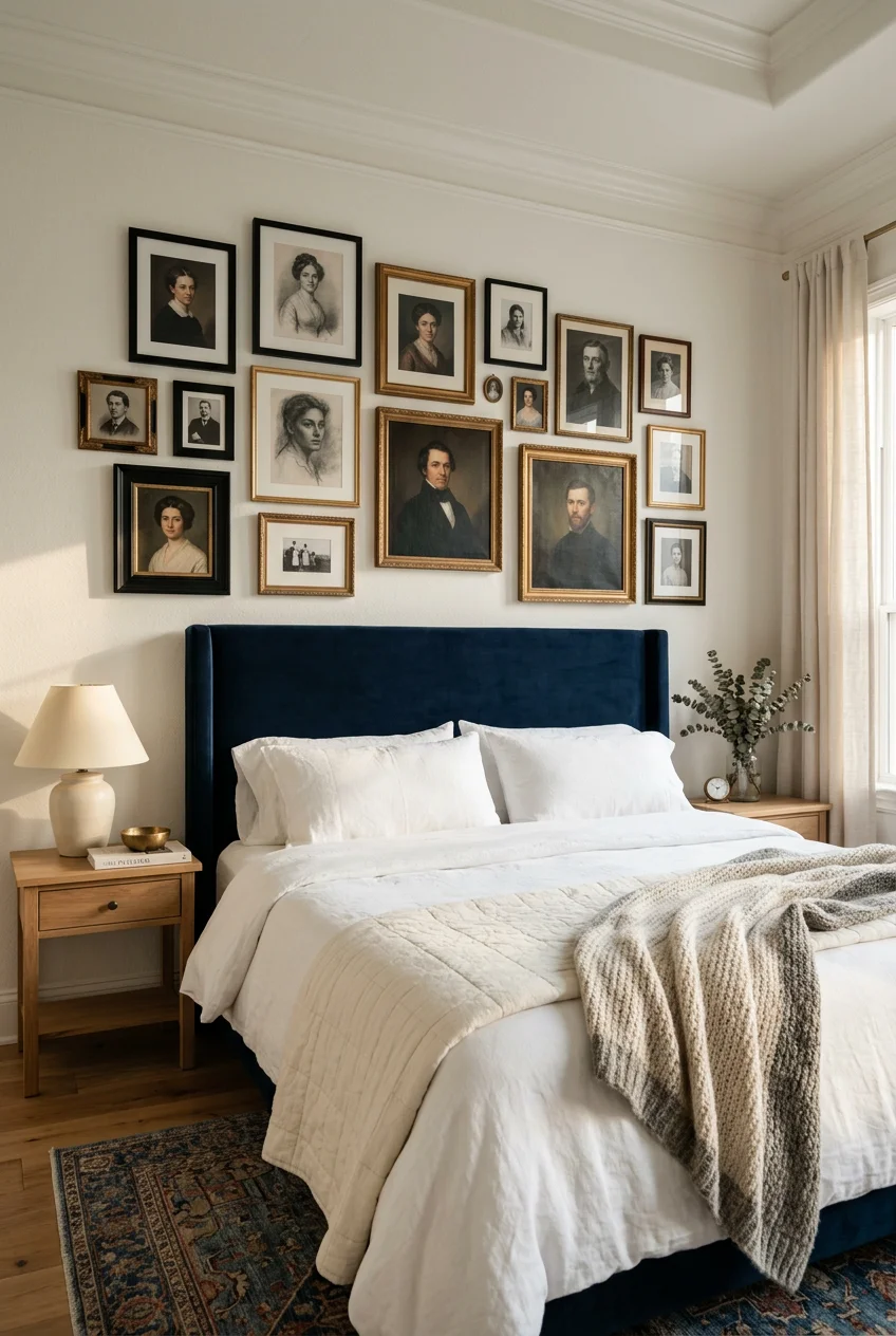
Move away from perfectly spaced, identical frames. The current trend for gallery walls is personal and collected. It focuses on meaning and mood rather than rigid symmetry. Mix different frame styles—maybe a chunky ornate wood frame next to a thin metal one—and vary the sizes. Leave exactly 2 to 5 inches of breathing room between the frames to keep the display cohesive yet dynamic. It looks like it evolved naturally over time rather than being bought as a matching set. The catch: achieving the effortlessly mismatched look requires a trained eye and hours of adjusting; otherwise, it just looks like a cluttered, chaotic mess. You might also like: 16 Small Closet Organization Bedroom for Every Budget
9. Utilize Floating Shelves for Flexible Displays

Instead of committing to permanent nail holes in your drywall, install floating shelves to display framed portraits. Brands like IKEA offer affordable floating shelves, typically under $30, that work perfectly for this. You can prop up your art, easily swap out photos when you get bored, and layer smaller 5×7 pieces in front of larger 11×14 frames. It also gives you a dedicated spot to incorporate other decorative elements like small trailing pothos plants or battery-operated LED candles. It’s the ultimate low-commitment display method. The catch: flat floating shelves are dust magnets, and keeping the frames and the shelf surface clean requires constant, annoying wiping down every single week.

Fixwal Floating Shelves for Wall
Fixwal Floating Shelves for Wall is sturdier in person than the photos suggest — over 459 buyers gave it 4.5 stars.
10. Incorporate Textured and Layered Designs

Flat, glossy prints are out. The focus now is on texture and physical depth. Look for portraits printed on heavily textured canvas, pieces with visible, thick acrylic brushstrokes, or art that incorporates mixed media. You can even create the illusion of texture through layered framing, using deep 2-inch shadow boxes or thick, unglazed linen mats. This adds a tactile element to the room that makes the space feel richer, warmer, and complex. You can find heavily textured canvas pieces at retailers like Crate & Barrel in the mid-range pricing tier. The catch: textured art, especially pieces with heavy impasto brushstrokes or raw linen mats, is difficult to clean and holds onto airborne dust and allergens.
11. Plan Your Layout with the Painter’s Tape Method

Best for: beginners.
Before you pick up a hammer, use blue painter’s tape or kraft paper templates cut to the exact size of your artwork. Visualize the arrangement on the wall. Tape them up, step back, and look at the proportions from across the room. This stops you from drilling five different holes because you misjudged the spacing by half an inch. Grab a $5 roll of tape from Home Depot and take the extra twenty minutes to map it out. It’s a non-negotiable step for gallery walls or off-center placements. The catch: measuring and cutting out exact paper templates for a dozen different frames is tedious, time-consuming work that most people abandon halfway through out of frustration.
12. Don’t Over-Decorate Every Single Wall

Less is more in a bedroom. A major mistake is feeling the need to hang art on every single blank wall you see. This creates a visually overstimulated environment. That’s the opposite of what you want in a room designed for sleeping. Embrace empty space. Let the wall behind your bed be the sole focal point, and leave the opposite or adjacent walls bare to give your eyes a place to rest. It creates a calmer, uncluttered sanctuary. It’s okay to let the paint color do the heavy lifting on a massive wall. The catch: minimalists love this, but if you’re a maximalist at heart, leaving walls blank will feel unfinished and bare to you.

Fixwal Black Floating Shelves for Wall
If you want something that just works, Fixwal Black Floating Shelves for Wall is a safe bet (46 reviews, 4.5 stars).
13. Prop Large Art for a Contemporary Vibe

Best for: renters.
For a relaxed, modern vibe, take those massive portraits—we’re talking 40×60 inches or larger—and simply lean them against the wall. You can prop them directly on the floor in a corner or rest them on top of a low, wide mid-century dresser. It bypasses the need for heavy-duty wall anchors and gives the room a casual, airy studio-like atmosphere. You see this casual lean in high-end architectural magazines. You can find great oversized floor mirrors and art at Urban Outfitters to achieve this look. The catch: propping massive art on the floor takes up valuable square footage, and it’s a bad idea if you have robotic vacuums, toddlers, or large dogs that might knock it over.
14. Match the Mood of the Art to the Room’s Function

The bedroom is for unwinding, so the art needs to reflect that. Choose calm, soothing pieces with soft watercolor lines and muted color palettes. Avoid bold, aggressive, or dramatic artwork that might overstimulate your senses when you’re trying to wind down at night. High-energy abstract pieces in harsh neon acrylics belong in the living room, not in your line of sight from the pillows. Stores like Sprouts or Whole Foods often sell small, calming botanical prints near their floral sections that work perfectly for this. The catch: prioritizing a calm, sleepy mood means you limit your options for bold, expressive artistic statements, forcing you into a safer aesthetic lane.
15. Explore Custom Portrait Services for Unique Pieces

For personalized decor, turn your own cherished photos into custom canvas prints. Services like Customprintscanvas.com or Oh Canvas handle this beautifully. They allow you to upload your own high-resolution files and offer digital proofing systems. You can approve the exact crop and color balance before it hits the printer. It guarantees you won’t see the exact same piece of art hanging in your neighbor’s house. Prices vary but generally sit in the mid-range tier depending on the size. Expect to wait at least two to three weeks from uploading the file to hanging it on your wall. The catch: processing, digital proofing, and shipping custom art takes significantly longer than grabbing a ready-made piece off the shelf.

WOPITUES Wood Floating Shelves Set of 6
A dependable everyday pick — WOPITUES Wood Floating Shelves Set of 6 pulls in 68 ratings at 4.5 stars. Not flashy, just solid.
16. Mix Vintage and Modern Frames for Contrast

Matching frame sets look cheap. To get a curated look, mix ornate, vintage brass or carved wood frames with sleek, thin modern metal ones. You can hunt for incredible vintage frames at local thrift stores or Goodwill for under $10. Pair them with crisp, contemporary matte black frames from CB2. The contrast between the old-world detail and the modern minimalism makes the whole collection look intentional and expensive. You’ll likely spend more on the custom matting than you did on the thrifted frame itself. The catch: sourcing vintage frames that are in good condition and finding custom-cut mats to fit their odd, non-standard sizes is a time-consuming hassle.
17. Unify Mismatched Photos with Black and White Filters

If you have a collection of personal photos taken in different lighting conditions, with different cameras, and clashing color palettes, don’t hang them as-is. It looks messy. Run them all through a high-contrast black and white filter before printing. You can get these printed cheaply at the Costco photo center or Walmart. Stripping the color unifies the entire collection instantly. It makes a chaotic mix of bright beach trips and dark indoor portraits look like a deliberate, cohesive gallery. It’s a stark look that requires warm lighting in the room to balance out the grayscale tones. The catch: black and white photos can feel cold, stripping away the vibrant, nostalgic warmth of the original memory.
18. Frame Your Art with Wall Sconces

Best for: dark, windowless walls.
Placing a wall sconce on either side of a large portrait improves the entire setup immediately. It frames the art, adds crucial ambient lighting to the bedroom, and highlights the physical texture of the piece. You can find beautiful plug-in sconces at Pottery Barn that give you this high-end architectural look without needing to rip open your drywall for expensive hardwiring. It draws the eye exactly where you want it. Make sure you use warm 2700K LED bulbs, otherwise the art will look like it’s sitting in a sterile hospital room. The catch: even with the convenience of plug-in sconces, you’re left dealing with cords dangling down the wall, which requires buying rigid plastic cord covers to hide the mess.
19. Use Grid Layouts for Maximum Uniformity

If the loose, asymmetrical gallery wall stresses you out, go the exact opposite route: a tight, perfectly measured grid. A series of four, six, or nine identical frames hung with exact two-inch spacing creates a structured, tailored look. It works well with cohesive photo series, like botanical prints or minimalist black-and-white sketches. You can buy identical frame sets at Target or Walmart in the budget tier to keep the cost down while achieving a uniform, expensive look. You absolutely need a laser level for this project; a standard bubble level won’t cut it across a wide wall. The catch: hanging a grid requires absolute mathematical precision; if even one frame is an eighth of an inch off, the entire grid looks crooked.
20. Source Bedroom Portraits Wall Art from Independent Artists

Stop buying the same mass-produced leaf print everyone else has. Sourcing your bedroom portraits from independent artists gives your room actual character. Platforms like Etsy or local weekend art fairs are packed with original works and limited-edition prints printed on heavy 300gsm cotton rag paper. Buying direct supports the creator and ensures your space feels unique. You can find stunning original sketches or small watercolor paintings for under $100 if you know where to look. Standard 8×10 or 11×14 frames from Michaels rarely fit these bespoke pieces, forcing you into custom framing territory. The catch: independent art rarely comes framed, meaning you’ll have to spend extra time and money sourcing expensive custom frames to fit non-standard paper sizes.
How we chose these ideas: We evaluated these styling methods based on renter-friendliness, visual impact, and budget flexibility. We prioritized practical, low-effort solutions that work across various room sizes and tricky lighting conditions, focusing on layouts that maximize aesthetic return without requiring expensive professional installation.
Finding the right art placement changes how a room feels. I’d recommend starting with the painter’s tape method before you commit to any nails. It saves so much frustration and drywall patching. It took me years to figure out, but it’s a great trick. Pin this guide to your bedroom decor board so you have the exact measurements handy when you’re ready to start hanging!
Frequently Asked Questions
How high should I hang art above my headboard?
Position the bottom edge of the frame exactly 6 to 12 inches above the top of your headboard. This keeps the art visually connected to the bed rather than floating awkwardly in the middle of the wall.
What size art is best for a queen bed?
For a standard 60-inch wide queen bed, choose artwork or a gallery grouping that spans 40 to 45 inches across. This follows the rule of keeping art at two-thirds to three-quarters the width of the furniture below it.
Is it safe to hang heavy framed art over a bed?
Heavy glass frames pose a risk in earthquake zones or homes with active pets. Opt for lightweight canvas prints or secure heavy frames with heavy-duty drywall anchors rated for at least 50 pounds, rather than standard nails.
How far apart should frames be in a gallery wall?
Leave exactly 2 to 5 inches of space between each frame. Tighter 2-inch spacing works best for rigid, symmetrical grids, while 3 to 5 inches allows breathing room for looser, asymmetrical layouts.
