What’s Inside
- Warm Up With Organic Khaki (Sherwin-Williams Universal Khaki)
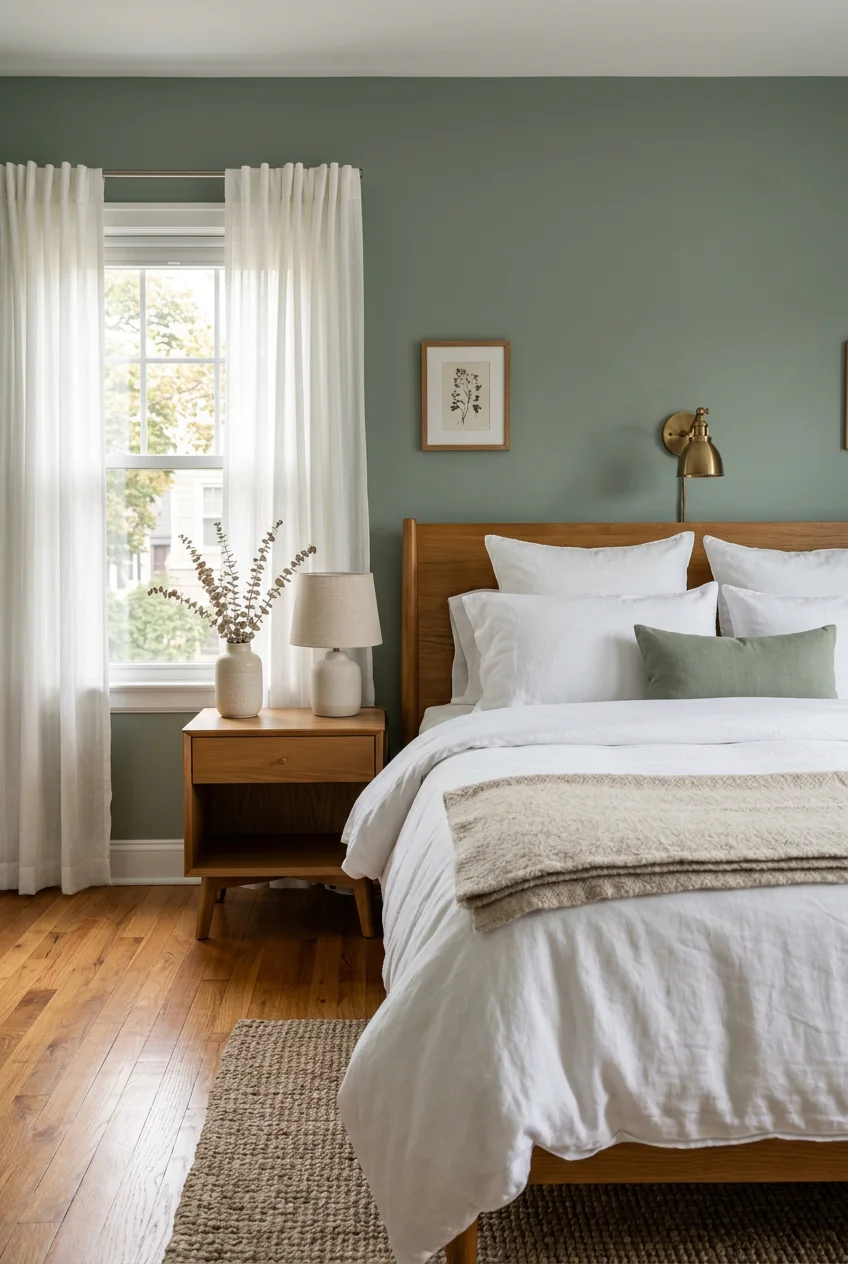
- Ground the Space With Earthy Green (Valspar Warm Eucalyptus)
- Try Dusty Mauve as a Surprising Neutral (Sherwin-Williams Mellow Mauve)
- Soften With Peach-Toned Off-Whites (Benjamin Moore Butter Pecan)
- Avoid Overstimulating Guest Bedroom Paint Colors
- Ditch the Gloomy Cool-Toned Grays
- Color Drench for a Cocooning Effect (Farrow & Ball Duck Green)
- Create a Boutique Hotel Vibe With Moody Browns (Sherwin-Williams Sable)
- Paint the Ceiling a Complementary Hue
- Invest in High-Quality Paint for Durability
- Calculate Your Paint Quantities Accurately
- Coordinate With the Rest of Your Home’s Trim
- Define Zones in Multi-Functional Spaces (Behr Limousine Leather)
- Lean Into Calming Coastal Blues (Benjamin Moore Smoke)
- Embrace the Spa Vibe With Salty Greens (Sherwin-Williams Sea Salt)
- Always Test Your Samples Properly
Most folks treat their spare room like an afterthought, slapping on whatever leftover gray they’ve got sitting in the garage. Choosing guest bedroom paint colors shouldn’t be a random guessing game. You’re creating a temporary home for visitors, and sterile bluish-gray walls just make a space feel like a cheap roadside motel. Let’s fix that. Your guests deserve a space that feels intentional, grounded, and actually designed for human comfort. If you only try one idea from this list, make it #7. Here’s why: color drenching an entire room in a rich, moody hue hides the awkward angles most spare bedrooms have while making the space feel expensive. No exaggeration.
Skip this list if you’re renting with a strict no-painting clause and your landlord won’t budge. These ideas require actual pigment on drywall. If you’re stuck with plain white walls and rely purely on removable wallpaper from Target or Command hooks to add personality, this guide isn’t for you.
1. Warm Up With Organic Khaki (Sherwin-Williams Universal Khaki)

Stark white walls feel clinical. Warm, organic neutrals offer a depth that cooler grays lack. Sherwin-Williams Universal Khaki SW 6150 is a prime example of a color that works with the weird mixed lighting most spare rooms get. It grounds the space and pairs well with natural wood tones, like a solid oak bed frame or those woven rattan nightstands from Target. You’re getting a welcoming vibe without it screaming for attention. The catch: this shade can look muddy if your room only gets northern light, so you’ll need to use warm 3000K LED bulbs in your bedside lamps. It typically costs $35 to $65 per gallon. For a standard 10×12 foot room, budget for two gallons to get solid coverage. Don’t skimp on the second coat. It makes a massive difference in how the undertones settle. Learned that the hard way.
2. Ground the Space With Earthy Green (Valspar Warm Eucalyptus)

Green is the ultimate comfort color for sleeping. Valspar Warm Eucalyptus 8004-28F brings an earthy gray-green to the walls that lowers the heart rate. It’s a restorative shade that doesn’t feel like a cartoon forest. You’ll find this at Lowe’s, and it usually runs in the budget to mid-range price tier. It mimics the natural world, which is exactly what a tired traveler needs. Best for: homes with pets or kids, since this mid-tone green hides scuffs and paw prints better than a pale neutral. Pair it with crisp white cotton sheets and a textured linen duvet for a high-end hotel aesthetic. The catch: earthy greens clash with cherry wood or reddish furniture, making the room look like a permanent holiday display. Keep your wood tones ashy or stick to white furniture to maintain that peaceful, grounding sensation. Always grab a small 4 oz sample pot before committing to a full gallon.
3. Try Dusty Mauve as a Surprising Neutral (Sherwin-Williams Mellow Mauve)

Forget what you know about pink bedrooms. Mauve is stepping in as a sophisticated neutral, carrying a dusty, grey-pink undertone that adds subtle heat. Sherwin-Williams Mellow Mauve offers warmth without overwhelming the space or looking like a nursery. It pairs beautifully with earthy tones, brass hardware, and heavy textured fabrics. A velvet headboard against a mauve wall looks intensely luxurious. You can grab brass accents from Anthropologie or a local HomeGoods to complete the look. The catch: mauve is tricky to photograph and can look purple under fluorescent lighting. You absolutely must swap out any cool-toned ceiling bulbs for warm white options, or the walls will look bruised. A gallon of premium paint in this shade typically runs $50 to $80. It’s an investment, but the rich pigment means you won’t be applying four coats just to hide the drywall tape.

Govee RGBIC LED Strip Lights, Smart LED Lights for Bedroom
If you want something that just works, Govee RGBIC LED Strip Lights is a safe bet (251 reviews, 4.5 stars).
4. Soften With Peach-Toned Off-Whites (Benjamin Moore Butter Pecan)

Pure, untinted white is a mistake in a guest room. It feels stark and uninviting. Instead, off-white hues with a touch of peach or pink bring a cozy harmony to the space. Benjamin Moore Butter Pecan OC-89 is a fantastic option for a serene retreat. It reflects light beautifully while maintaining a soft, enveloping warmth. You’re wrapping the room in a visual cashmere blanket. It works well in rooms with small windows, bouncing whatever sunlight you have without turning icy. Best for: small dark rooms that need a brightening lift without feeling like a hospital corridor. The catch: peach-toned whites require careful coordination with your trim. If your baseboards are a cool, blue-toned white, the walls will look dirty by comparison. You’ll need to ensure your trim is a warm, creamy white to keep the transition smooth.
5. Avoid Overstimulating Guest Bedroom Paint Colors

People often want their spare rooms to feel energetic, which leads to disastrous choices like bright red, tangerine, or sunflower yellow. These are highly stimulating colors. They excite the brain and fight against relaxation. Choosing overstimulating guest bedroom paint colors is a guaranteed way to ensure your visitors toss and turn all night. A bedroom’s primary function is sleep. You want colors that lower blood pressure, not colors that belong in a fast-food restaurant. Stick to muted tones, deep darks, or soft neutrals. If you desperately want a pop of yellow, put a vase of fake lemons from Michaels on the dresser or fold a mustard blanket at the foot of the bed. The catch: avoiding bright colors can make a room feel a bit too serious for younger guests. You can fix this by bringing in playful art prints or patterned throw pillows that can be swapped out in five minutes. You might also like: 15 Inspiring Master Bedroom Wall Decor to Transform Your Space
6. Ditch the Gloomy Cool-Toned Grays

The all-gray trend of the last decade did a lot of damage to guest rooms. Neutrals with strong cool undertones, especially those leaning bluish, make a room feel gloomy. On an overcast day, a cool gray room doesn’t feel cozy. It feels lonely and damp. You’re aiming for hospitality, not a waiting room. If you have a leftover can of cool gray paint, leave it in the garage. Don’t use your guest room as a dumping ground for bad paint choices. Instead, shift toward greiges that have a distinct brown or yellow base. The catch: warm greiges can clash with existing gray carpeting. If your guest room has cool-toned wall-to-wall carpet you can’t rip out, you’ll need a transition color. A large, warm-toned area rug from Wayfair or IKEA (budget $100 to $300) placed over the carpet can bridge the gap. You might also like: 15 Small Kids Bedroom Ideas Worth Trying

Govee RGBIC LED Strip Lights
If you want something that just works, Govee RGBIC LED Strip Lights is a safe bet (251 reviews, 4.5 stars).
7. Color Drench for a Cocooning Effect (Farrow & Ball Duck Green)

If you want to create an intimate space, color drenching is the way to go. This means painting the walls, baseboards, window trim, and even the ceiling in the exact same rich, dark hue. It eliminates visual breaks and creates an enveloping atmosphere. Farrow & Ball Duck Green is spectacular for this. By removing the stark white trim lines, the boundaries of the room blur, making small spaces feel larger and infinitely cozier. It’s a bold move that pays off. Best for: awkwardly shaped rooms with sloped ceilings or strange architectural bump-outs. The uniform color hides those flaws perfectly. The catch: color drenching requires absolute precision. You can’t be sloppy with your cutting in, and you’ll need to use different paint finishes (matte for walls, satin for trim) tinted to the exact same color. Premium brands cost north of $100 a gallon, so it requires a healthy budget. You might also like: 19 Cozy Aesthetic Bedroom Ideas You Need to See
8. Create a Boutique Hotel Vibe With Moody Browns (Sherwin-Williams Sable)

Designers are stepping away from light and airy guest rooms and moving toward deep, saturated colors. The goal is to create a memorable experience that feels like a boutique hotel. Sherwin-Williams Sable is a soft, velvety brown that transforms a basic drywall box into a cozy den. Dark brown is grounding and makes everything placed against it look more expensive. Crisp white sheets pop brilliantly against a dark brown wall. You can find excellent affordable bedding at Target or Walmart to complete this high-contrast look. The catch: a dark room demands excellent lighting. If you only have a single, dim ceiling fixture, a color like Sable will turn the room into a cave. You must layer your lighting. Plan to add at least two bedside lamps and a floor lamp, ensuring you have at least three light sources to bounce warmth around the dark walls.
9. Paint the Ceiling a Complementary Hue

The ceiling is the fifth wall, and leaving it flat white is a missed opportunity. Painting the ceiling a color other than white significantly impacts how a room feels. If you’re using a mid-tone blue on the walls, try painting the ceiling a shade two steps lighter on the same paint chip. It draws the eye upward and creates architectural interest. Alternatively, a soft blush ceiling above warm neutral walls adds an unexpected glow. It’s a designer trick that costs nothing more than the paint. The catch: painting a ceiling is physically exhausting and messy. You’re guaranteed to get splatters on the floor and in your hair. You need proper drop cloths—not just cheap plastic tarps that slip around—and an extension pole for your roller. It also requires a smooth ceiling. If you have heavy popcorn texture, a colored ceiling will just highlight the ugly bumps.

Govee 100ft RGBIC LED Strip Lights
Govee 100ft RGBIC LED Strip Lights punches above its price — 7 buyers rated it 4.5 stars. The kind of pick people reorder.
10. Invest in High-Quality Paint for Durability

Cheap paint is a false economy. While you can find gallons for $20 at big box stores, you’ll end up doing four coats to get decent coverage. Higher-quality paints, ranging from $35 to $65 per gallon from brands like Benjamin Moore or Sherwin-Williams, contain finer pigments and often feature built-in primers. They cover better, level out smoothly, and are far more durable against suitcase scuffs and handprints. Spending an extra $20 on a gallon saves you hours of frustrating labor. Best for: beginners who don’t have perfect rolling technique, as premium paints are more forgiving of roller marks. The catch: even the most expensive paint won’t cover a dark red wall with a single coat of light cream. If you’re doing a drastic color change, you still need to buy a separate, dedicated bonding primer (usually under $30 a gallon) to block the old color.
11. Calculate Your Paint Quantities Accurately

Running out of paint halfway through a wall is a nightmare. You need to calculate your needs before hitting the store. A standard gallon of interior paint covers roughly 350 to 400 square feet in a single coat. Let’s look at a typical 10×12 foot guest room with standard 8-foot ceilings. That gives you about 350 square feet of wall space. While one gallon technically covers it once, you always need two coats for optimal color depth. Therefore, budget for two gallons. The catch: heavily textured walls, like knockdown or orange peel, absorb significantly more paint than smooth drywall. If your walls have a heavy texture, your coverage will drop closer to 250 square feet per gallon for a single coat. Always buy a little more than your math suggests. You can keep the remaining 1/2 quart in a sealed glass jar for future touch-ups.
12. Coordinate With the Rest of Your Home’s Trim

Your guest room shouldn’t feel like an isolated spaceship disconnected from the rest of your house. To ensure the space flows naturally, you need to coordinate with your existing trim. If your hallways and living spaces feature a specific shade of white on the baseboards and door casings, carry that exact same white into the guest room. It provides a cohesive visual thread. If the guest room is entirely self-enclosed, you have more freedom, but avoiding clashing undertones is still vital. The catch: matching old, oil-based trim paint with modern water-based acrylics is a massive headache. Older oil paints yellow over time. If you try to touch up a 10-year-old oil-based baseboard with a fresh can of standard white latex, the new spots will look glaringly bright, and the old paint will look dirty. You might be forced to repaint all the trim in the room to make it look clean.

WOPITUES Wood Floating Shelves Set of 6
If you want something that just works, WOPITUES Wood Floating Shelves Set of 6 is a safe bet (68 reviews, 4.5 stars).
13. Define Zones in Multi-Functional Spaces (Behr Limousine Leather)

Most of us don’t have the luxury of a dedicated room that sits empty 300 days a year. Spare rooms usually double as home offices, gyms, or craft spaces. You can use paint to visually divide these functions. Try using a soft, creamy white like Behr Creamy White W-D-710 on the majority of the walls, and then paint a rich, deep black like Behr Limousine Leather MQ5-05 on an accent wall behind the bed. This delineates the sleeping zone from the working zone. It adds structure to a room that might otherwise feel cluttered. The catch: accent walls can look dated if done poorly. The sharp contrast of black against white draws attention to the corners. If your drywall corners aren’t perfectly straight, or if your taping job is sloppy, the high-contrast paint will highlight every single architectural flaw. You must use high-quality painter’s tape and press the edges down firmly.
14. Lean Into Calming Coastal Blues (Benjamin Moore Smoke)

Color psychology is a real factor in how a room functions. Cool hues like soft blues and lavenders naturally lower the heart rate and promote restful sleep. Benjamin Moore Smoke 2122-40 is an incredibly popular choice because it hits that perfect balance between blue, gray, and a hint of green. It feels like an overcast day at the beach. It’s serene, quiet, and universally appealing. Pair it with warm wood furniture and brushed nickel hardware for a classic, transitional look. You can find great hardware upgrades at Ace Hardware or Lowe’s for just a few dollars a pull. The catch: light blue can easily veer into a nursery aesthetic if you aren’t careful. To avoid this, anchor the room with mature, sophisticated textiles. Skip the ruffled white curtains and opt for heavy, textured linen drapes or a vintage-looking Persian rug to give the soft blue walls some necessary edge.
15. Embrace the Spa Vibe With Salty Greens (Sherwin-Williams Sea Salt)

If blue feels a bit too chilly, a muted blue-green is the perfect alternative. Sherwin-Williams Sea Salt SW 6204 is a chameleon color that shifts throughout the day. In the morning light, it leans green; in the evening, it reads more blue-gray. It brings a high-end spa quality to a standard bedroom. It’s the kind of color that makes you want to put on a plush robe and read a book. Best for: rooms with large windows and plenty of natural light, which allows the subtle undertones to show up rather than flattening out into a dull gray. The catch: because Sea Salt is such a chameleon, it’s heavily influenced by whatever is outside your window. If you have a massive red brick wall or a bright green lawn reflecting light into the room, the paint color will shift dramatically. You absolutely must test this specific color on multiple walls before committing to a full gallon.

JARLINK Over The Door Organizer Storage
JARLINK Over The Door Organizer Storage punches above its price — 46 buyers rated it 4.5 stars. The kind of pick people reorder.
16. Always Test Your Samples Properly

Never buy a gallon of paint based on a tiny paper chip under the harsh fluorescent lights of a hardware store. That’s a rookie mistake that leads to instant regret. Paint experts stress the importance of testing paint on multiple walls. A gallon of paint typically costs between $20 and $80, so spending a few dollars on small sample pots is the smartest investment you can make. Paint large swatches (at least 2×2 feet) on walls that face different directions. Look at them at 8 AM, 2 PM, and 9 PM with the lamps on. The catch: painting directly on your current walls can leave raised edges that show through your final coats of paint if you don’t sand them down. To avoid this texture issue, paint your samples onto large sheets of heavy watercolor paper or foam board. You can then move these boards around the room, stick them in dark corners, and see exactly how the color behaves without ruining your drywall. Took me years to figure out.
How we chose these ideas: The selections in this guide were evaluated based on renter-friendliness, overall cost, DIY effort, and visual impact. Priority was given to shades that balance universal appeal with modern design trends, ensuring a space that feels intentional rather than leftover.
Stop letting your spare room be the most boring space in your house. Grab a few sample pots, test out a moody brown or an earthy green, and completely change the vibe. Pin this guide to your favorite home decor board so you have these exact shade names ready when it’s time to hit the paint counter.
Frequently Asked Questions
What is the most relaxing color for a guest bedroom?
Soft, muted greens and blues are scientifically proven to lower heart rates and promote rest. Colors with warm undertones prevent the room from feeling clinical or cold.
Should guest bedrooms be light or dark?
It depends on the natural lighting. Dark, moody colors work beautifully in rooms with ample artificial lighting, creating a cozy boutique hotel feel. Light, warm neutrals are better for small spaces that need brightening.
What finish is best for bedroom walls?
Matte or eggshell finishes are ideal for bedroom walls. They absorb light, hide drywall imperfections, and provide a soft, velvety look. Save satin and semi-gloss finishes for your baseboards and window trim.
How do I choose a paint color for a room with no windows?
Avoid stark whites, which look dingy without natural light. Instead, lean into warm, mid-tone neutrals or embrace the darkness with a rich, saturated color like navy or dark green, supported by layered artificial lighting.
