What’s Inside
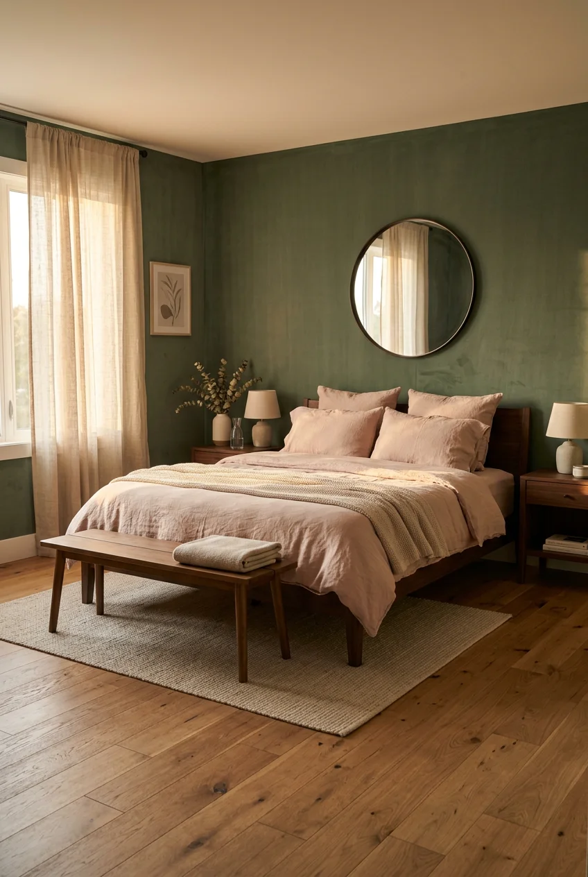
- Embrace Muted Sage Green Walls for Serenity
- Layer with Dusty Rose and Blush Pink Bedding
- Incorporate Biophilic Design with Thoughtful Greenery
- Anchor the Room with a Green Velvet Headboard
- Add Warmth with Brass Accents
- Utilize an Accent Wall Behind the Bed
- Choose Natural Materials for Furniture
- Layer Lighting for Mood and Function
- Avoid Overly Saturated Tones Entirely
- Implement Subtle Color Blocking
- Incorporate Patterns Thoughtfully
- Ground the Palette with Warm Neutrals
- Consider a Pink or Green Painted Ceiling
- Prioritize Sustainable and Eco-Friendly Choices
- Use a “Rule of Three” for Small Accents
- Choose Matte Finishes Over High Gloss
- Introduce Color Through Heavy Window Treatments
I ruined my guest room back in 2021 by painting it a blinding shade of neon watermelon and lime. Nailing a sophisticated pink and green bedroom look takes actual restraint, not just throwing two bright colors at a wall. I spent three months fixing that mistake. I sanded down the gloss, bought fresh primer at Walmart, and started over. It’s easy to get this combo wrong because when you pair complementary colors, they naturally fight for attention. The trick is manipulating the saturation and texture so they cooperate. Here are seventeen ways to balance these tones without making your space look like a pre-teen birthday party.
1. Embrace Muted Sage Green Walls for Serenity

A calming, nature-inspired sage green sets a solid foundation. I tried bright mint first, and it felt like sleeping inside a toothpaste tube. You’re better off choosing a muted tone. A popular choice is Benjamin Moore October Mist 1495. It was their Color of the Year for 2022 and stays a top pick because the gray undertones keep it from feeling too juvenile. Alternatively, Sherwin-Williams Halcyon Green SW 6213 offers a serene, dusty mint option that works beautifully in low light. Painting a standard 10×12 foot bedroom typically takes two to three gallons of paint. At about $70 to $90 per gallon for premium brands, this is a reasonable weekend project. I recommend buying a $5.99 sample pot first. Paint a two-foot square next to your window and watch how the color shifts from morning to night. Sage green absorbs shadows differently than stark white, so you’ll want to see it in your actual lighting conditions—I learned that the hard way.
2. Layer with Dusty Rose and Blush Pink Bedding

Introduce pink through textiles to avoid overwhelming the space. When you put pink directly on the walls, it often reflects too much warm light, making the room feel smaller. I prefer using a queen-sized duvet cover in a dusty rose or blush pink. The Belgian Flax Linen Duvet Cover from West Elm costs between $180 and $250, but the textured, wrinkled linen finish keeps the pink from looking overly sweet or synthetic. Pair it with crisp white or cream sheets from Costco for a clean contrast. Then, layer with two to three throw pillows in varying shades of pink and green. I bought a velvet blush pillow and a sage green knitted one from Target last Tuesday. They cost about $20 to $60 each. The mix of velvet and knit materials adds necessary friction to the bed design. If everything is smooth cotton, the bed looks flat.
3. Incorporate Biophilic Design with Thoughtful Greenery

Biophilic design connects interiors with nature, which complements this color scheme perfectly. Instead of cluttering your dresser with ten tiny succulents, integrate one large statement piece. I killed three real fiddle leaf figs before I finally accepted defeat. Now, I use a 6-foot Artificial Fiddle Leaf Fig Tree. You can find realistic ones at Walmart or Target for $40 to $150. Place it in an empty corner or right next to your dresser to draw the eye upward. To make a fake plant look authentic, you can’t just leave it in the tiny plastic nursery pot. Put it inside a heavy ceramic pot in a neutral tone, like terracotta or cream. I found a great textured clay planter at Sprouts for $29.99. I fill the top of the pot with real Spanish moss to hide the fake plastic base. The large green leaves break up the pink accents perfectly.

Bedsure GentleSoft Sage Green Throw Blanket for Couch
A dependable everyday pick — Bedsure GentleSoft Sage Green Throw Blanket for Couch – Checkered Cute pulls in 97 ratings at 4.5 stars. Not flashy, just solid.
4. Anchor the Room with a Green Velvet Headboard

If you aren’t ready to paint an entire room green, use your furniture to do the heavy lifting. Choosing an upholstered headboard in a rich green velvet adds immediate depth and a sophisticated focal point. A queen-sized velvet headboard typically ranges from $200 to $600 depending on the brand and tufting style. I bought a channel-tufted emerald one from Wayfair for $315. The velvet material is crucial here because it absorbs light, creating dark, moody shadows that flatter soft pink bedding. I’ve noticed that flat cotton headboards in dark colors just look like black voids. Velvet catches the ambient light from your windows. This approach lets you use a bolder, darker green without committing to a massive painting project. It anchors the bed against a neutral wall, giving you a strong base to layer those dusty rose throw blankets. Just keep a lint roller nearby, because velvet attracts dust incredibly fast—no exaggeration.
5. Add Warmth with Brass Accents

Silver and brushed nickel hardware can make a pink and green room feel cold and clinical. Brass is a timeless metallic that pairs beautifully with these colors, keeping the space from feeling too sweet or flat. The yellow undertones in brass warm up the cool greens and complement the pinks. Incorporate brass through a heavy brass-framed mirror above your dresser. I found a gorgeous arched one at Pottery Barn for $250. It reflects natural light and breaks up empty wall space. You can also install antique brass wall sconces on either side of the bed. Rejuvenation sells beautiful hardwired options for $100 to $300 each. I switched to wall sconces after my old table lamp broke, and the freed-up nightstand space is practical. If you don’t want to deal with hardwiring, you can buy plug-in brass sconces or simply swap out the drawer pulls on an old dresser. A $4 brass knob from Home Depot changes everything.
6. Utilize an Accent Wall Behind the Bed

A strategic accent wall creates color balance without suffocating the room. I recommend painting the wall directly behind your bed in a deeper shade, while keeping the other three walls neutral. Consider Benjamin Moore Cushing Green HC-125 for a deep olive tone that grounds the space. If you prefer a warmer backdrop, Sherwin-Williams Redend Point offers a muddy, earthy blush-pink. This creates a cozy effect when you’re lying in bed. I tried painting all four walls a dark olive last winter, and it felt like sleeping inside a heavy shipping container. It was a mistake. Limiting the dark color to one wall gives your eyes a place to rest. When you use an accent wall, you must tie that color into the rest of the room. If your accent wall is dark green, put a dark green throw blanket on the foot of the bed or a dark green vase on the dresser.

50×70 Inch Rust Throw Blanket – Soft & Fluffy Fleece
50×70 Inch Rust Throw Blanket – Soft & Fluffy Fleece punches above its price — 12 buyers rated it 4.5 stars. I would buy it again.
7. Choose Natural Materials for Furniture

Heavily painted or lacquered furniture fights with a pink and green color palette. To keep the room looking modern, opt for furniture made from light woods like oak, ash, or bamboo. A minimalist nightstand with clean lines in a light wood finish allows the colorful textiles and walls to stand out without competing for attention. I bought the BJÖRKSNÄS birch nightstand from IKEA for $99. The pale wood grain adds organic texture that bridges the gap between the green walls and pink sheets. Dark mahogany or cherry wood makes pink and green look like a dated 1980s country club. You want raw, matte wood finishes. I also recommend incorporating rattan or cane detailing. A cane-front dresser or a woven rattan chair introduces a tactile, earthy element. I learned this the hard way after trying to force a glossy black modern dresser into my guest room. It looked harsh against the soft sage walls. You might also like: 20 Inspiring Bedroom Wall Lights That Are Totally Worth It
8. Layer Lighting for Mood and Function

A single overhead ceiling light flattens pink and green tones, making them look cheap. Soft, warm lighting enhances pink undertones and prevents deeper greens from feeling muddy. You need at least three light sources in a bedroom. Beyond the main overhead fixture, include a bedside table lamp with a soft linen fabric shade. I picked up a simple ceramic lamp from Target for $45. The fabric shade diffuses the light, casting a warm glow that makes blush pink bedding look inviting. Add a floor lamp in the opposite corner to eliminate dark shadows. Article sells a great mid-century brass floor lamp for $150 to $250. Make sure you use warm white LED bulbs, ideally between 2700K and 3000K. Cool white daylight bulbs turn sage green into a sickly hospital blue and wash out soft pinks entirely. I strictly buy 2700K bulbs at Kroger when I do my grocery runs. You might also like: 15 Charming Men’s Bedroom Wall Decor Ideas You Need to See
9. Avoid Overly Saturated Tones Entirely

The most common mistake people make with this palette is buying bright, highly saturated items. Neon pinks or kelly greens belong in a playroom, not a master bedroom. I painted a bathroom bright kelly green once, and the reflection in the mirror made me look chronically ill. You won’t achieve a sophisticated look with pure, primary colors. Instead, lean into muted alternatives. Look for colors described as dusty, muddy, or chalky. Dusty rose, sage green, moss, or deep forest green create a timeless and relaxing environment. These muted tones have gray or brown mixed into them, which desensitizes the color and makes it easier on the eyes. When you shop for a pink rug or a green curtain, hold it up against a piece of stark white printer paper. If the color looks shockingly bright next to the white paper, it’s too saturated for a bedroom. You might also like: 20 Simple Bedroom Wall Design Ideas That Actually Work

SUOXING Bedside Wall Organizer for Bedroom,Rv,Small Rooms
SUOXING Bedside Wall Organizer for Bedroom punches above its price — 207 buyers rated it 4.5 stars. I would buy it again.
10. Implement Subtle Color Blocking

For a modern and intentional architectural detail, try subtle color blocking on your walls. Instead of traditional wainscoting, paint the lower third of a wall in a soft green like Benjamin Moore Saybrook Sage HC-114. Then, paint the upper two-thirds in a warm white or a very pale pink like Sherwin-Williams Intimate White. This creates visual interest without shouting at you when you walk in. I taped off my own bedroom walls at the 36-inch mark using standard blue painter’s tape. It took about four hours to measure and paint, but it completely changed the proportions of the room. The horizontal line draws the eye around the perimeter, making the ceiling feel slightly higher. You can’t rush the taping process, though. I didn’t press the tape down hard enough on my first try, and the green paint bled under the edge. Use a damp rag to seal the tape edge before you paint.
11. Incorporate Patterns Thoughtfully

Solid blocks of pink and green can start to look like a generic hotel room. You need patterns to break up the visual weight. Use botanical or geometric prints to subtly reinforce the color theme. A throw pillow with a simple repeating block print in blush and sage adds necessary detail. I found a beautiful block-print lumbar pillow on Etsy for $45. You can also hang a set of curtains with a delicate leaf or vine pattern. Just ensure the patterns are balanced with plenty of solid neutrals. If your duvet cover is patterned, your sheets and curtains should be solid. If you mix too many different scales of floral prints, the room quickly looks like a chaotic thrift store. I prefer small-scale geometric patterns over massive floral blooms because they feel more tailored and less grandmotherly. A subtle ticking stripe in faded pink on a bench cushion is a perfect example.
12. Ground the Palette with Warm Neutrals

If every single item in the room is either pink or green, the design becomes overwhelming and cartoonish. You must introduce warm neutrals to give your eyes a resting place. Cream, warm beige, camel, and mushroom gray are essential buffer colors. I use these neutrals for the largest elements in the room. An 8×10 foot chunky jute area rug is perfect for this. You can find decent jute rugs online for $150 to $400. The rough, natural texture of the jute breaks up the softness of the pink bedding and grounds the floating furniture. I also keep a warm beige linen armchair in the corner for reading. When I first decorated my room, I skipped the neutrals and tried to match everything. It felt claustrophobic. The beige and cream elements act like white space on a printed page. They separate the colorful moments so you can actually appreciate them.

Fixwal Black Floating Shelves for Wall
A dependable everyday pick — Fixwal Black Floating Shelves for Wall pulls in 43 ratings at 4.5 stars. Not flashy, just solid.
13. Consider a Pink or Green Painted Ceiling

Most people leave their ceilings stark white by default, which is a massive missed opportunity. For an unexpected and immersive experience, paint the ceiling a very light, muted pink or green. A soft pink like Sherwin-Williams Romance or a pale green like Benjamin Moore Soft Fern 2144-40 creates a beautiful cocooning effect. It draws the eye up and makes the room feel custom-designed. I painted my guest room ceiling a pale blush last spring. It reflects a flattering, warm glow over the entire room during the afternoon. White ceilings can sometimes look stark and unfinished against colored walls. If you’re nervous about it being too dark, ask the paint store to mix the ceiling color at 50% strength. This gives you just a hint of the pigment. Painting a ceiling is physically exhausting work, and I definitely strained my neck doing it, but the subtle wash of color overhead is worth it.
14. Prioritize Sustainable and Eco-Friendly Choices

A major shift in bedroom design is focusing on healthy, sustainable materials. You spend a third of your life breathing the air in your bedroom, so the materials matter. Always opt for low-VOC or zero-VOC paints. Almost all major brands offer these now for about $5 extra per gallon. They don’t off-gas harsh chemicals, meaning you can sleep in the room the same day you paint it. I also prioritize natural fiber textiles. I bought a set of organic cotton sheets from West Elm for $120. They breathe better than cheap polyester microfiber, which traps heat and makes you sweat. For furniture, look for pieces made from sustainably sourced solid wood rather than MDF glued together with formaldehyde resins. I bought a reclaimed wood bench for the foot of my bed at a local antique mall. It’s better for the environment, and solid wood actually lasts.
15. Use a “Rule of Three” for Small Accents

When placing decorative items on your dresser or nightstand, group them in odd numbers. The rule of three is a standard styling trick because the human brain finds asymmetrical odd groupings more visually appealing. For example, on a bedside table, I arrange a small brass-framed photo I got at Target for $15, a small green ceramic vase holding a single pink peony I bought at Trader Joe’s for $9.99, and a stack of two hardcover books. That equals three distinct visual elements. If you just put one item on a table, it looks lonely. If you line up four items in a row, it looks like a retail store display. Vary the heights of the three objects. The vase should be tall, the books should be low and flat, and the frame sits in the middle. Limiting yourself to three curated items creates intentional balance and prevents clutter.

Poeland 5 Pcs Drawer Organizer Tray Storage Box for Bedroom
If you want something that just works, Poeland 5 Pcs Drawer Organizer Tray Storage Box for Bedroom Nightstand is a safe bet (12 reviews, 4.5 stars).
16. Choose Matte Finishes Over High Gloss

The finish of your paint and decor items is just as important as the color itself. In a pink and green bedroom aesthetic, high-gloss finishes ruin the soft, calming vibe. Glossy paint reflects light harshly and shows every single imperfection on your drywall. I always specify a matte or eggshell finish for bedroom walls. It absorbs light and makes the colors look deeper and more velvety. The same rule applies to your decor. A shiny, glazed ceramic lamp looks cheaper than a matte, unglazed clay one. I bought a matte blush pink vase from West Elm last month for $35, and it looks like a museum artifact. A glossy version of the exact same vase would look like plastic. Even your metal hardware should lean matte. Brushed brass or aged antique brass looks significantly better than polished, mirror-finish brass. Eliminating shiny surfaces prevents the space from feeling sterile.
17. Introduce Color Through Heavy Window Treatments

If you’re renting and absolutely can’t paint the walls, window treatments are your best tool. Heavy, floor-to-ceiling curtains inject massive blocks of color into a room without altering the drywall. I bought custom-sized moss green velvet blackout curtains from Half Price Drapes for about $180 per panel. They completely fixed my stark white apartment bedroom. Mount the curtain rod as close to the ceiling as possible, and extend it eight to twelve inches past the window frame on either side. This trick makes your windows look huge and allows the curtains to hang in thick folds without blocking the natural light. I made the mistake of buying cheap, unlined cotton curtains once, and the sunlight completely washed out the green dye, making them look yellow. Always buy lined or blackout curtains if you want the pink or green fabric to retain its true, rich color during the day.
Creating a cohesive pink and green bedroom aesthetic requires a careful balance of muted tones, warm brass, and natural textures. I’ve rearranged my own space a dozen times, but sticking to these seventeen principles keeps the room feeling grounded instead of chaotic. I’d highly recommend starting with your bedding and curtains before committing to a wall paint color because it’s much easier to match paint to fabric than the other way around. If you found these tips helpful, save this post to your bedroom inspiration Pinterest board so you can reference the exact paint colors and product prices later.
Frequently Asked Questions
What shades work best for a pink and green bedroom aesthetic?
Muted and desaturated tones work best. Pair a dusty rose or blush pink with a soft sage or deep olive green. Avoid neon or highly saturated primary colors, as they can make the bedroom feel chaotic instead of relaxing.
How can I add pink and green without painting the walls?
Use large textiles to introduce color. Hang heavy green velvet blackout curtains, invest in a blush pink linen duvet cover, or use an 8×10 foot area rug with botanical prints. A green velvet headboard is also a great focal point.
What metal hardware pairs best with pink and green?
Antique or brushed brass is the best choice. The warm yellow undertones of brass complement both pink and green perfectly, adding a touch of sophistication. Avoid polished chrome or brushed nickel, which can look too cold against these colors.
How do I keep a pink and green room from looking too sweet?
Ground the space with natural materials and warm neutrals. Incorporate light oak or bamboo furniture, a chunky jute rug, and matte finishes. Avoid glossy surfaces and balance the colors with plenty of cream, beige, or mushroom gray.
