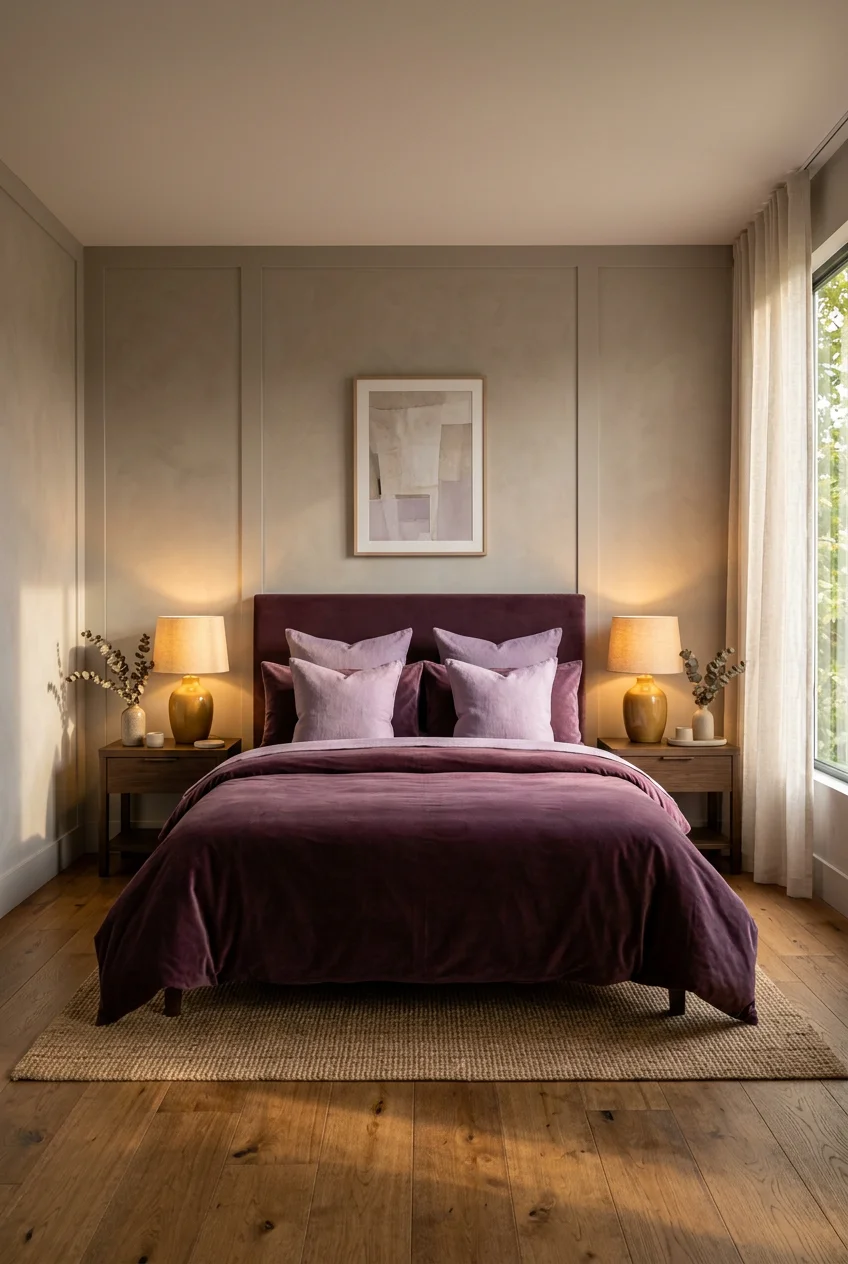
What’s Inside
- Muted Plum Tones for a 2026 Purple Bedroom Aesthetic
- Layering Shades of Purple for Depth
- Incorporate Metallic Brass Accents
- Choose a Velvet Headboard as a Statement Piece
- Balance with Neutrals Using the 60-30-10 Rule
- Utilize Smart Lighting with Warm Tones
- Don’t Overlook Complementary Colors as Pops
- Consider a Dark Purple Accent Wall
- Incorporate Nature-Inspired Elements
- Choose Luxury Bedding for a Royal Feel
- Expert Tip: Test Paint Swatches Extensively
- Surprising Trick: Paint Only the Trim Purple
- Trending in 2026: Burnished Lilac Accents
- Avoiding the Childish Lavender Trap in a Purple Bedroom Aesthetic
- Integrate Layered Textured Elements
- Grounding with Dark Walnut Furniture
- Abstract Purple Art Integration
- Heavy Drapery for Mood Control
- Scenting the Space to Match the Mood
Three years ago, I painted my guest room what I thought was a sophisticated mauve. Under the 60-watt bulb, it looked exactly like a crushed grape Popsicle. Nailing a true purple bedroom takes actual math and color theory, not just picking a pretty chip at the store. It’s a notoriously tough color to balance. Go too light, and it looks like a nursery. Go too dark without the right lighting, and it’s a cave. I spent six months repainting and returning bedding before I figured out the formulas that make purple work in an adult space. I’m sharing the exact paint codes, fabric weights, and lighting temps that actually work. This isn’t about slapping purple on every surface. It’s about being methodical so the room feels intentional and grounded. I learned that the hard way. Here’s how I break it down.
1. Muted Plum Tones for a 2026 Purple Bedroom Aesthetic

Let’s start with the base. Bright purples reflect too much light and strain the eyes. For a space where you want to sleep, you need muted plum tones with heavy gray or brown undertones. Designers are pushing these earthy, grounding shades for 2026 because they feel warmer. Last October, I bought a gallon of Benjamin Moore Cinnamon Slate for $65 at Home Depot. It’s a muddy, complex plum that shifts throughout the day. When I rolled it on, the room finally felt quiet. The gray base absorbs light instead of bouncing it around. Another solid pick is Sherwin-Williams Plum Brown SW 6272, which runs about $72 a gallon. You need premium paint here. Cheap formulas lack the complex pigments to keep dark colors from looking flat. Apply two coats with a 3/8-inch nap roller for a completely opaque, suede-like finish.
2. Layering Shades of Purple for Depth

If you buy a bed-in-a-bag set where everything matches perfectly, your room will look flat. You need to layer intensities to build depth. The rule is simple: keep the undertones identical. If your walls are a warm plum, use warm lavender and dusty mauve textiles. I learned that the hard way when I paired a cool-toned violet blanket with warm plum sheets. The clash was jarring. Right now, my bed features a deep plum linen duvet cover from Target’s Casaluna line that cost $129 for the queen size. I paired it with two 20×20 inch dusty mauve cushions I found at Crate & Barrel for $45 each. The contrast between the heavy duvet and the lighter cushions breaks up the visual weight. It’s a methodical way to use color without letting it swallow the furniture.
3. Incorporate Metallic Brass Accents

Purple absorbs light, especially in matte finishes. You must introduce reflective surfaces to bounce light back. Brass and gold are the best metals for this because their yellow undertones sit opposite purple on the wheel, creating immediate contrast. Silver looks too cold and makes purple read as sterile. I use a pair of West Elm overlapping square brass table lamps that cost $129 each on my nightstands. The brass warms up the cool tones and provides a sharp break against the dark walls. You don’t need much metal to make an impact. A 24×36 inch gold-framed mirror from Lowe’s, priced at $89, hung opposite a window will double your natural light while adding warmth. Just keep the finish consistent. Mixing polished brass with brushed nickel creates visual clutter.

50×70 Inch Rust Throw Blanket – Soft & Fluffy Fleece
Honestly, 50×70 Inch Rust Throw Blanket – Soft & Fluffy Fleece surprised me — sturdier than it looks in the photos, and over 12 buyers gave it 4.5 stars.
4. Choose a Velvet Headboard as a Statement Piece

A standard wooden headboard often gets lost against dark walls. To anchor the bed, you need a material that absorbs color differently than drywall. A plum or deep violet velvet headboard works perfectly. The pile catches the light, making the color look richer than flat paint. I bought a Mercer41 queen velvet headboard on Wayfair for $145. It’s 54 inches tall, so it stands out against the wall. There’s a downside: velvet is a dust magnet. I use a lint roller on it every Tuesday when I wash my sheets, or it looks dingy. Despite the maintenance, the texture contrast is necessary. If you pair a velvet headboard with crisp cotton percale sheets, the friction between the matte cotton and the plush velvet makes the bed look expensive.
5. Balance with Neutrals Using the 60-30-10 Rule

You can’t saturate a room with 100 percent purple and expect it to look sophisticated. Interior designers rely on the 60-30-10 rule. Your room needs 60 percent neutral, 30 percent purple, and 10 percent accent color. The easiest way to hit that 60 percent neutral quota is through your flooring and bedding. If your walls are medium purple, you need a massive visual break on the floor. I own an 8×10 foot cream wool rug from Rugs USA that cost $215. It covers the floor under the bed and stops the purple from feeling suffocating. I also use crisp white 300-thread-count cotton sheets from Brooklinen, which run $149 for a queen set. The white sheets and cream rug act as negative space. They give your eyes a place to rest.
6. Utilize Smart Lighting with Warm Tones

Purple is notorious for shifting. Under cool daylight bulbs, a warm plum will suddenly look like a harsh, cheap violet. Lighting completely dictates how this color behaves. You must control the color temperature. I swapped out all my lamps for Philips Hue White and Color Ambiance smart bulbs. They cost $49.99 each, which adds up, but they solve the problem. I set the app to a warm 2700K in the evenings. The yellow light neutralizes the harsh blue undertones, making the walls look like a cozy, dark brown-plum. In the morning, I shift them to a crisp 3000K to mimic sunlight. If you use standard 4000K or 5000K daylight bulbs, your room will look like a hospital waiting room. Warm lighting is non-negotiable. Trust me.

PU Leather Square Tissue Box Cover
A dependable everyday pick — PU Leather Square Tissue Box Cover – Multi-Functional Tissue Box Holde pulls in 947 ratings at 4.5 stars. Not flashy, just solid.
7. Don’t Overlook Complementary Colors as Pops

A room heavily reliant on purple needs friction. If everything is harmonious, the space feels sleepy. Introduce friction with complementary colors. Yellow, chartreuse, and mustard sit directly across from purple on the color wheel. A tiny dose makes the purple look deeper and more saturated. I keep a single 18×18 inch mustard yellow velvet throw pillow from Target on my bed. It cost $20. That small square of yellow is the first thing you notice. It breaks up the heavy plum bedding perfectly. You can also achieve this with art. A 16×20 inch abstract print with small strokes of chartreuse green does the same job. Keep this to the 10 percent accent rule. If you add yellow curtains, pillows, and a rug, you’re living in a sports team’s locker room.
8. Consider a Dark Purple Accent Wall

Painting all four walls a dark shade isn’t practical for small rooms with only one window. It absorbs too much light. The alternative is painting a single accent wall behind the bed. This defines the sleeping zone without turning the room into a cave. I used Sherwin-Williams Kimono Violet SW 6839 for an accent wall in my old apartment. It’s a highly saturated, true purple that costs $72 a gallon. Because it’s dark, it acts like a shadow, making the bed pop forward. Here’s a warning: dark, saturated paints show every flaw in your drywall. I didn’t patch a small dent from a picture frame, and the paint caught the light right on that spot, making it glaringly obvious. Sand your wall perfectly smooth and use a high-quality primer like Kilz 2 ($22 a gallon) first. You might also like: 20 Aesthetic Wall Stickers Bedroom You Need to See
9. Incorporate Nature-Inspired Elements

Purple is a synthetic-looking color. It doesn’t appear in large doses in nature, which is why a purely purple room can feel artificial. You must ground it with organic elements. Live plants are the easiest way to inject texture and cut the sweetness. Last Tuesday at Sprouts, I bought a snake plant in a 6-inch plastic pot for $24.99. I dropped it into a terracotta planter I owned and set it on my dresser. The dark green leaves and the rough, earthy terracotta made the room feel like a real, livable space. Snake plants and ZZ plants are ideal for bedrooms because they tolerate low light. The green foliage provides a natural, quiet contrast to the purple walls that feels much more sophisticated than artificial decor. You might also like: 20 Simple Bedroom Wall Design Ideas That Actually Work

Ultra Soft Cozy Faux Fur Throw Blanket
Ultra Soft Cozy Faux Fur Throw Blanket has been one of the most consistently praised picks in this category. 1 reviewers averaged 4.5/5.
10. Choose Luxury Bedding for a Royal Feel

Historically, purple is associated with royalty because the dye was expensive. You can lean into this, but do it with fabric weight, not just color. Flimsy, thin polyester sheets in purple look cheap. You need heavy, substantial textiles. I use a Julian Charles plum duvet set that I bought on sale for $185. The fabric has a high thread count and a dense weave, so it drapes heavily over the sides instead of bunching. If you prefer a matte look, a heavy flax linen duvet cover provides excellent texture. Linen wrinkles naturally, which adds a relaxed, lived-in feel that prevents the formal purple color from feeling too stiff. Avoid shiny satin or silk sheets. They reflect too much light and push the aesthetic into an outdated 1980s nightclub look. Stick to matte, heavy fabrics. You might also like: 17 Small Guest Bedroom Ideas That Actually Work
11. Expert Tip: Test Paint Swatches Extensively

Skipping the swatch phase is the fastest way to ruin a room. Purple paint chips in the hardware store lie. The fluorescent lighting makes them look completely different than they will in your house. I tried this wrong for months. I’d tape a tiny 2×2 inch paper square to the wall and guess. Now, I use Samplize peel-and-stick swatches. They cost $5.95 each and measure 9×14.75 inches. They use real paint, not dyed paper. I order three shades of plum, stick them to the wall facing the window, and leave them for 48 hours. You must look at them at 8 AM, 2 PM, and 9 PM with the lamps on. A shade that looks dusty at noon might look like neon grape juice at night. Don’t buy a $70 gallon of paint until you’ve stared at a massive swatch in your specific lighting.
12. Surprising Trick: Paint Only the Trim Purple

If committing to purple walls terrifies you, there’s a subtle workaround. Paint the walls a warm, creamy off-white, and paint the baseboards, window casings, and door frames a deep, saturated purple. I did this in my office using Farrow & Ball’s Brinjal, a rich eggplant shade that costs $140 a gallon. You only need one quart for the trim, which brings the cost down to about $45. This frames the room and adds architectural interest without darkening the space. It’s an unexpected detail. Most people default to white trim, so using a dark plum immediately makes the room look custom. You must use a high-gloss or semi-gloss finish for the trim so it stands up to scuffs from the vacuum. The glossy finish also catches the light beautifully against flat, matte walls.

COOVA Faux Fur Throw Blanket for Couch
If you want something that just works, COOVA Faux Fur Throw Blanket for Couch is a safe bet (12 reviews, 4.5 stars).
13. Trending in 2026: Burnished Lilac Accents

Pantone’s Spring/Summer 2026 palette features a shade called Burnished Lilac (15-1905). It’s a smoky, gray-toned lavender that feels vintage rather than childish. If you want to update your room without repainting, bring this shade in through small furniture. I recently added a 16×16 inch velvet ottoman in a similar smoky lavender shade from CB2. It cost $149. I use it at the foot of my vanity. This muddy lilac works perfectly as a bridge between dark plum walls and white bedding. It softens the stark contrast. You can also introduce this color through a heavy ceramic vase or a stack of linen-bound books. The key is the gray undertone. If the lilac leans too pink, it loses that sophisticated quality and looks like standard pastel. Always look for the gray base.
14. Avoiding the Childish Lavender Trap in a Purple Bedroom Aesthetic

The biggest mistake people make is accidentally creating a room that looks like it belongs to a seven-year-old. This happens when you mix light lavender walls with light pastel bedding and white furniture. It lacks visual weight. To fix this, you must introduce charcoal or black. I pair my lighter purple walls with a set of charcoal gray percale sheets from Brooklinen, which cost $149. The dark, moody gray instantly matures the space. I also swapped out my white ceramic table lamps for matte black metal ones from Target ($40 each). The black accents act as a visual anchor. They stop the light purple from floating away into pastel sweetness. If your room feels too young, don’t repaint immediately. Try changing your hardware, picture frames, and bed sheets to matte black or dark charcoal first.
15. Integrate Layered Textured Elements

When you use a lot of one color, the room can feel flat. You combat this by aggressively layering different textures. The eye needs tactile variety. I use a formula of three distinct textures on the bed. First, a smooth, cool base layer using 400-thread-count cotton sateen sheets. Second, a rough, matte middle layer using a chunky knit cotton blanket from West Elm ($130). Third, a plush accent layer using a 50×60 inch faux fur berry-colored throw from Pottery Barn that costs $79. I drape the faux fur diagonally across the bottom corner. The way the light hits the smooth cotton, the matte knit, and the shiny faux fur creates shadows and highlights. This makes the purple tones look expensive. If you only use smooth cotton, the bed looks like a flat, uninviting block of color.

KSIPZE 100ft Led Strip Lights RGB Music Sync Color Changing
KSIPZE 100ft Led Strip Lights RGB Music Sync Color Changing Led Lights punches above its price — 388 buyers rated it 4.5 stars. I would buy it again.
16. Grounding with Dark Walnut Furniture

Light oak or white painted furniture against purple walls creates a high-contrast, casual look. If you want elegance, you need dark wood. Walnut and mahogany have warm, reddish-brown undertones that pair perfectly with cool and warm purples alike. The dark wood grounds the room and adds visual weight. I use an Article Taiga walnut nightstand that cost $249. The rich, dark grain against the muted plum wall looks incredibly sophisticated. It’s a classic pairing. I tried using a cheap, white laminate dresser in this room years ago, and it made the walls look like a cheap apartment paint job. The moment I brought in the heavy walnut piece, the wall color suddenly looked intentional. If real walnut is out of your budget, look for solid wood secondhand pieces and use a dark gel stain like Minwax Walnut ($18/quart).
17. Abstract Purple Art Integration

Hanging generic, mass-produced floral prints in a purple room is a fast track to looking like a dated hotel. You need large-scale abstract art to pull the palette together. Abstract art lets you introduce those necessary 10 percent accent colors without committing to a recognizable shape. I bought an 18×24 inch framed canvas print from Minted for $198. The composition is mostly cream and charcoal, with thick, messy strokes of plum and mustard yellow. Hanging this above the dresser ties the plum walls, the cream rug, and the yellow accent pillow together in one focal point. It proves to the eye that the palette is intentional. When hanging art over a bed or dresser, ensure the frame is at least two-thirds the width of the furniture below it. Anything smaller looks disproportionate and gets swallowed by the dark wall.
18. Heavy Drapery for Mood Control

Flimsy, sheer white curtains don’t work in a dark, moody bedroom. They look out of place, like you forgot to finish decorating. You need window treatments with physical weight. I use Half Price Drapes signature velvet blackout curtains in a dark plum shade. They cost $62 per 50×84 inch panel. I hang them high and wide. The curtain rod is mounted four inches below the ceiling line and extends eight inches past the window frame on each side. This creates the illusion of a massive window. The heavy velvet material blocks out streetlights completely, which is crucial for sleep, but it also adds a massive vertical block of texture. The thick folds catch the ambient light beautifully. I learned to steam them immediately after hanging. A $30 handheld Conair steamer removes the packaging creases. Wrinkled velvet looks incredibly cheap.
19. Scenting the Space to Match the Mood

Aesthetic isn’t just visual. If your room looks like a dark, moody, sophisticated plum sanctuary but smells like a generic synthetic vanilla plug-in, the illusion breaks. You must match the scent to the weight of the room. I skip the overly sweet floral candles. Instead, I use P.F. Candle Co.’s Teakwood & Tobacco 7.2 oz soy candle, which costs $24. It has notes of leather, teak, and sandalwood. The woody, masculine scent perfectly balances the inherent sweetness of the purple decor. I also keep a small $15 bottle of cedarwood essential oil from Whole Foods on my nightstand. I put three drops on a cotton ball and tuck it inside my pillowcase. It grounds the room sensorially. The heavy, earthy scent reinforces the visual warmth of the brass lamps and walnut furniture, completing the entire design on a subconscious level.
Designing a space with these tones takes patience, but the payoff is a room that actually helps you decompress. I’m completely done with sterile white bedrooms. Once you get the lighting and the undertones right, this color palette feels luxurious. No exaggeration. Pin this guide to your bedroom mood board so you have the specific paint codes and rules handy when you’re standing in the hardware store aisle.
Frequently Asked Questions
What colors go best with a purple bedroom aesthetic?
To create a mature purple bedroom aesthetic, pair deep plum or muted lavender with grounding neutrals like charcoal gray, cream, and warm walnut wood. For a dynamic pop of contrast, introduce small accents of mustard yellow or brass.
How do I keep a purple bedroom from looking childish?
Avoid mixing light pastel lavender walls with white furniture and pastel bedding. Instead, use muted, gray-toned purples like plum or burnished lilac, and anchor the space with dark elements like matte black hardware or charcoal gray sheets.
What is the best lighting for purple walls?
Purple color-shifts heavily under different lighting. Use warm 2700K to 3000K LED bulbs to neutralize the harsh blue undertones in purple paint. Cool daylight bulbs (4000K+) will make warm plum tones look like cheap, sterile violet.
Should I paint my whole bedroom purple?
If you use a light, dusty lilac, painting all four walls works well. If you prefer dark, saturated plum, consider painting just an accent wall behind the bed or painting only the room’s trim to prevent the space from feeling too dark.
