What’s Inside
- The 2/3 Rule for a Balanced Art Wall Bedroom Layout
- Mapping It Out With Paper Templates First
- Testing Layouts With Digital Visualization Apps
- Choosing Calm and Serene Pieces Over High Drama
- Mixing Mediums to Break Up the Grid
- Incorporating Custom Canvas Prints for Personal Storytelling
- Sourcing Affordable Art Without Sacrificing Quality
- Mastering the Three to Six Inch Spacing Rule
- Hanging Everything at the Proper Eye Level
- Securing Frames With Command Strips Instead of Nails
- Using Floating Shelves for a Flexible Art Wall Bedroom Display
- Adding Oversized Mounts for a High-End Finish
- Adopting the Soft Modern Aesthetic for 2026
- Committing to One XXL Statement Piece
- Upgrading to Solid Wood Frames to Avoid Looking Cheap
Three years ago, I stood in my bedroom staring at a lopsided grid of cheap frames. I was holding a half-empty mug of Trader Joe’s cold brew, which I promptly spilled on my rug out of sheer frustration. Getting an art wall bedroom layout right is surprisingly mechanical. It requires math, patience, and a tape measure. Most people just start hammering nails and hope for the best. I tried that for months before figuring out why my walls always looked like a messy dorm room. If you want a cohesive space, you’ve got to follow specific spacing and scale rules. Let’s walk through the exact steps to fix your layout.
1. The 2/3 Rule for a Balanced Art Wall Bedroom Layout

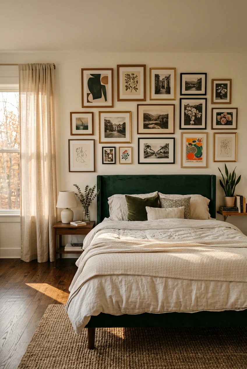
When you hang art above a bed or dresser, the scale dictates whether the room looks grounded or chaotic. I learned that the hard way. I hung a tiny 11×14 frame over my queen bed, and it looked like a postage stamp floating in a sea of drywall. The fix is the two-thirds rule. Your artwork, or the entire cluster of frames, needs to span roughly two-thirds the width of the furniture below it. A standard queen bed is 60 inches wide, which means your art arrangement should cover about 40 inches across. This creates a solid visual anchor. If you skip this math, your pieces will look disconnected. I use a Stanley 25-foot tape measure I bought at Home Depot for $9.97 to mark the exact boundaries before I do anything else. You don’t need to be perfect down to the millimeter, but hitting that 40-inch mark changes the entire balance of the wall. It pulls the bed and the art together into a single cohesive unit.
2. Mapping It Out With Paper Templates First

Don’t pick up a hammer until you map your layout with paper. I skipped this step last Tuesday while trying to finish a client’s guest room in a hurry. I eyeballed the spacing, drove the nails, and immediately realized the whole grouping was three inches too far to the left. I had to pull everything down and patch six holes with spackle. Now, I use brown paper bags from Whole Foods. I trace each frame onto the paper, cut them out, and stick them to the wall using Scotch Blue Painter’s Tape (the 1.41-inch wide roll costs $4.49 at Target). This tape won’t peel your drywall paint when you inevitably move things around. You can shift the paper squares fifty times until the layout feels right. Leave the paper up for a full day. Walk past it in the morning light and again at night. You’ll notice if a piece feels too heavy on one side or if the gaps are uneven. Once you’re satisfied, you can literally hammer the nail directly through the paper template.
3. Testing Layouts With Digital Visualization Apps

Before I commit to buying prints, I test them digitally. I used to print tiny thumbnails on my printer and hold them up, which was entirely useless for judging scale. Now I use WallApp, a free browser-based tool, or ArtPlacer, which costs $15 a month for a basic plan. You take a photo of your empty wall, upload it, and drop in digital files of the art you want to buy. The apps let you adjust the dimensions so you can see exactly how a 24×36 print looks next to an 8×10. I did this last month when deciding between a single large canvas and a gallery grid. The digital mockup proved the grid looked too busy against my patterned wallpaper. It saved me from spending $200 on frames I didn’t need. If you’re buying art online, save the product images and run them through one of these apps. It takes ten minutes and prevents the terrible realization that the colors clash with your headboard.

WOPITUES Wood Floating Shelves Set of 6
If you want something that just works, WOPITUES Wood Floating Shelves Set of 6 is a safe bet (66 reviews, 4.5 stars).
4. Choosing Calm and Serene Pieces Over High Drama

The bedroom is for sleeping, not for analyzing intense visual stimuli. In my early twenties, I bought a massive, bright red abstract canvas at a flea market and hung it directly across from my bed. I couldn’t sleep for a week. It felt like staring at a neon stop sign every time I opened my eyes. The current trend leans heavily toward soft modernism, prioritizing muted scenery prints and warm minimalist pieces. I replaced the red disaster with a 16×20 inch tonal nature print from Minted that cost $48. The muted greens and soft grays instantly lowered my heart rate. When you’re selecting pieces, look for low-contrast images. You want artwork that fades into the background when the lights go down, not something that demands your attention. I prefer matte finishes over glossy ones because glossy paper reflects bedside lamps and creates harsh glare. A matte print absorbs the light and keeps the room feeling quiet. I put the Minted print in a simple oak frame with a 2-inch white mat to give it breathing room. You might also like: 20 Fresh Bedroom Ideas to Transform Your Space
5. Mixing Mediums to Break Up the Grid

A wall of identical rectangular frames looks like a corporate office hallway. You need different textures to make the arrangement feel intentional and residential. I break up straight lines by adding circular objects or woven materials. Right now, I own an IKEA STOCKHOLM round mirror (the 31.5-inch version, which costs $49.99) anchored in the center of my bedroom wall. The walnut veneer frame adds warmth, and the reflective surface bounces morning light into the dark corners of the room. Around the mirror, I layered three rectangular prints and a small 6-inch woven basket I found at a thrift store. You can also use small floating shelves to hold a 4-ounce ceramic vase or a trailing pothos plant. Mixing glass, wood, canvas, and textiles creates depth. I tried an all-black frame gallery once, and it looked incredibly flat and heavy. Adding just one metallic or woven element breaks the visual monotony and gives your eyes somewhere interesting to rest. I recommend starting with one non-traditional item per three framed prints.
6. Incorporating Custom Canvas Prints for Personal Storytelling

Generic hotel art works fine for staging a house, but your bedroom should actually look like you live there. I used to buy random geometric prints just to fill empty wall space. They meant nothing to me. Now, I mix in personal photos, but I treat them like fine art. I use Mixtiles to print black-and-white photos from my camera roll. Their 8×8 inch canvas prints cost $11 each and come with an adhesive backing that sticks directly to the drywall. The matte finish makes iPhone photos look surprisingly professional. Last year, I printed four photos from a hiking trip and arranged them in a tight square. Because they’re black and white, they blend perfectly with my other art instead of looking like a messy scrapbook. The adhesive backing means I don’t need to drill holes for these smaller filler pieces. If I get bored of the photos, I just peel them off and stick new ones up. It takes five minutes and costs less than a takeout dinner. I usually order them in batches of three to maintain odd numbers. You might also like: 17 Minimalist Bedroom Ideas Worth Trying

Fixwal Black Floating Shelves for Wall
Fixwal Black Floating Shelves for Wall has been one of the most consistently praised picks in this category. 42 reviewers averaged 4.5/5.
7. Sourcing Affordable Art Without Sacrificing Quality

You don’t need to spend thousands of dollars at a gallery to get high-quality pieces. I buy almost all my filler art from independent artists online. Society6 and Desenio are my standard go-to sites. An 18×24 inch heavyweight art print on Society6 usually costs around $24.99. The paper quality is thick enough that it won’t ripple inside the frame, which is a common problem with cheap poster paper. I specifically look for archival matte paper. I once bought a $5 digital download on Etsy and printed it at a local pharmacy on standard glossy photo paper. It looked terrible. The ink bled, and the glossy finish made it look like a cheap magazine page. If you buy digital downloads, take them to a professional printer and ask for 100-pound matte cardstock. It usually costs about $3.50 per page, but the result looks identical to a $50 art print. Spending an extra three dollars on the paper makes all the difference in the final aesthetic. I keep a dedicated folder on my laptop for art downloads so I can batch print them. You might also like: 15 Charming Men’s Bedroom Wall Decor Ideas You Need to See
8. Mastering the Three to Six Inch Spacing Rule

Spacing is where most gallery walls fall apart. If frames are too close, it looks cluttered. If they’re too far apart, the pieces look disconnected. The sweet spot is a gap of three to six inches between every single frame. I use a standard 12-inch wooden ruler I bought at Walmart for $0.97 to measure the gaps. I tape the ruler to the wall between the paper templates to ensure the spacing is identical on all sides. For smaller 5×7 frames, I stick to a tight 3-inch gap. For larger 24×36 pieces, I expand the gap to 5 or 6 inches so the art has room to breathe. I learned this after hanging a cluster of frames with a 1-inch gap. The frames kept bumping into each other when the door closed. Consistent spacing acts like invisible glue. Even if you’ve got completely mismatched frames and different art styles, a uniform 4-inch gap will make the entire collection look intentional. I mark the 4-inch line directly on my wooden ruler with a Sharpie.
9. Hanging Everything at the Proper Eye Level

The biggest mistake I see in bedrooms is art hung way too close to the ceiling. It forces you to crane your neck and makes the ceiling feel lower. Galleries hang art so the center of the piece is exactly 57 to 60 inches from the floor, which is standard human eye level. I mark the 58-inch height on my wall using a pencil and a HyperTough hammer I got at Walmart for $6.88. If you’re hanging art above a dresser, you need to leave 6 to 12 inches of blank space between the top of the dresser and the bottom of the frame. Last year, I hung a massive print just two inches above my dresser. Every time I set down my jewelry dish or a water bottle, it scraped against the bottom of the frame. Leaving that 8-inch gap gives you functional clearance for lamps, books, and daily items. Always measure from the floor up, find the center point of your frame, and match it to that 58-inch mark. Resist the urge to adjust this height to your own eye level.

upsimples Floating Shelves for Wall
A dependable everyday pick — upsimples Floating Shelves for Wall pulls in 4 ratings at 4.5 stars. Not flashy, just solid.
10. Securing Frames With Command Strips Instead of Nails

I refuse to use nails unless a frame weighs more than fifteen pounds. I live in an older house with plaster walls, and hammering a nail usually causes a 3-inch chunk of plaster to crumble onto the baseboards. I rely entirely on Command Large Picture Hanging Strips. A 12-pair pack costs $12.49 at Costco. You need four pairs per frame, which means one pack hangs three large pieces. Each pair holds about four pounds, giving you 16 pounds of total support. I made the mistake of buying cheap dollar-store adhesive strips once. At 3 AM, a heavy glass frame fell off the wall and shattered all over my hardwood floor. Stick to the name brand. To use them correctly, you’ve got to press the strips against the wall for a full 30 seconds, then wait an hour before actually hanging the frame on them. I also wipe the wall with 2 tablespoons of rubbing alcohol on a cotton pad before applying the strips to remove any hidden dust.
11. Using Floating Shelves for a Flexible Art Wall Bedroom Display

If you like to swap your art frequently, an art wall bedroom layout with floating shelves is the best approach. I get bored of my decor every six months. Pulling down frames and measuring new gaps is exhausting. Instead, I installed two IKEA LACK Wall Shelves. The 43 1/4 inch version costs $19.99. I staggered them on the wall and just lean my framed prints against the drywall. This lets me layer a large 18×24 frame behind a smaller 8×10 frame. I also mix in a 6-ounce glass candle and small trailing plants to soften the hard edges of the frames. One negative is that the shelf itself collects dust very quickly, so I’ve got to wipe it down weekly. However, the flexibility is worth the extra dusting. When I buy a new print, I don’t need a hammer or a tape measure. I just slide the old frame out and prop the new one up. It takes ten seconds and completely refreshes the room’s focal point. Make sure your frames have a sturdy easel back or are thick enough to stand without sliding forward.
12. Adding Oversized Mounts for a High-End Finish

The fastest way to make a $10 print look like it costs $200 is to use an oversized mat. A mat is the thick white cardboard border inside the frame. Most store-bought frames come with a standard 1-inch mat, which looks cheap and cramped. I throw those away. Instead, I buy custom mats from Michaels. A custom 16×20 inch mat cut to fit an 8×10 photo costs about $14.99. This gives the artwork four inches of negative white space on every side. That breathing room draws the eye directly to the art and adds a layer of architectural sophistication. I tried cramming an 8×10 print into an 8×10 frame without a mat last winter. It looked incredibly flat and visually heavy. The white border acts as a visual palate cleanser, especially if your bedroom walls are painted a dark color. When you’re shopping for mats, always choose an acid-free option so the inner bevel doesn’t turn yellow and stain your artwork over time. I specify a ‘bright white’ core when ordering from the framing counter.

QEEIG Floating Shelves for Wall Bathroom Shelf Bedroom
If you want something that just works, QEEIG Floating Shelves for Wall Bathroom Shelf Bedroom Kitchen Living is a safe bet (45 reviews, 4.5 stars).
13. Adopting the Soft Modern Aesthetic for 2026

The stark, high-contrast minimalist look of the 2010s is completely dead. 2026 is all about the soft modern aesthetic. This means trading harsh black-and-white graphics for warm neutrals, organic shapes, and tactile surfaces. I recently bought a textured linen canvas from West Elm for $120. It doesn’t feature a clear picture on it; it’s just a subtle, textured plaster design in a warm oatmeal color. It brings a human, handmade element to the room that a glossy photograph simply can’t achieve. I used to display a very rigid, geometric black-and-white print above my nightstand. It felt clinical, like a doctor’s office. The soft modern approach relies on materials like raw canvas, unbleached cotton, and matte clay tones. If you’re building a new collection, look for pieces with soft, blurred edges rather than sharp vector lines. These softer visuals tell your brain it’s time to relax, which is exactly what you need in a bedroom environment. I pair these textured pieces with warm 2700K LED light bulbs in my bedside lamps.
14. Committing to One XXL Statement Piece

Sometimes, the best gallery wall is just one massive piece of art. If you’ve got a large, empty wall, hanging fifteen small frames can look busy and chaotic. A single XXL statement piece brings structure and immediate impact. I consider anything wider than 40 inches to be XXL. I bought a massive 45×60 inch oversized abstract canvas from Crate & Barrel for $299. I hung it squarely above my dresser, and it completely changed the room’s proportions. The ceiling suddenly looked taller, and the room felt deliberately designed. The downside to massive art is the logistics. I couldn’t fit the canvas in my sedan and had to rent a truck from Home Depot for $19 just to get it home. You also definitely need a second person to help you lift and level it. But once it’s up, the visual quietness of a single large piece is incredibly calming. It acts as a singular focal point rather than forcing your eyes to dart between a dozen smaller images. When hanging something this heavy, skip the adhesive strips and use a dedicated French cleat hanging system.
15. Upgrading to Solid Wood Frames to Avoid Looking Cheap

You can buy a gorgeous, expensive piece of art, but if you put it in a cheap plastic frame, the whole room suffers. Interior designers always notice bad framing. I bought a set of five black MDF frames from Amazon for $30. Within a month, the black veneer started peeling off the corners, exposing the ugly brown particle board underneath. The plastic covers also scratched every time I dusted them. I threw them all in the trash. Now, I only buy solid wood frames. I usually grab the Wood Gallery Frames from Pottery Barn, which start around $49.50 for the smaller sizes. Yes, they cost more upfront, but the joints are tightly secured, the wood grain looks authentic, and they use real glass instead of flimsy acrylic. The glass is crucial because it doesn’t warp or scratch when you clean it with Windex. If you’re on a strict budget, go to a thrift store and buy ugly art that happens to be in a high-quality solid oak frame. I found a stunning solid mahogany frame at Goodwill last month for $6.99. No exaggeration.
Building a cohesive layout doesn’t happen by accident. It takes measuring, planning, and a willingness to patch a few drywall mistakes along the way. I’ve spent hours staring at paper templates and adjusting spacing by a quarter of an inch, but that tedious work is exactly what separates a chaotic room from a restful one. Don’t rush out and buy twenty pieces of cheap art just to fill the space. Start with one oversized piece or a small cluster of three solid wood frames, and let the collection grow as you find pieces that actually mean something to you. I’m still swapping out prints and adjusting my floating shelves when I get bored. If you follow the two-thirds rule and keep your spacing consistent, you can’t really mess it up. Save this guide and reference the measurements the next time you’re standing in the middle of your room with a hammer in your hand. Pin your favorite layouts, grab some painter’s tape, and start mapping out your walls tonight.

Qukaka Floating Shelves for Wall Decor
Qukaka Floating Shelves for Wall Decor punches above its price — 169 buyers rated it 4.5 stars. I would buy it again.
Frequently Asked Questions
How high should I hang pictures in an art wall bedroom?
The center of your artwork should sit exactly 57 to 60 inches from the floor, which is standard human eye level. If hanging above a dresser or bed, leave a 6 to 12-inch gap between the furniture and the bottom frame.
How much space should be between frames on a bedroom gallery wall?
Maintain a consistent gap of 3 to 6 inches between every frame. Use a tight 3-inch gap for smaller 5×7 prints, and expand to 5 or 6 inches for larger 24×36 pieces so the arrangement doesn’t look cluttered.
How wide should art be over a queen bed?
Follow the two-thirds rule. A standard queen bed is 60 inches wide, so your art wall or single statement piece should span roughly 40 inches across to create a balanced visual anchor without overwhelming the space.
Can I hang an art wall without using nails?
Yes, Command Large Picture Hanging Strips are incredibly reliable for damage-free hanging. Use four pairs of large strips per frame to support up to 16 pounds. Always clean the wall with rubbing alcohol first and wait an hour before hanging.
