What’s Inside
- Embrace Warm Gray Undertones Instead of Cool Grays
- Layer Textures Aggressively
- Introduce Earthy and Dusty Jewel Tones
- Select the Right Rug Size for Your Bed
- Strategically Place Wall Art Above the Headboard
- Opt for Warm-Toned Layered Lighting
- Choose Bedding for Contrast or Monochromatic Harmony
- Incorporate Natural Elements and Greenery
- Avoid the Outdated Greige Mistake
- Consider a Wall-to-Wall Shelter Headboard
- Use Pattern on Pattern for Expressiveness
- Integrate Metallic Accents for Contrast
- Hang Bold Art for Better Sleep Dynamics
- Apply Textured Gray Wall Treatments
- Use Gray as a Grounding Bridge Color
Most people get gray headboard decor wrong by treating it like a blank canvas for more gray. The result? A room that feels like a corporate hotel suite instead of a cozy retreat. Gray is a great neutral, but it needs deliberate styling, aggressive texture mixing, and specific lighting to work in a home. If you just throw a gray bed into a white room with standard builder-grade lighting, the whole setup falls flat. It’s a total snooze. If you only try one idea from this list, make it #2. Layering heavy, contrasting textures masks the basic nature of a standard upholstered headboard and makes the whole bed look custom.
Skip this if: You’re aiming for a stark, ultra-minimalist white-box aesthetic. Gray needs proper lighting, layered textiles, and warm undertones to avoid looking like a concrete bunker, so if you’re stuck on harsh daylight LEDs or bare surfaces, these tricks won’t save your space.
1. Embrace Warm Gray Undertones Instead of Cool Grays

Cool, icy grays are out. They make a bedroom feel sterile. For a cohesive look, pair your gray headboard with warmer wall colors that feature brown, beige, or green undertones. Sherwin-Williams’ Universal Khaki or Valspar’s Warm Eucalyptus are solid choices that immediately soften the room. A standard bedroom usually needs about 1 gallon of paint for two solid coats. When you use a warm, earthy gray-green, the fabric of a standard headboard finally looks intentional. A common mistake is matching the wall paint exactly to the headboard fabric. This creates a flat, muddy void. You need contrast. If your headboard is charcoal, go light on the walls. If the headboard is a pale silver, choose a deeper, moodier wall color. The matte finish of a quality interior paint absorbs light beautifully, creating a soft, velvety backdrop that makes even budget-friendly headboards look expensive. I learned that the hard way years ago.
Best for: North-facing rooms that lack natural sunlight and need artificial warmth.
The catch: Warm grays with heavy brown undertones can sometimes pull a fleshy pink in south-facing rooms depending on the time of day.
2. Layer Textures Aggressively

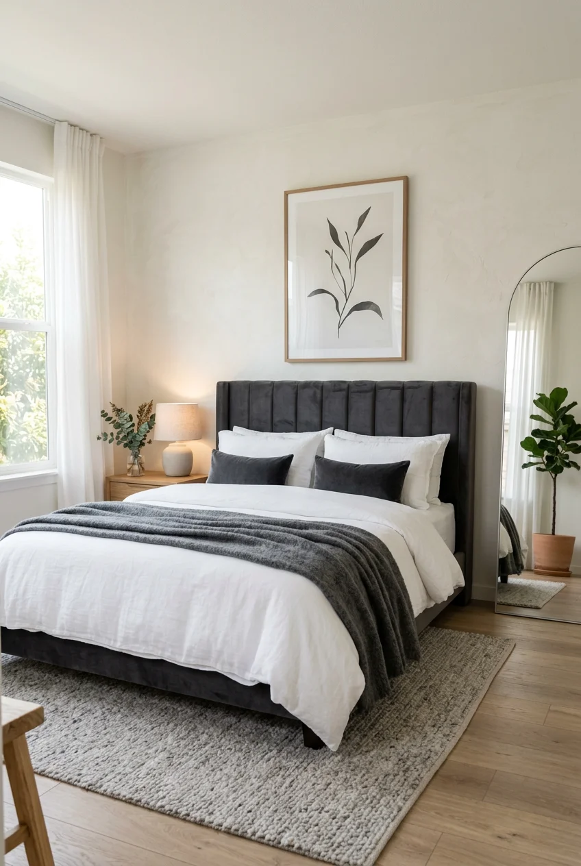
A flat gray headboard paired with flat cotton sheets is a recipe for a boring room. You have to layer textures to bring the space to life. Take a standard piece like the LUCID Mid-Rise Upholstered Headboard and surround it with heavy, tactile fabrics. Think a rumpled linen duvet cover, a chunky knit wool throw blanket at the foot of the bed, and heavily textured velvet or boucle accent cushions. When washing your linen duvet, add 1/2 cup of white vinegar to the rinse cycle to keep fibers soft without using artificial softeners that leave a waxy residue. The visual weight of these materials creates shadows and highlights, preventing the gray from looking one-dimensional. The contrast between a smooth upholstered headboard and a rough, nubby throw pillow is exactly what gives a bedroom that curated look. Trust me.
The catch: Highly textured fabrics like boucle and chunky knits attract pet hair and dust like a magnet, requiring constant lint-rolling.
3. Introduce Earthy and Dusty Jewel Tones

Gray is the perfect backdrop for rich, saturated colors, but primary colors will make the room look like a playroom. Instead, bring in earthy mid-tones and dusty jewel tones. Target’s Threshold line often carries ceramic vases in warm terracotta that look fantastic on a bedside table. Pair your gray bed with a set of Pillow Perfect throw pillows in a rich emerald velvet or a subdued cranberry red. These muted tones add sophistication without screaming for attention. A common mistake is scattering too many different colors around the room. Pick one or two jewel tones and repeat them in your artwork, a throw blanket, and a small decorative object. This creates a deliberate color story rather than a chaotic jumble.
The catch: Deep jewel tones can make a small room feel slightly darker, so you’ll need to compensate with adequate ambient lighting.

Leeleberd Led Lights for Bedroom 100 ft (2 Rolls of 50ft)
A dependable everyday pick — Leeleberd Led Lights for Bedroom 100 ft (2 Rolls of 50ft) Music Sync C pulls in 204 ratings at 4.5 stars. Not flashy, just solid.
4. Select the Right Rug Size for Your Bed

A rug anchors the bed and breaks up the floor, but most people buy rugs that are far too small. For a standard queen bed, you need an 8×10 foot rug. This size allows the rug to comfortably extend beyond the foot and sides of the bed, and it provides enough space for the front legs of your nightstands to rest on the fibers. If you’re working with a very tight space, a 6×9 foot rug is a decent compromise, providing about 24 inches of coverage on both sides. Costco frequently stocks large area rugs in muted traditional patterns that pair beautifully with gray upholstery. A rug with subtle hints of charcoal, rust, or navy will tie the whole room together.
Best for: Bedrooms with hard flooring like wood or laminate that echo sound.
The catch: An 8×10 rug is extremely heavy and usually requires two people to properly position under a heavy bed frame.
5. Strategically Place Wall Art Above the Headboard

Hanging art above a bed is tricky. Most people hang these way too high. The bottom edge of your artwork should sit exactly 6-8 inches above the top of your headboard. This keeps the art connected to the bed visually. Furthermore, the art piece or gallery grouping should span 60-80% of the headboard’s width. For a standard 60-inch wide queen headboard, your art arrangement should be between 36 and 48 inches wide. Anything wider makes the arrangement look top-heavy and unbalanced. A large canvas with subtle abstract strokes in charcoal and cream works perfectly to bridge the gap between a plain wall and a solid gray headboard.
The catch: Large-scale framed art is heavy and requires heavy-duty drywall anchors, not just standard picture nails, to prevent it from crashing down on you at night.
6. Opt for Warm-Toned Layered Lighting

Lighting dictates how gray is perceived. Under harsh, cool lighting, a gray headboard looks like office furniture. You must use warm-toned LED bulbs, specifically in the 2700K to 3000K range, for all fixtures in the bedroom. Avoid overhead lighting when possible and rely on layered ambient light. A pair of bedside lamps, like the Kodu Grey Table Lamp from Adairs, adds a soft pool of light right where you need it. Alternatively, install wall-mounted sconces like the Erin Glass Wall Light from Dunelm. Sconces free up valuable nightstand real estate and cast a beautiful wash of light down the wall, highlighting the texture of your headboard. It’s a total win. You might also like: 15 Beautiful Mirror Behind Nightstand Ideas You’ll Love
The catch: Hardwired wall sconces require hiring an electrician, and plug-in sconces leave a visible cord dangling down your wall.

Tenmiro Led Lights for Bedroom 100ft (2 Rolls of 50ft)
A dependable everyday pick — Tenmiro Led Lights for Bedroom 100ft (2 Rolls of 50ft) Music Sync Colo pulls in 786 ratings at 4.5 stars. Not flashy, just solid.
7. Choose Bedding for Contrast or Monochromatic Harmony

Your bedding choice makes or breaks the setup. For a crisp, hotel-like aesthetic, pair the gray upholstery with stark white sheets. Walmart’s Better Homes & Gardens line offers affordable white cotton sets that look sharp against a dark charcoal headboard. If stark white feels too clinical, embrace a monochromatic look by layering varying shades of gray. Start with light silver sheets, add a medium gray duvet, and finish with a dark charcoal throw blanket. This tonal approach adds massive visual interest without introducing a single new color. A common mistake is buying a “bed in a bag” where everything matches the headboard exactly. You want varying shades, not a uniform block of a single color. You might also like: 18 Modern Bedroom Decor You Need to See
The catch: Maintaining bright white sheets requires regular bleaching and washing with specialized detergents to prevent them from yellowing over time.
8. Incorporate Natural Elements and Greenery

Gray is an inherently synthetic, industrial color. You have to actively fight this by bringing in organic materials. A light oak or walnut nightstand provides immediate warmth and visual relief from the gray fabric. Add a live plant to filter the air and introduce a vibrant pop of green. A ZZ plant or a Snake plant is ideal for bedrooms because they tolerate low light and neglect. You can usually find healthy starter plants at Trader Joe’s or Sprouts. A ZZ plant in a 6-inch ceramic pot only needs about 4 oz of water every few weeks. Place it on your nightstand or a nearby dresser. The organic, irregular shapes of the leaves break up the rigid, straight lines of a typical rectangular headboard. You might also like: 19 Aesthetic French Bedroom You Need to See
Best for: Sterile, modern bedrooms that feel too rigid or cold.
The catch: Real plants require maintenance, proper drainage, and can attract fungus gnats if you accidentally overwater them.
9. Avoid the Outdated Greige Mistake

The early 2010s were dominated by “greige”—a pale, muddy mix of gray and beige that designers now recognize makes a room feel unresolved. Skip the fat-free stuff. If you’re using a gray headboard, commit to a gray with a clear, deliberate undertone. A subtle purple-gray offers sophistication, while a deep charcoal provides dramatic contrast. When you pair a basic gray headboard with greige walls and bedding, the room looks like it’s covered in dust. Instead, let the headboard be the true gray element, and use crisp whites, deep woods, or genuine colors for the rest of the room. Clarity in your color choices prevents the space from looking washed out.
The catch: Committing to a strong, clear undertone on your walls limits your future bedding and accessory color choices.

WOPITUES Wood Floating Shelves Set of 6
If you want something that just works, WOPITUES Wood Floating Shelves Set of 6 is a safe bet (68 reviews, 4.5 stars).
10. Consider a Wall-to-Wall Shelter Headboard

If you’re upgrading your bed, look into the wall-to-wall or “shelter” headboard trend. Instead of a standard panel that just sits behind the mattress, these headboards extend across the entire width of the bedroom wall, often incorporating the nightstands into the design. Brands like Wayfair and Ashley Furniture carry oversized upholstered options that create a luxurious, cocooned feeling. This transforms the gray headboard from a simple piece of furniture into a major architectural feature. It anchors the space completely. If you can’t find one large enough, you can mount individual upholstered gray panels side-by-side directly onto the drywall to achieve the same custom look for less money.
The catch: Oversized, extra-wide headboards are notoriously difficult to maneuver up narrow staircases and around tight hallway corners.
11. Use Pattern on Pattern for Expressiveness

Plain gray upholstery is safe, but patterned fabric is far more interesting. If your headboard is a solid gray, bring in bold patterns elsewhere to compensate. A large-scale floral or geometric wallpaper on the wall directly behind the bed works wonders. Spoonflower sells fantastic peel-and-stick wallpaper options that are easy to apply. If you aren’t ready for wallpaper, use a heavily patterned duvet cover. The trick to mixing patterns with a solid gray headboard is varying the scale. Pair a large, bold pattern on the wall with a small, subtle stripe on the throw pillows. This keeps the eye moving without overwhelming the space.
Best for: Maximalists who want to inject personality into a standard neutral bedroom.
The catch: Matching large-scale wallpaper patterns requires precise measuring and often leads to a significant amount of wasted paper offcuts.
12. Integrate Metallic Accents for Contrast

Gray absorbs light. To prevent the room from feeling dull, you need materials that reflect it. Metallic accents are the easiest way to achieve this. A brushed brass table lamp from West Elm or a gold-framed mirror leaning against the wall adds instant warmth and a touch of glamor. The warmth of the brass cuts right through the coolness of the gray. If you prefer a sleeker look, polished chrome or silver accents work well, but they won’t provide the same level of warmth as brass or gold. Mix a few metallic picture frames into your gallery wall above the bed to catch the natural light.
The catch: Polished metallic finishes show fingerprints, dust, and smudges instantly, requiring frequent wiping with a microfiber cloth.

upsimples 6 Pack Wooden Floating Shelves
upsimples 6 Pack Wooden Floating Shelves punches above its price — 47 buyers rated it 4.5 stars. The kind of pick people reorder.
13. Hang Bold Art for Better Sleep Dynamics

Here’s a counter-intuitive trick: hang your most vibrant, bold, or complex art directly above the gray headboard. Why? Because when you’re lying in bed trying to fall asleep, you won’t see it. You want the wall across from the bed—your direct line of sight when resting—to feature calmer, more serene artwork or a clean, empty space. A striking, colorful abstract piece above the headboard draws the eye when you walk into the room, creating a strong focal point that grounds the gray furniture. But once you’re in bed, that bold energy is out of sight, allowing your brain to wind down. Just ensure any heavy frames are properly secured to wall studs.
The catch: A massive, heavy canvas right above your head can cause subtle anxiety if you aren’t 100% confident in the wall anchors.
14. Apply Textured Gray Wall Treatments

Flat wall paint is fine, but textured walls are better. Consider treating the wall behind your bed with a limewash, microcement, or Roman clay finish. These treatments add incredible visual depth and an artisanal, mottled quality that flat paint can’t replicate. When you apply limewash, you typically mix the base with about 2 tablespoons of concentrated pigment to achieve the desired gray tone. The resulting finish shifts beautifully depending on how the natural light hits it throughout the day. A textured gray wall behind a slightly lighter or darker gray upholstered headboard creates a sophisticated, high-end hotel vibe that standard drywall will never achieve.
Best for: Homeowners looking for a permanent, high-end architectural upgrade.
The catch: Limewash and Roman clay are highly porous finishes that cannot be easily scrubbed clean if you accidentally stain or scuff them.
15. Use Gray as a Grounding Bridge Color

As the “sad beige” era finally ends, gray remains incredibly useful as a bridge color. You don’t have to decorate the whole room in gray. Instead, use your gray headboard as a grounding neutral that allows bolder color choices in the room to shine without competing. If you want a dark emerald green dresser or a vibrant rust-colored rug, a gray headboard sits quietly in the background, balancing the palette. It acts as a visual palate cleanser. When styling the bed, use throw pillows that pull in the colors from the rest of the room. The gray fabric will soften the transition between the bright accessories and the neutral bedding.
The catch: Using gray strictly as a background color can make the headboard disappear entirely if the surrounding furniture and rugs are excessively loud or bulky.
How we chose these ideas: We selected these styling methods based on their visual impact, varying cost levels, and practical application for both renters and homeowners. The focus was on realistic texture mixing and lighting strategies rather than unattainable architectural renovations.
Styling a gray headboard doesn’t have to mean settling for a boring room. By mixing aggressive textures, fixing your lighting temperatures, and bringing in the right contrasting tones, you can easily build a room that feels deliberate and cozy. I’d definitely recommend starting with the lighting—swapping out those harsh white bulbs for 2700K warm LEDs changes the entire vibe of the room in five minutes. No exaggeration. Pin this list for your next bedroom refresh so you don’t forget the exact rug dimensions and paint undertones when you’re standing in the store.

Govee RGBIC LED Strip Lights, Smart LED Lights for Bedroom
If you want something that just works, Govee RGBIC LED Strip Lights is a safe bet (251 reviews, 4.5 stars).
Frequently Asked Questions
What colors go best with a gray headboard?
Warm, earthy tones like terracotta, sage green, and dusty navy pair beautifully with a gray headboard. Avoid matching the walls exactly to the headboard; instead, use contrasting warm whites or deep jewel tones to make the gray fabric stand out.
How do I make a gray bedroom feel less cold?
Introduce heavy textures like linen, velvet, and chunky wool knits. Swap out cool daylight bulbs for warm 2700K-3000K LED lighting, and bring in natural materials like oak nightstands or live plants to add organic warmth.
What size art should go above a queen gray headboard?
Artwork should span roughly 60 to 80 percent of the headboard’s width. For a standard 60-inch queen bed, look for art pieces or gallery arrangements that are 36 to 48 inches wide, hung 6 to 8 inches above the headboard.
Should my bedding match my gray headboard?
No, matching exactly creates a flat, muddy look. Opt for crisp white sheets for high contrast, or use a monochromatic approach by layering significantly lighter silver and darker charcoal bedding to create visual depth.
