What’s Inside
- Anchor the Room with One Oversized Society6 Print
- Warm Earth Tones for a Calming Vibe
- The 57-Inch Eye-Level Rule for Posters on Wall Bedroom Aesthetic
- Connect Art to Your Headboard with Precise Spacing
- Master the Two-Thirds Rule for Balanced Proportions
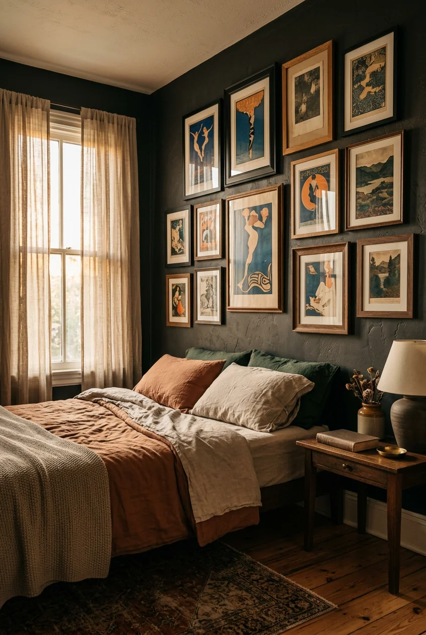
- Create Dynamic Gallery Walls with 2-Inch Gaps
- Protect Your Prints with UV-Filtering Acrylic
- Sneak in Acoustic Panels as Functional Art
- Download Digital Prints for Budget-Friendly Updates
- Mix Wood and Metal Frames for Depth
- Use Removable Adhesives for Unframed Prints
- Mount Heavy Pieces with Gorilla Putty
- Don’t Forget the Wall Opposite Your Bed
- Try Expressive Minimalism Over Generic Line Art
- Layer Afrohemian and Scandi Styles
- Combine Celestial and Botanical Themes
- Build a 3D Texture Wall with Felt Panels
- Perfecting the Posters on Wall Bedroom Aesthetic Layout
Last October, I tried to nail the perfect bedroom wall aesthetic by slapping five unframed prints directly onto my drywall with standard office tape. It was a complete disaster. At 3 AM, I woke up to the sound of thick paper scraping down the wall, leaving sticky yellow residue behind. The posters curled at the edges, and the whole setup looked like a messy college dorm instead of an intentional adult space. Getting your bedroom walls right requires actual math and the right materials. I spent the next six months testing frames, adhesives, and layouts. Here is exactly how I fix bare walls using real measurements and specific products.
1. Anchor the Room with One Oversized Society6 Print

Instead of buying a dozen small prints, I anchor my main wall with one massive piece. I used to buy cheap 8x10s and cluster them, but it just made my small room feel claustrophobic. A single oversized print creates a calm, architectural feel. I bought a 24×36 inch abstract landscape from Society6 for $28.99 (unframed). The sheer scale of a 3-foot tall poster forces the eye upward, making my standard 8-foot ceilings feel significantly higher. When you hang a piece this large, you don’t need surrounding clutter. I mounted mine right above my low-profile bed. The trick is avoiding glossy paper at this size. The Society6 print uses a 100lb matte stock, which absorbs overhead light rather than reflecting a giant white glare across the room. If you’re tired of dusting multiple small frames, switching to one massive focal point cuts your cleaning time in half and immediately grounds the space. Trust me on this.
2. Warm Earth Tones for a Calming Vibe

Stark black and white photography feels too harsh for a sleeping space. I switched to warm earth tones last winter when my bedroom felt completely sterile. Terracotta, sand, rust, ochre, and dusky rose are huge right now because they naturally soften the hard edges of your furniture. I picked up an 18×24 canvas print from Target’s Project 62 line for $35.00 that features heavy rust and sand tones. The muddy orange color warms up my cool gray walls instantly. When you use earth tones, the room looks lived-in and relaxed. I specifically look for abstract shapes or muted nature scenes rather than high-contrast typography. The visual weight of terracotta anchors the room without shouting at you. I pair these prints with a beige linen duvet cover. The earthy tones in the poster pull the natural fibers of the bedding together, making the whole room feel like a unified, quiet space instead of a random collection of furniture.
3. The 57-Inch Eye-Level Rule for Posters on Wall Bedroom Aesthetic

Most people hang their art way too high. I made this mistake for years, straining my neck to look at a 16×20 frame I bought at Walmart for $12.48. To get the posters on wall bedroom aesthetic right, you need to follow the 57-inch rule. You measure exactly 57 to 60 inches (about 145 to 152 cm) from the floor and mark that spot with a pencil. That mark is where the dead center of your poster should sit. This is the average human eye level. When art sits at this height, the room immediately feels balanced and comfortable. You aren’t forcing your eyes to track upward. I use a standard 25-foot Stanley measuring tape to find the exact center point of my frame, then calculate where the nail needs to go. It takes three extra minutes of math, but it stops your walls from looking like a waiting room.

Qukaka Floating Shelves for Wall Decor
Honestly, Qukaka Floating Shelves for Wall Decor surprised me — sturdier than it looks in the photos, and over 169 buyers gave it 4.5 stars.
4. Connect Art to Your Headboard with Precise Spacing

Hanging art above a headboard or dresser comes with its own strict math. If you leave too much space, the poster looks like it’s floating away into space. I learned that the hard way after mounting an IKEA RIBBA frame ($19.99) a full two feet above my queen bed. It looked completely disconnected. The bottom edge of your frame needs to sit exactly 6 to 12 inches above the top of your furniture. I aim for 8 inches above my wooden headboard. This narrow gap acts as a visual bridge, connecting the artwork to the bed so they read as one single unit. When I sit up in bed, my head doesn’t hit the glass, but the art still feels grounded. I use a standard wooden ruler to measure the 8-inch gap before driving the nail. This precise spacing fixes that awkward empty void that ruins the cohesion of your bedroom layout.
5. Master the Two-Thirds Rule for Balanced Proportions

Proportions matter just as much as placement. If your art is too small, it looks ridiculous over a large piece of furniture. You need the two-thirds rule. Your artwork, or your entire gallery wall grouping, should span about two-thirds the width of the furniture below it. My upholstered bed is 60 inches wide, so my poster arrangement needs to be roughly 40 inches across. I bought a set of three digital prints from Etsy for $14.50. I printed them as 11x14s and spaced them out to hit that 40-inch total width. Before I knew this rule, I tried centering a single 16×20 frame over my wide dresser, and it looked like a tiny postage stamp on a massive blank wall. Measuring the width of your furniture first ensures your posters carry enough visual weight to hold their own against bulky dressers and wide mattresses.
6. Create Dynamic Gallery Walls with 2-Inch Gaps

Gallery walls turn into chaotic messes when the spacing is inconsistent. I used to eyeball the gaps between my frames, ending up with a crooked layout that drove me crazy every time I looked at it. The rule is strictly 2 to 3 inches of space between small to medium frames, and up to 6 inches for massive pieces. I use a roll of ScotchBlue painter’s tape ($4.98 for a 1.41-inch roll) as a physical spacer. I literally stick a piece of tape between the frames while I’m hanging them. The 1.41-inch width gives me a perfect, uniform gap every single time without having to measure repeatedly. If you cram frames closer than two inches, the wall looks cluttered and your eyes don’t know where to rest. The negative space between the posters is just as important as the art itself. It gives each individual piece room to breathe. You might also like: 18 DIY Bedroom Decor Worth Trying

ROMGUAR CRAFT Corner Floating Shelves Wall Mounted Set of 4
ROMGUAR CRAFT Corner Floating Shelves Wall Mounted Set of 4 has been one of the most consistently praised picks in this category. 19 reviewers averaged 4.5/5.
7. Protect Your Prints with UV-Filtering Acrylic

Sunlight destroys cheap paper. I lost a vintage concert poster I bought for $50 because I hung it in a standard glass frame right across from my south-facing window. Within six months, the vibrant red ink faded to a sad, washed-out pink. Now, I strictly use UV-filtering acrylic for anything I care about. I order custom metal frames from Frame It Easy (starting around $22.50 for smaller sizes) and specifically select their UV-protective glazing option. It filters out the harmful light rays that bleach the ink. Acrylic is also much lighter than glass, which means I don’t have to use heavy-duty wall anchors just to hang a 16×20 print. The acrylic has a slightly different glare than cheap glass, but it keeps the colors crisp. If you have a sunlit bedroom, standard glass is a mistake that will ruin your posters within a year. You might also like: 20 Stunning Pink Bedroom Ideas You Need to See
8. Sneak in Acoustic Panels as Functional Art

My bedroom faces a busy street, so traffic noise is a constant issue. I recently discovered you can use acoustic wall panels as actual decor. This is a massive trend for 2026. I bought a 24×24 inch hand-painted acoustic panel from Acousart for $85.00. It looks exactly like a textured abstract canvas, but it’s built from dense sound-absorbing foam. It reduces the echo in my room and dampens the noise from outside by about 40%. The panel has a thick, felt-like texture that adds a ton of visual warmth to the wall. I mounted it right behind my bedroom door where the sound bounces the most. You get the aesthetic appeal of a modern art piece combined with the practical function of soundproofing. It totally beats hanging those ugly black foam egg-crate squares that belong in a basement recording studio. You might also like: 20 Creative Cozy Small Bedroom for Any Style
9. Download Digital Prints for Budget-Friendly Updates

I change my mind about my bedroom colors every six months, which gets expensive if you’re buying physical art. Digital downloads are the only way I afford this habit. I buy instant download files from shops like StyleMyHaven on Etsy for about $9.90 a piece. Then, I send the files to my local Walgreens photo center and print them on heavy 80lb cardstock for $3.99. You can blow them up to 24×36 inches at a local print shop for a fraction of the cost of a pre-printed poster. Last Tuesday, I swapped out a moody winter landscape for a bright Scandi folk scene in under an hour. The trick is making sure you download the high-resolution 300 DPI files. If you try to print a cheap, low-res image, it looks pixelated and blurry once it’s blown up to poster size. Digital art lets you test trends without committing a massive budget.

Amaoot Floating Shelves Set of 3, Home Wood Wall Shelf
Amaoot Floating Shelves Set of 3 punches above its price — 893 buyers rated it 4.5 stars. I would buy it again.
10. Mix Wood and Metal Frames for Depth

Matching all your frames makes a room look like a cheap hotel. I used to buy bulk packs of identical black plastic frames, and my walls felt completely flat and uninspired. Mixing materials adds instant depth. I pair a natural oak wood RIBBA frame from IKEA ($9.99, 12×16) with a sleek matte black metal frame from Target’s Room Essentials line ($8.00). The contrast between the warm, grainy wood and the cold, smooth metal creates friction that makes the wall interesting. I stick to a maximum of three finishes. Usually oak, matte black, and brass. If you introduce too many materials, it looks messy. The wood frames bring out the warm earth tones in my posters, while the thin metal frames give the layout a sharp, structured edge. It’s a subtle styling trick that makes inexpensive prints look like a curated collection.
11. Use Removable Adhesives for Unframed Prints

If you’re renting, you can’t go drilling holes for every single poster. But standard tape ruins your drywall and leaves greasy marks. I strictly use Scotch 109 Removable Poster Tape now. It costs $4.29 for a 150-inch roll at Walmart. This specific tape holds up to 1/4 pound, which is plenty for heavy cardstock prints. I apply a two-inch strip to all four corners of an 18×24 unframed poster. It grips the painted drywall firmly, but when you peel it off slowly, it leaves zero residue. I used to use those blue sticky tacks, but they left oily stains on my matte paint that I had to scrub off with a magic eraser. The double-sided Scotch tape sits completely flat, so the poster doesn’t have those weird, bumpy corners. It keeps the paper flush against the wall for a clean, tailored finish.
12. Mount Heavy Pieces with Gorilla Putty

For heavier, textured prints or thin wooden signs that won’t fit in a frame, tape won’t cut it. I use Gorilla Mounting Putty ($3.48 for a 2 oz pack at Home Depot). This stuff is incredibly dense and holds up to 2 lbs. I roll it into pea-sized balls and press them into the corners of my heavier unframed pieces. It has a slight rubbery smell when you first open the package, but it fades quickly. The grip is intense. I have a thick, woven fabric poster that kept falling down with command strips because of the fabric texture. The Gorilla Putty pressed right into the fibers and bonded to the wall instantly. It doesn’t dry out and flake off like cheaper putties do after a few months. You just have to roll it off slowly with your thumb when you want to remove it.

QEEIG Floating Shelves for Wall Bathroom Shelf Bedroom
Honestly, QEEIG Floating Shelves for Wall Bathroom Shelf Bedroom Kitchen Living surprised me — sturdier than it looks in the photos, and over 45 buyers gave it 4.5 stars.
13. Don’t Forget the Wall Opposite Your Bed

Everyone obsesses over the wall behind the bed, but they completely ignore the wall opposite the bed. That blank space is the first thing I see when I wake up and the last thing I look at before I go to sleep. Leaving it bare is a missed opportunity. I hung a massive 18×24 botanical print I found at a local Whole Foods artist display for $15.00 directly across from my pillows. I positioned it exactly at my seated eye level from the mattress. Waking up to a calming, muted green fern print subtly shifts my mood before I even check my phone. I keep this wall minimal. One single, large piece of art is enough. If you put a busy, cluttered gallery wall right across from your bed, your brain has to process all that visual noise the second you open your eyes. Keep this specific wall quiet and focused.
14. Try Expressive Minimalism Over Generic Line Art

The generic, continuous line-art faces that were everywhere a few years ago look incredibly dated now. Minimalism is still relevant, but it needs to be expressive. I avoid anything that looks like it was generated by a computer in five seconds. Instead, I look for abstract forms, poetic silhouettes, and layouts with heavy negative space. I bought an 11×14 print from Desenio for $14.95 that features a single, sweeping charcoal brushstroke. The matte texture of the ink looks hand-painted. Expressive minimalism doesn’t scream for attention, but it invites you to look closer. The bold, imperfect shapes provide contrast against the straight lines of my dresser and nightstands. When you choose minimal posters, the quality of the paper matters immensely because there’s nowhere for cheap printing to hide. I always opt for a heavy, textured cotton rag paper to give the simple design some physical weight.
15. Layer Afrohemian and Scandi Styles

The strongest layouts right now layer two distinct styles to create tension. Repeating the exact same aesthetic across ten posters gets boring fast. I layer Afrohemian botanical prints with strict Scandi line art. The organic, leafy shapes of the botanicals soften the rigid geometry of the Scandinavian designs. I bought a 30×40 inch fabric wall hanging from Urban Outfitters for $24.00 that features a rich, earthy Afrohemian geometric pattern. I hung it next to a stark, black-and-white Scandi typography print. The key to making this work is maintaining a tight color palette. Even though the styles clash, they both feature heavy rust and matte black ink. Because the colors match, the contrasting styles look intentional rather than accidental. If you mix styles and mix bright, chaotic colors at the same time, the wall just looks like a messy thrift store bin.

AMADA HOMEFURNISHING Floating Shelves
If you want something that just works, AMADA HOMEFURNISHING Floating Shelves is a safe bet (114 reviews, 4.5 stars).
16. Combine Celestial and Botanical Themes

Celestial themes are huge, but hanging a basic photo of the moon feels a bit juvenile. The 2026 trend is crossing celestial elements with vintage botanicals. I found a great 8×10 print in the seasonal home aisle at Kroger for $9.99. It features a muted gold crescent moon layered behind a detailed, scientific illustration of a fern. The combination of space and earth gives the poster a moody, grounded vibe. I placed it in a brass frame on my nightstand. The metallic ink on the moon catches the light from my reading lamp at night. Mixing these two themes prevents the room from looking like a teenager’s astrology phase. The botanical elements ground the celestial shapes, making the artwork feel sophisticated and intentional. It’s a very specific niche, but it works perfectly in a bedroom where you want a calm, nighttime atmosphere.
17. Build a 3D Texture Wall with Felt Panels

Flat posters sometimes aren’t enough to fix a boring room. I started incorporating 3D texture by blending acoustic felt panels with my framed art. I bought a set of 3D acoustic tiles from Inhabit Living. They cost $115.00 for a pack of 10, and they are made from recycled PET felt. The felt has a rough, wool-like texture that absorbs light and sound. I installed a cluster of these panels behind my headboard and hung my framed posters around them. The panels stick out about an inch from the wall, creating physical shadows that change as the sun moves across the room. It breaks up the flat monotony of standard drywall. The felt material brings a soft, tactile element to the wall that standard paper posters just can’t provide. It turns the entire wall into a cohesive, mixed-media installation.
18. Perfecting the Posters on Wall Bedroom Aesthetic Layout

You can’t just start hammering nails into your drywall and hope for the best. That’s how you end up with walls full of spackle patches. The secret to a flawless posters on wall bedroom aesthetic is mapping everything out on the floor first. I use my large 8×10 Costco area rug ($99.99) as a staging ground. I lay all my frames out on the rug and shift them around until the balance feels right. I look for heavy, dark frames and make sure they are distributed evenly so one side of the layout doesn’t look visually heavier than the other. Once I like the arrangement, I trace each frame onto cheap newspaper, cut out the templates, and tape the paper to the wall. This lets me step back and see the exact scale and placement before I pick up a hammer. Took me years to figure out.
Getting your bedroom walls right takes a bit of planning, but it completely changes how the room feels. I spent way too much time staring at blank walls because I was afraid of making holes in the drywall. Grab a tape measure, stick to the 57-inch rule, and mix your frame textures. If you try the Scotch 109 tape or the acoustic panels, you won’t regret it. Pin this guide for later so you have the exact measurements handy when you’re ready to hang your prints. No exaggeration.
Frequently Asked Questions
How high should I hang posters in my bedroom?
Follow the 57-inch rule. Measure 57 to 60 inches from the floor to find the average human eye level. The exact center of your poster or gallery wall should sit directly on this mark for the most balanced look.
How do I hang posters without damaging drywall?
Use removable adhesives designed specifically for paper. Scotch 109 Removable Poster Tape holds up to 1/4 pound and leaves no residue. For heavier unframed pieces, Gorilla Mounting Putty provides a strong grip without staining matte paint.
How much space should be between frames on a gallery wall?
Maintain a strict 2 to 3-inch gap between small and medium frames. For oversized pieces, you can increase the gap to 6 inches. Using a roll of painter’s tape as a physical spacer ensures uniform gaps every time.
How far above a headboard should art be placed?
The bottom edge of your frame should sit 6 to 12 inches above the top of your headboard. This narrow gap visually connects the artwork to the furniture, preventing the poster from looking like it is floating too high.
