What’s Inside
- Embrace Light, Cool Hues for Expansive Walls
- Monochromatic Magic: Blur Boundaries with Tonal Schemes
- The Fifth Wall Illusion: Paint Your Ceiling with Purpose
- Strategic Sheen for Light Reflection
- Vertical Stripes for Height, Horizontal for Width
- Accent Walls with Intent: Depth, Not Confinement
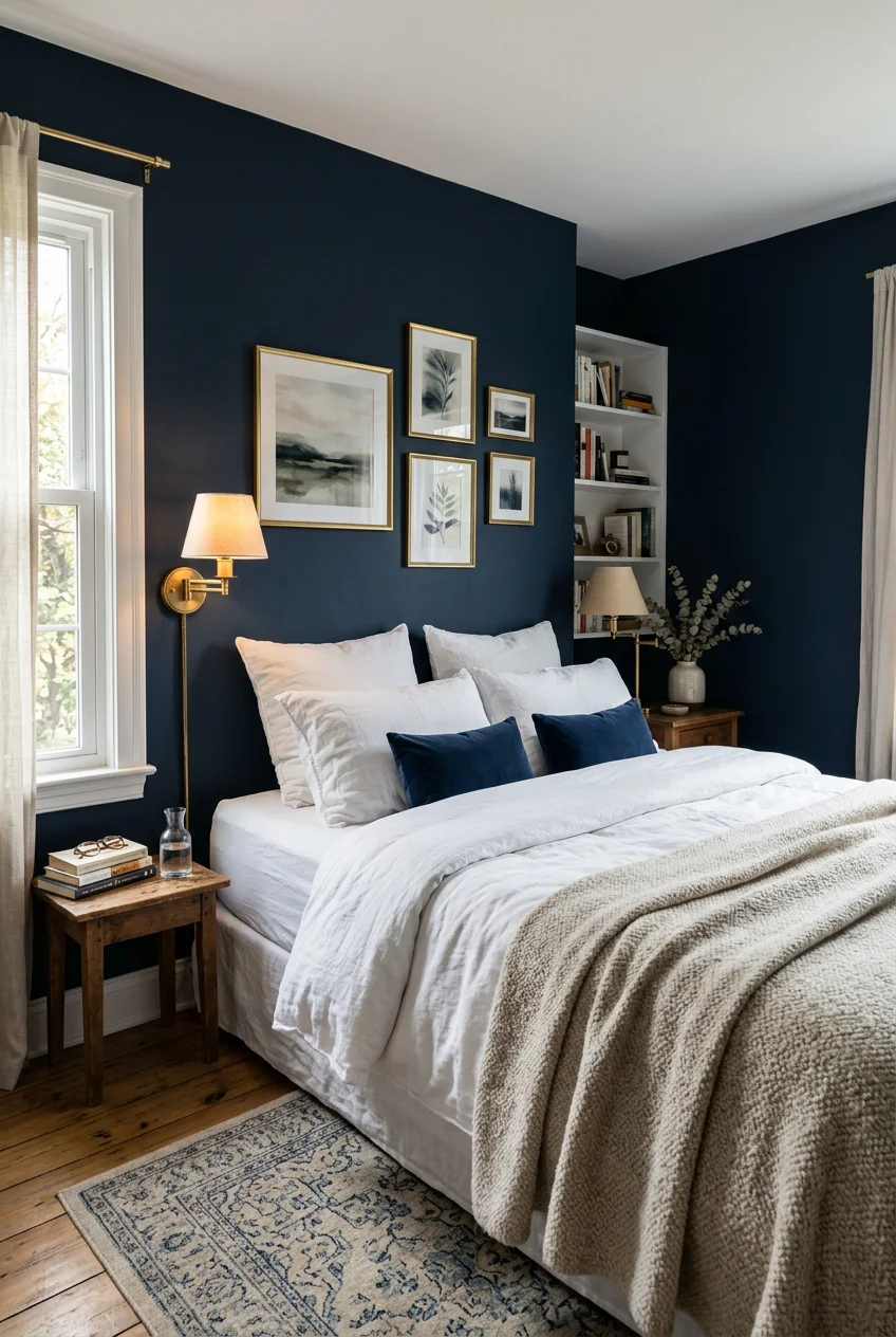
- Embrace Dark, Moody Tones Carefully
- Continuous Trim and Door Integration
- The Power of Primer: Do Not Skip This Step
- Test Swatches Before You Commit
- Reflective Ceilings: High-Gloss White for Drama
- Trending Neutrals: Greige for Depth
- Half-Wall Technique for Visual Interest
- Avoid Overly Contrasting Colors
- Metallic Accents for Optical Illusion
- Color Drenching the Built-ins
- Prep Your Walls Like a Professional
Most folks default to stark white walls for a cramped sleeping space, but that’s a massive mistake. When you rely solely on builder-grade white, the room feels like a sterile, tiny box. If you want small bedroom paint ideas that actually work, think about how color manipulates shadows and depth. Blurring the boundaries between walls and trim is the most effective way to trick the eye into seeing a larger room. If you only try one idea from this list, make it #2. Painting your trim the same color as your walls stops your eye from registering where the wall ends. It creates an optical illusion of endless space.
Skip this list if your bedroom gets zero natural light and you won’t add lamps. Paint colors need light to reflect. If you live in a basement with one tiny window and only use a harsh overhead fan, no color will save the space. Focus on your lighting plan first. Trust me.
1. Embrace Light, Cool Hues for Expansive Walls

In tight square footage, the instinct is to grab the brightest white available. But stark white often looks dead in small spaces without massive windows. Instead, light and cool-toned hues are better for expansive walls. Cool tones recede visually, pushing the walls away. Benjamin Moore makes a crisp white called Chantilly Lace, but their Healing Aloe is a much better option. It’s a serene blue-green with warm undertones that bounces light around. A gallon of Benjamin Moore Aura paint usually runs between $90 and $110 depending on the sheen. This formula covers beautifully and resists scuffs. The catch: light, cool tones can feel chilly if your room faces north and only gets gray, indirect sunlight. Balance these walls with warm textiles like heavy linen curtains or a thick wool rug to keep the room cozy.
2. Monochromatic Magic: Blur Boundaries with Tonal Schemes

Instead of stark contrasts, use a single color in varying shades across your walls, trim, and ceiling. This minimizes visual breaks, letting the eye move freely and expanding the room. It’s a killer trick for cramped spaces. Paint your walls in Lick’s Grey 02 and your trim in a slightly lighter tint of the same color. When baseboards aren’t glaring white, the wall appears to stretch to the floor. Best for: rooms with low ceilings. Grab your supplies and painter’s tape at Target to get started. The catch: tonal schemes require precision. If your ceiling line isn’t perfectly straight, a slight variation in color highlights every wobble. Use high-quality tape and a steady hand. It’s also harder to touch up later.
3. The Fifth Wall Illusion: Paint Your Ceiling with Purpose

Paint your ceiling the same color as your walls, or one shade lighter, to create a continuous look that makes the ceiling feel higher. This contradicts the habit of painting ceilings flat white. A stark white ceiling creates a harsh break, telling your brain exactly how small the room is. Alternatively, a soft sky blue ceiling gives a sense of height, mimicking the outdoors. Before starting, mix 2 tablespoons of mild dish soap into warm water to wash the ceiling dust off. The catch: painting ceilings is exhausting. You’ll get paint in your hair, and your neck will ache for days. Stock up on snacks from Trader Joe’s because you won’t have energy to cook. You also need heavy-duty drop cloths to protect your floors from the splatter.

QEEIG Floating Shelves for Wall Bathroom Shelf Bedroom
A dependable everyday pick — QEEIG Floating Shelves for Wall Bathroom Shelf Bedroom Kitchen Living pulls in 46 ratings at 4.5 stars. Not flashy, just solid.
4. Strategic Sheen for Light Reflection

The right finish is as important as the color. Choose an eggshell or satin finish for your walls. These reflect light softly without a harsh glare, and they’re more forgiving than high-gloss. Avoid flat paint entirely. It absorbs light, making the space feel smaller. Sherwin-Williams Emerald Interior Acrylic Latex Paint in a satin finish is a solid choice, typically costing around $50 to $60 per gallon during sales. The catch: while satin reflects light, it highlights drywall imperfections more than flat paint. If your walls have patches or dents, the satin sheen puts a spotlight on every flaw. Spend extra time sanding and prepping your walls to ensure a smooth surface.
5. Vertical Stripes for Height, Horizontal for Width

You can manipulate the perception of your room’s dimensions with painted stripes. Vertical stripes, like thin, light-colored lines against a slightly darker background, force the eye upward. This makes a low-ceilinged room appear taller. Conversely, horizontal bands make a narrow space seem wider. Best for: narrow rooms that feel claustrophobic. For precision, you’ve got to use high-quality painter’s tape. FrogTape Delicate Surface Painter’s Tape prevents the paint from bleeding. The catch: tape bleed is a nightmare if you rush. If you don’t press the edges down firmly, or peel it off too late, you’ll end up with jagged, messy lines. Measuring and leveling the stripes also takes hours of prep work. It’s not a quick weekend project if you want it done right. You might also like: 19 Grey Bedroom Decor for Every Budget
6. Accent Walls with Intent: Depth, Not Confinement

If you’re set on an accent wall, opt for a subtle contrast rather than a dark color that shrinks the space. A muted green, like Benjamin Moore’s October Mist, or a calming greige panel behind your headboard adds depth without overwhelming the room. Cool, darker tones like greens, blues, and purples draw the wall away from the eye, making the space appear larger. Most people get this wrong by choosing a loud, warm color like red or orange, which makes the room feel cramped. The catch: accent walls can look dated if the contrast is too harsh. If you pick a random wall without anchoring it to furniture, the room feels unbalanced. Learned that the hard way. You might also like: 15 Boys Bedroom Decor for Every Budget

Bedsure GentleSoft White Throw Blanket for Couch
If you want something that just works, Bedsure GentleSoft White Throw Blanket for Couch – Cozy Soft Fleece Su is a safe bet (24 reviews, 4.5 stars).
7. Embrace Dark, Moody Tones Carefully

While generally advised against, a dark ceiling in charcoal or midnight blue can make a small bedroom feel luxurious. For walls, a deep forest green, like Benjamin Moore’s Hunter Green 2041-10, creates a sense of depth and a cozy, cave-like feel. This works well when balanced with warm artificial lighting. Best for: bedrooms used strictly for sleeping by people who work night shifts. The catch: dark paint absorbs light. If your room doesn’t have excellent lighting, it’ll feel like a gloomy closet. Dark colors also show dust and fingerprints faster. You’ll wipe the walls more, requiring a highly durable, scrubbable paint finish. You might also like: 20 Simple Bedroom Wall Design Ideas That Actually Work
8. Continuous Trim and Door Integration

Paint your baseboards, window trim, and interior doors the exact same color as your walls. This blurs the borders and makes the space read as one continuous, larger shape. Most people leave doors and trim builder-grade white, which chops up the wall space and highlights the small footprint. Use a slightly higher sheen, like satin or semi-gloss, on the trim for durability. Pick up high-quality trim brushes at Walmart to ensure a smooth finish. The catch: touching up baseboards is harder when they aren’t standard white. If your vacuum cleaner scratches the paint, you can’t just grab a generic pen. You’ve got to keep a labeled jar of your specific wall color on hand.
9. The Power of Primer: Do Not Skip This Step

Always use a quality primer, especially when covering dark colors with light ones. Primer ensures better adhesion, provides a smooth surface, and extends the life of your paint job. Zinsser Bullseye 123 is the industry standard. A 1-gallon can typically costs around $25 to $35 and is worth every penny. Skipping primer guarantees your expensive topcoat looks blotchy. The catch: priming adds an entire day to your project. You’ve got to wait for it to dry, meaning your bedroom is out of commission for at least 48 hours. It’s an extra expense and extra cleanup. If you take a shortcut using paint-and-primer-in-one, you’ll end up doing three coats of expensive paint anyway.

YUFLINX 16’’White Floating Shelves for Wall Set of 4
A dependable everyday pick — YUFLINX 16’’White Floating Shelves for Wall Set of 4 pulls in 658 ratings at 4.5 stars. Not flashy, just solid.
10. Test Swatches Before You Commit

Always test your colors in the actual room. Paint large swatches, at least 1 foot by 1 foot, on different walls. Observe how the color appears throughout the day under different light conditions before committing. Paint colors shift drastically depending on the light. Many brands offer 4 oz sample pots for a few dollars. Best for: indecisive planners who second-guess their choices. The catch: painting thick swatches directly onto drywall can leave raised edges under your final coat. If you apply the sample too heavily, you’ll see the square outline even after you paint the whole room. Feather the edges, sand them down, or use peel-and-stick samples to avoid damaging your wall texture.
11. Reflective Ceilings: High-Gloss White for Drama

For a surprising effect, consider a high-gloss white ceiling. This finish bounces light well, raising the room and making it feel taller. It acts like a mirror, reflecting natural light back into the space. It’s a bold choice that makes a basic bedroom feel custom. The catch: high-gloss paint shows imperfections. If your ceiling has uneven tape lines, old water damage, or popcorn texture, high-gloss makes it look terrible. Prep is non-negotiable. You’ve got to skim coat to a level-five smooth finish, sand it, and prime it. It’s an incredibly labor-intensive process that most DIYers aren’t ready for. Skipping the prep ruins the illusion.
12. Trending Neutrals: Greige for Depth

Greige is dominating bedroom design. This shade combines the warmth of beige with the cool sophistication of gray, creating depth without darkness. It makes small bedrooms feel cozy without leaning too yellow or sterile. Benjamin Moore’s Pale Oak is a perfect example that works in almost any space. It provides just enough contrast against white trim to look intentional but stays airy. The catch: greige can look muddy in north-facing rooms. Because north-facing light is cool and blue, it pulls out the gray undertones and suppresses the beige. If your room lacks bright sunlight, it ends up looking like wet cement. Test this color with your specific lighting first.

COOVA Faux Fur Throw Blanket for Couch
COOVA Faux Fur Throw Blanket for Couch punches above its price — 12 buyers rated it 4.5 stars. The kind of pick people reorder.
13. Half-Wall Technique for Visual Interest

To add drama without overwhelming a small space, paint the lower section of a wall a bold hue and keep the top half light. This anchors the bed and grounds the room while keeping a sense of space near the ceiling. It mimics the look of expensive wainscoting without the cost. Best for: renters who want big impact but need an easy paint-over job. The catch: this requires a perfectly level line across the room. If your floors or ceilings are sloped, which is common in older houses, a level paint line looks crooked. You’ve got to use a laser level and high-quality tape, and you often have to make micro-adjustments. It’s frustrating work.
14. Avoid Overly Contrasting Colors

A common mistake is using bold, highly contrasting colors on walls, ceilings, and trim. This chops up the space and makes it feel disjointed. When your eye constantly stops at sharp transitions, the room feels cluttered. Stick to harmonious, analogous palettes to create a cohesive feel. Choose colors that sit next to each other on the color wheel, or stick to varying shades of the same base. The catch: this limits your ability to use multiple favorite colors. If you love navy blue and mustard yellow, you can’t put them both on the walls without making the space feel chaotic. You’re forced to use contrasting colors for throw pillows or blankets instead.
15. Metallic Accents for Optical Illusion

Incorporate metallic paint, particularly in grey or blue tones, with a slight sheen. This maximizes light reflection and creates an optical illusion of a larger space. A soft metallic glaze over a matte base coat gives the walls a subtle shimmer that changes as you walk, making them feel less solid. The catch: metallic paint is notoriously difficult to roll evenly. It dries quickly, and if you don’t maintain a wet edge, you’ll end up with visible lap marks and streaks that ruin the effect. You often need specialized foam rollers or a paint sprayer to get a factory-like finish. It’s not beginner-friendly, and fixing a botched job usually requires sanding the wall down.

Govee RGBIC LED Strip Lights, Smart LED Lights for Bedroom
A dependable everyday pick — Govee RGBIC LED Strip Lights pulls in 251 ratings at 4.5 stars. Not flashy, just solid.
16. Color Drenching the Built-ins

If your small bedroom has closets, shelving, or radiator covers, paint them the exact same color as the walls. This technique, known as color drenching, stops clunky storage units from breaking up the visual flow. When a bulky wardrobe matches the wall, it effectively disappears, making the room feel less crowded. Best for: rooms with outdated storage solutions you can’t rip out. The catch: painted shelves chip easily without proper prep and cure time. You can’t just slap wall paint onto a laminate door. You’ve got to use a bonding primer, a durable cabinet-grade enamel, and let it cure for up to 30 days. If you rush, your books will stick to the paint and peel it.
17. Prep Your Walls Like a Professional

The best paint color won’t save a room if the walls are dirty and textured with old drips. Professional painters spend 70% of their time prepping. Wash your walls first. Mix 1/2 cup of a TSP substitute with warm water, grab sponges from Kroger, and scrub the baseboards to remove oils. If you want to be eco-conscious, grab natural soap from Sprouts. Fill every nail hole, sand the patches, and wipe the dust away with microfiber towels from Costco. The catch: prep is tedious, boring, and physically demanding. It’s the step everyone skips because it doesn’t offer immediate gratification. But if you paint over dust, the paint eventually peels. Old drips cast tiny shadows that ruin the finish. Took me years to figure out.
How we chose these ideas: We evaluated these strategies based on renter-friendliness, cost, DIY effort, and actual visual impact on small square footage. We prioritized techniques that manipulate light and shadow effectively, focusing on accessible materials and realistic timelines rather than expensive architectural overhauls.
Don’t let a small bedroom dictate a boring color palette. By manipulating light with sheens, blurring boundaries with tonal matching, and putting in the tedious prep work, you can make even the most cramped space feel intentional and cozy. Pick a strategy that fits your room’s natural light, grab your supplies, and start taping. Pin this list for your next weekend project so you don’t forget the primer rules.
Frequently Asked Questions
What is the best paint finish for a small bedroom?
Satin or eggshell finishes are best for small bedrooms. They reflect light softly, which helps the space feel larger, without creating the harsh glare of a semi-gloss. Avoid flat paint entirely, as it absorbs light and makes the room feel confined.
Should I paint my small bedroom ceiling white?
Not necessarily. A stark white ceiling creates a harsh visual break that highlights the room’s small footprint. Painting the ceiling the same color as the walls, or just one shade lighter, blurs the boundaries and makes the ceiling appear much higher.
Do dark colors make a small bedroom look smaller?
Dark colors absorb light, which can make a room feel smaller if it lacks proper artificial lighting. However, dark tones like hunter green or charcoal can also create depth and a cozy, cocoon-like atmosphere if balanced with warm lamps and light textiles.
How do I make a narrow bedroom look wider with paint?
You can paint horizontal stripes to trick the eye into seeing a wider space. Alternatively, painting the shorter end walls a slightly darker shade than the longer side walls visually pushes the longer walls outward, correcting the narrow, bowling-alley proportions.
